This article is part of the Stata for Students series. If you are new to Stata we strongly recommend reading all the articles in the Stata Basics section.
A scatterplot is an excellent tool for examining the relationship between two quantitative variables. One variable is designated as the Y variable and one as the X variable, and a point is placed on the graph for each observation at the location corresponding to its values of those variables. If you believe there is a causal relationship between the two variables, convention suggests you make the cause X and the effect Y, but a scatterplot is useful even if there is no such relationship.
This section will teach you how to make scatterplots; Using Graphs discusses what you can do with a graph once you've made it, such as printing it, adding it to a Word document, etc.
Setting Up
If you plan to carry out the examples in this article, make sure you've downloaded the GSS sample to your U:\SFS folder as described in Managing Stata Files. Then create a do file called scatter.do in that folder that loads the GSS sample as described in Doing Your Work Using Do Files. If you plan on applying what you learn directly to your homework, create a similar do file but have it load the data set used for your assignment.
Creating Scatterplots
To create a scatterplot, use the scatter command, then list the variables you want to plot. The first variable you list will be the Y variable and the second will be the X variable.
scatter weight height
This creates:
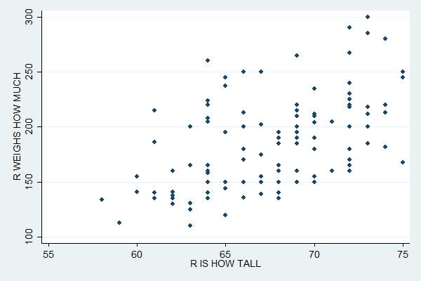
The distribution of the points suggests a positive relationship between height and weight (i.e. tall people tend to weigh more).
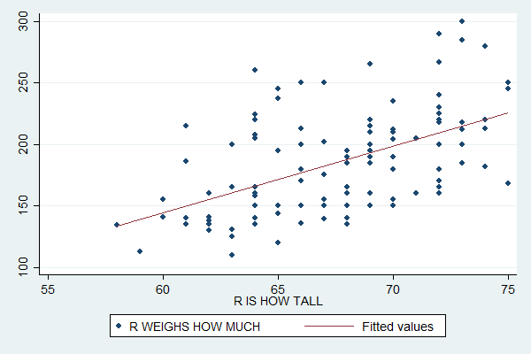
Adding a Regression Line
Regression attempts to find the line that best fits these points. You can plot a regression line or "linear fit" with the lfit command followed, as with scatter, by the variables involved. To add a linear fit plot to a scatterplot, first specify the scatterplot, then put two "pipe" characters (what you get when you press shift-Backslash) to tell Stata you're now going to add another plot, and then specify the linear fit.
scatter weight height || lfit weight height
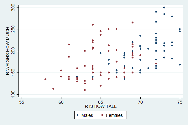
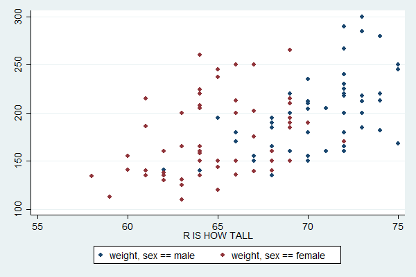
Plotting Subsamples
You can use similar code to plot subsamples in different colors:
scatter weight height if sex==1 || scatter weight height if sex==2
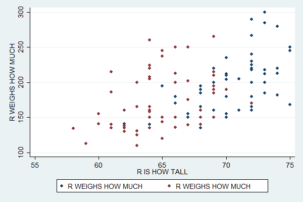
Unfortunately, the default legend at the bottom is now completely useless, so you'll need to specify what it should say. You can do so with the legend option, which then contains the order option. Within that you give a list of plot numbers and associated labels much like a list of value labels. The first plot you specify is plot number 1, the second number 2, etc.
scatter weight height if sex==1 || scatter weight height if sex==2, ///
legend(order(1 "Males" 2 "Females"))
An alternative way to plot create this plot is to start with the separate command.
separate weight, by(sex)
This creates two variables: a weight1 which only exists for males (i.e. it's missing for females and thus won't be plotted) and a weight2 which only exists for females. You can create a scatterplot that plots both of these variables with:
scatter weight1 weight2 height
The default legend for this version is more informative, but you'd still probably want to replace it (and add a title for the Y axis).
Plotting Multiple Variables
You can use similar syntax to plot multiple variables in the same scatterplot. Just list them after the scatter command. The last variable will always be the X variable and any other variables you list will be Y variables. For example:
scatter weight age height
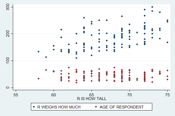
This plot suggests that while weight is positively related to height, age and height have a very weak relationship if any.
If you run tab height weight (and sift through the rather large amount of output it creates) you'll find a weakness of these plots: sometimes two people have the same height and weight.
Stata dutifully plots two points, but the second one completely covers up the first so that you can only see one. In the subsample graphs, a male (blue) point will be covered up by a female (red) point just because the graph for females was the second one specified.
This can distort the understanding you get of the distribution of the two variables. In this case it probably doesn't make much difference, but it would be a major problem if you tried to make a scatterplot of two categorical variables. (The underlying problem here is that many respondents seem to have rounded their weight to a multiple of five, making weight act somewhat like a categorical variable.)
There are many, many more options you can set for scatterplots, such as titles and colors. The easy way to find all these options is to click Graphics, Twoway graph, and then Create. Tweak the settings there until you get the graph you want, then copy the resulting command into your do file. Read An Introduction to Stata Graphics if you want to learn more about making scatterplots.
Complete Do File
capture log close
log using scatter.log, replace
clear all
set more off
use gss_sample
scatter height weight
scatter height weight || lfit height weight
scatter height weight if sex==1 || scatter height weight if sex==2
scatter height weight if sex==2 || scatter height weight if sex==1, ///
legend(order(1 "Males" 2 "Females"))
separate weight, by(sex)
scatter weight1 weight2 height
scatter weight age height
log close
Last Revised: 11/22/2016