This humorous video made in 2015 provides a sociological explanation for why a wall does not block unauthorized immigration and why tightened border controls beginning with President Reagan paradoxically actually increased the number of undocumented immigrants. It does not address the question of whether immigration is good or bad and
Read moreThoughts about Black Lives Matter in 2017
What a difference a few months makes. The Black Lives Matter movement was getting a lot of media coverage and popular support between 2014 and mid-2016. Multiple sessions at the American Sociological Association meeting were devoted to it. The Vision for Black Lives, prepared by a coalition named the Movement
Read moreEthnic Dimensions in Social Movements
Majority and minority protest movements have some structural differences and coalitions between majorities and minorities are fraught with difficulties. I’ve posted what I hope is close to the final version of my “Ethnic Dimensions in Social Movements” paper on SocArXiv while it awaits review for publication. It began life as
Read moreAsking the Wrong Questions About Protest
A protest field is like a ball game . . . [with] 12 teams, each trying to win with a somewhat different vision of what winning would mean, employing a wide variety of different kinds of tactics, forming temporary coalitions with other teams, trying to out-guess and out-think those opposed to their interests, and having somewhat different ideas of what the legitimate rules of the game are.
Read moreNews Coverage of Black Protest II: Movement in the Doldrums
SEE CORRECTION People who are not Black activists often believe that the Black movement went away after the late 1960s, either because it won or because people just gave up. And the available data certainly shows a steep decline in Black protest events as covered by the New York Times.
Read more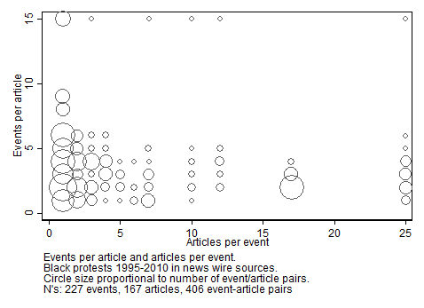
News Coverage of Black Protests I: Stories, not Episodes
In studying protest events using news sources, it is important to recognize the non-equivalence of events and articles about events. Social movement researchers usually code information about protest events in news sources with the goal of drawing conclusions about the frequency and size of the actual physical events that led
Read more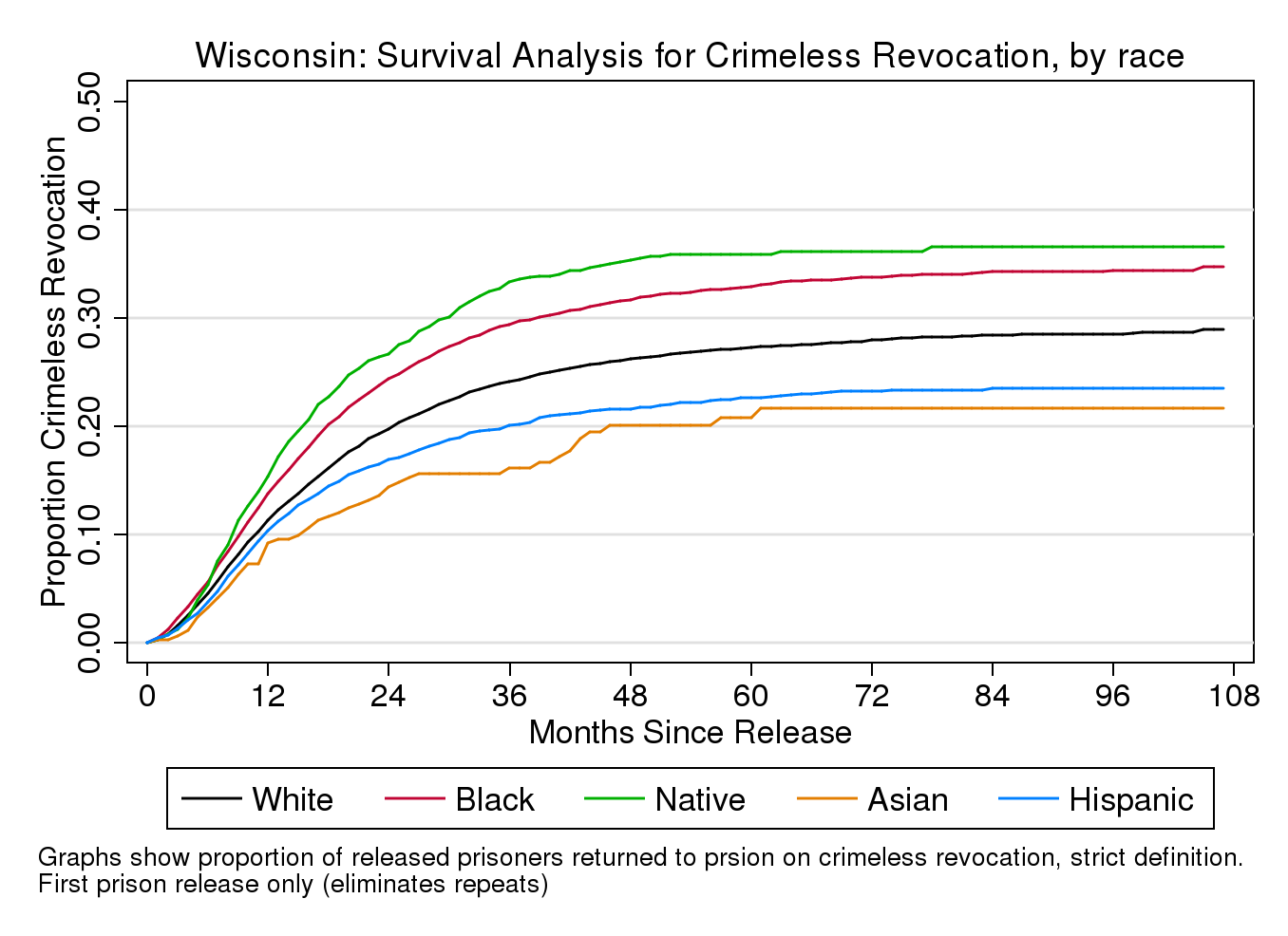
Crimeless Revocations, part 3: Racial Patterns
Key findings: Of those leaving Wisconsin prisons for the first time, Native American Indians have about a 30% higher rate of crimeless revocations than Whites, and Blacks about 20% higher (comparable to disparity ratios of 1.3 and 1.2) while Hispanic and Asian revocation rates are lower than White. For second and
Read more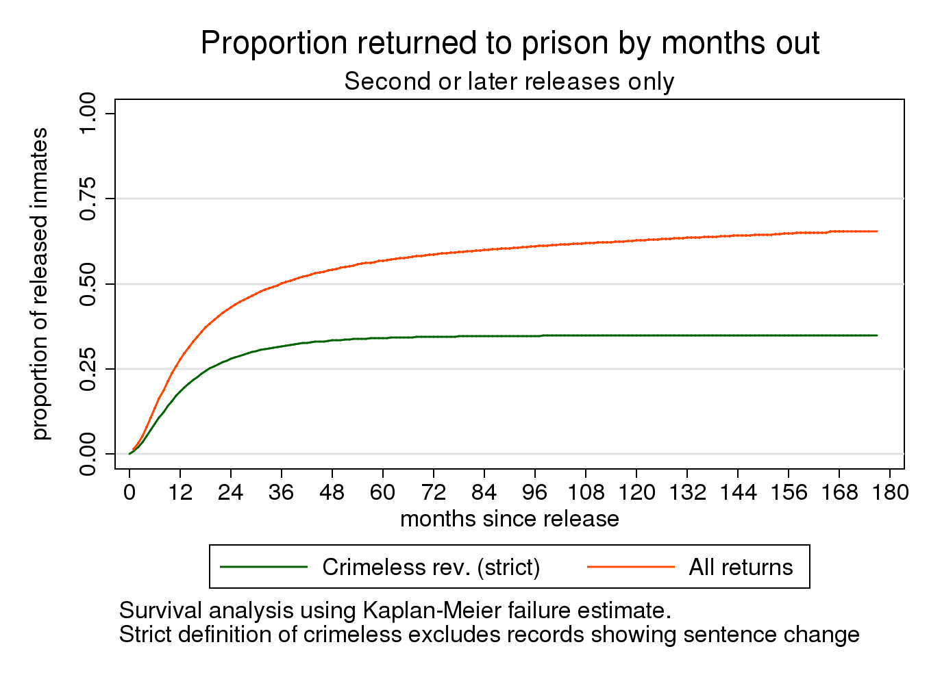
Crimeless Revocations, part 2
Key findings In Wisconsin, an estimated 35% of first spells in prison and 50-75% of second or later spells are crimeless revocations, depending on the criteria used for “crimeless”. A careful comparison of prison records suggests that roughly a third of prison admissions with no new sentence may have anticipated
Read more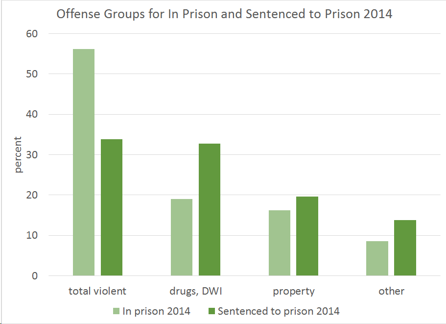
Sitting in prison versus going through prison: interpreting prison statistics
There is a lot of confusion in understanding imprisonment data created by the failure to understand the difference between the characteristics of people sitting in prison at any one time (what are technically called the “stock”) and the characteristics of the people who have gone though prison (the flow). This
Read more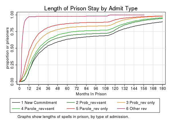
How long do people stay in prison in Wisconsin?
It is important to understand how long people stay in prison as part of understanding revocations. The graph below shows how long people stay in prison across all admission types. The vertical axis shows the cumulative percentage who have exited after the number of months on the horizontal axis. So,
Read more