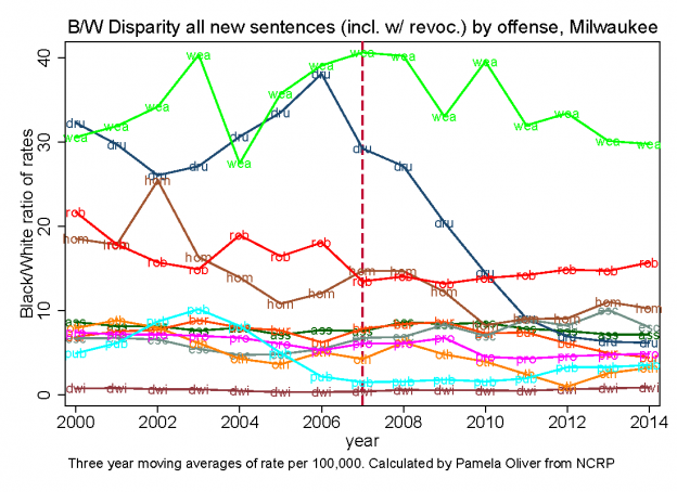
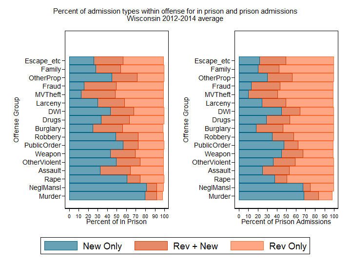
I’ve written several posts trying to clarify the reasons you will get a different mix of offenders in a snapshot of who is in prison versus the flow of prison admissions. This also comes up as we compare the combination of offense type and admission type. To illustrate this,
Read moreMilwaukee County Prison Admissions by Offense 2000-2014
These graphs are calculated from the restricted files of the National Corrections Reporting Program. They show the rate of admissions to prison for new sentences by offense group separately for Blacks, Whites and the Black/White disparity. A chart for the offense codes is between the Black and White graphs. They
Read more