Stata includes a rich set of tools for creating publication-quality graphics. Between the wide variety of graphs you can make and the sheer number of details you can control in a graph, Stata graphics can be a daunting subject. However, you'll probably only need to make a few different kinds of graphs, and in most cases Stata's default settings will be fine. What's more, Stata's Graphical User Interface (GUI) organizes the various graphing options in an intuitive way so you can find them when you need them without memorizing the syntax for each one. That doesn't mean you shouldn't put your graph commands in do files once you've created them, but it does mean that for complex graphs you can use the GUI to create the commands you'll store.
Stata 10 also added a graph editor which allows you to modify a graph after you've created it. This gives you even more control over your graph, but unlike the GUI for creating a graph the editor does not give you a command you can rerun later. If you later make any changes to your data, you'll have to start your graph over from scratch. Thus it's better to create the graph you want in the first place where possible, but the editor is still a very useful addition.
This article will discuss creating graphs using the Stata GUI, the structure of the graph command syntax (without dwelling too much on the details), some common types of graphs, and the graph editor. The best way to use this article is to read it at the computer and actually carry out the steps described. The examples in this article will use the automobile dataset that comes with Stata, so begin by typing:
sysuse auto
to load it. Feel free to experiment as you go, especially with the settings we don't discuss (usually because they're either fairly obvious or rarely used). Creating a graph will never change your data, so the worst that can happen is that your graph turns out to be useless or just plain ugly.
Creating Graphs Using the Graphical User Interface
We'll start with a simple scatter plot with weight as the X variable and mpg as the Y variable. Stata refers to any graph which has a Y variable and an X variable as a twoway graph, so click Graphics, Twoway graph. The next step is to define a plot. In Stata terms, a plot is some specific data visualized in a specific way, for example "a scatter plot of mpg on weight." A graph is an entire image, including axes, titles, legends, etc. Also, a single graph may contain multiple plots. The basic twoway dialog box will allow you to define as many plots as you need, plus control the other characteristics of the graph.
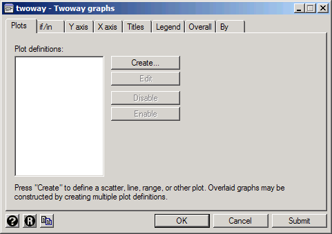
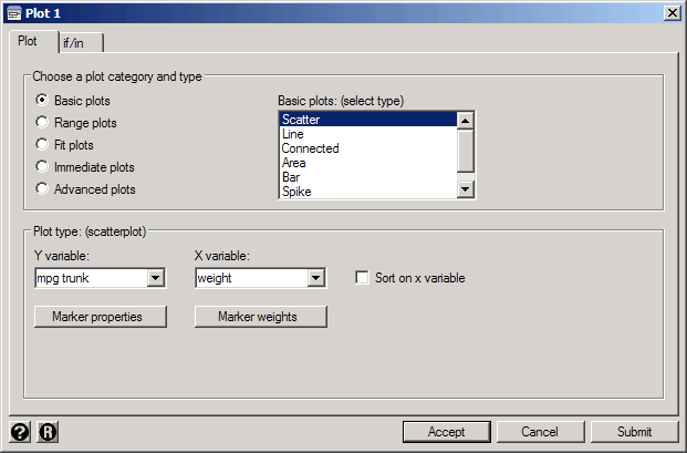
To define a plot, click Create. You'll then get a dialog box where you can describe the plot you want. Leave the category set to Basic plots and the type set to Scatter. For the Y variable select or type mpg, and for the X variable select or type weight. (Note: Linux Stata does not allow you to select variables so you'll need to type their names. In Windows Stata you can do either.)

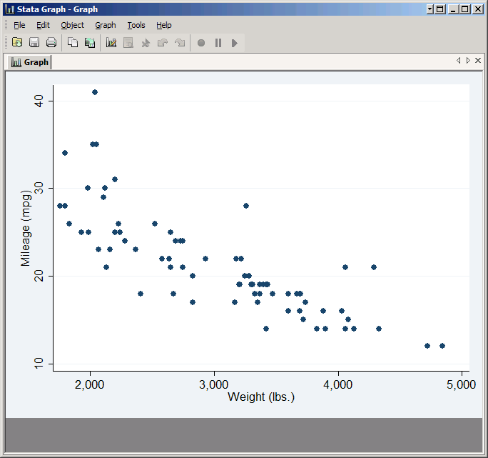
If you click Submit, the graph will be created without closing the dialog box. This allows you to look over the results and then easily make adjustments and try again. Click Submit now and you should get a simple but professional looking scatter plot.
Adding More Variables
If you want to add a second Y variable to the scatterplot, the easiest way is to type its name into the Y variable box after the one you've already selected. Stata does not allow you to select multiple variables from the list with the mouse, but it has no trouble understanding multiple variables in the Y variables box as long as you put them there yourself.
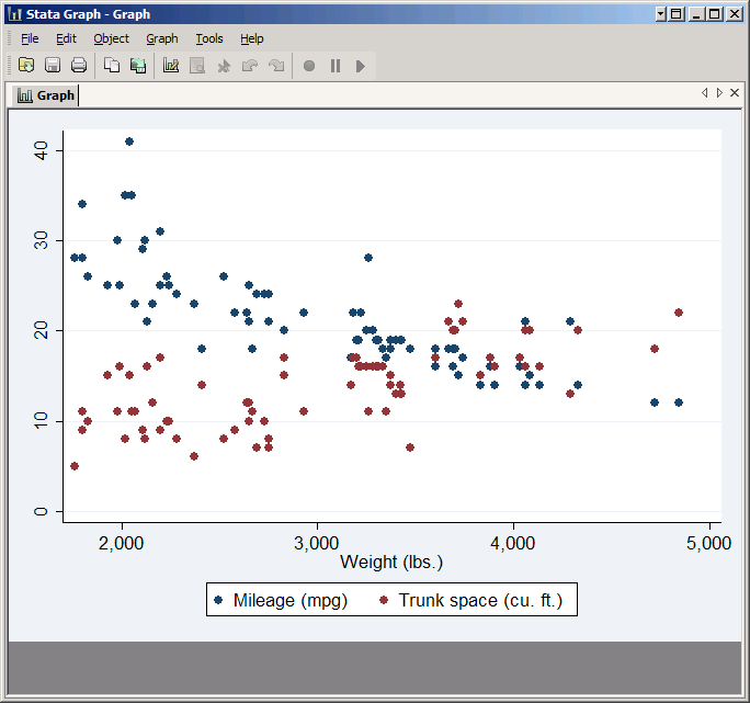
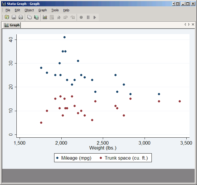
To make a sensible graph with two Y variables (without having multiple scales) we need variables with similar values. The trunk variable qualifies, so type it in the Y variable box after mpg and click Submit again.
The result will be a scatter plot with both variables. Note how Stata automatically puts the two variables in different colors and adds a legend explaining which is which. The legend text is drawn from the variable labels, but you could override all these default behaviors if you so desired.
Plotting a Subset of the Data
If you only want to include certain observations, you can specify which ones by clicking on the if/in tab. You can then type a condition in the If: box, and only observations that meet the condition will be included in the plot. Do not type the word if, as that is assumed.
To only plot foreign cars, type foreign in the If: box.
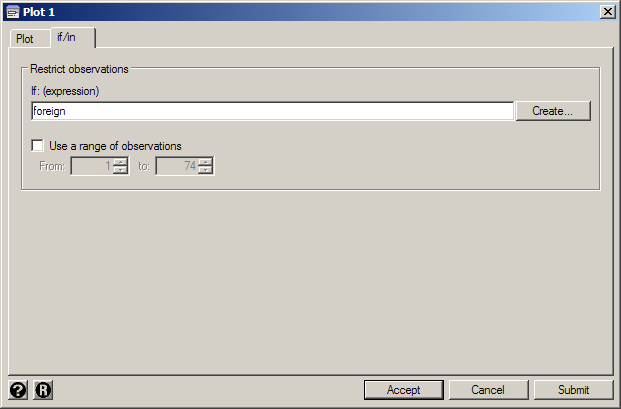
Recall that in Stata one is true and zero is false, and foreign is coded accordingly. Thus if foreign is equivalent to if foreign==1. Click Submit and you'll get a much sparser graph.
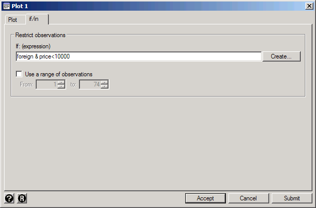
You can also use more complicated expressions. For example, type foreign & price<10000 and you'll get just the cars which are both foreign and cost less than $10,000 (in 1978 dollars).

Controlling the Markers
By default Stata marks each point with a small dot, but you can change this. First click on the Plot tab again, and for best results set the Y variable back to just mpg. Then click Marker Properties. Set Symbol to Hollow circle. Next check Add labels to markers and set the Variable to make, then click Submit.
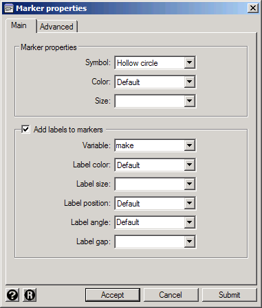
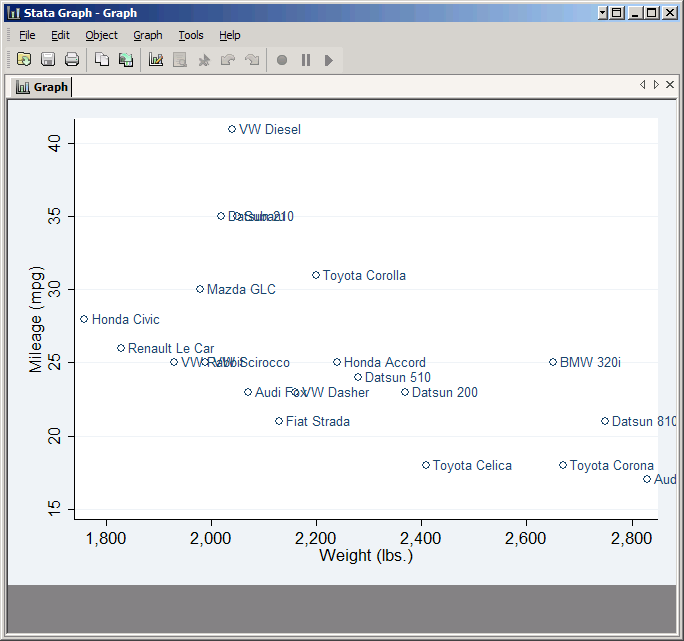
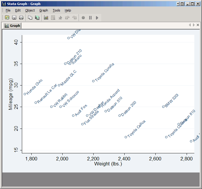
As you see, each point is now a hollow circle with the name of the car printed next to it, but many of the names overlap. You can improve the situation somewhat by changing Label angle to 45 degrees, but in general you can only put useful labels on a scatter plot if it has a small number of observations and they're spread out.
Overlaying Plots
Next we'll combine multiple plots. Uncheck Add labels to markers. Click Accept to accept these settings for Marker properties and go back to the Plot 1 window, then click Accept again to accept the plot as it is and go back to the main twoway window. Click Create to add another plot to the graph. This time we'll make a line plot. Set the plot type to Line, and again choose mpg and weight as the Y and X variables. Click Submit to see the result.
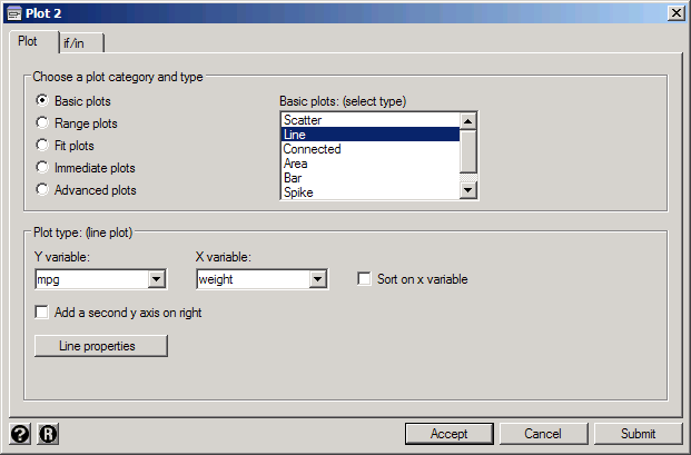
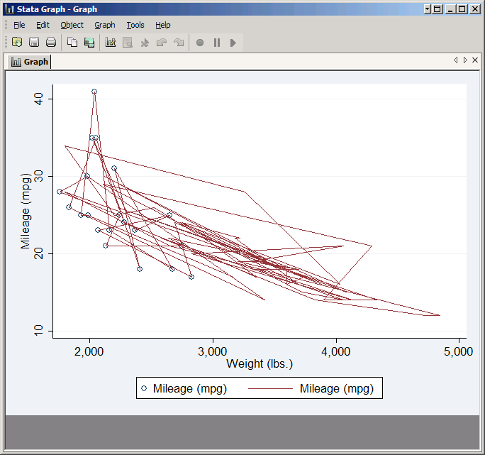
It's probably not what you expected--in fact it looks like a scribble. That's because by default Stata draws the line from observation one to observation two to observation three and so forth. What you want is a line from the observation with the lowest weight to the one with the next lowest weight, etc. That's why Stata included the checkbox Sort on x variable. This does not change the actual order of the observations in your data set, just the order in which they are connected in your line plot. Check it and click Submit again. This time you should get the graph you expected.

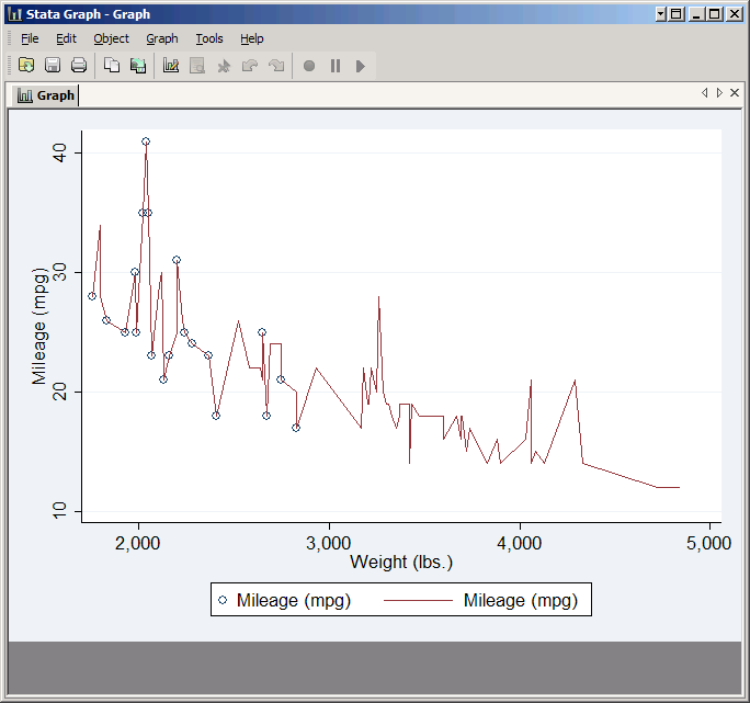
Note that while the line connects all the points in the scatter plot, it goes to a lot of points that the scatter plot does not include. That's because you didn't set an if condition for the line plot, so it's plotting all the observations in the data. The ability to set different if conditions for different plots is very useful, though you'll note that the twoway window has its own if/in tab which applies to all the plots.
Line properties
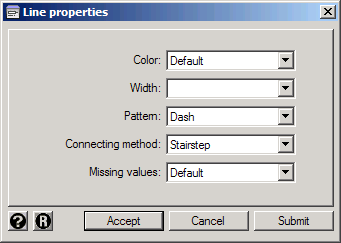
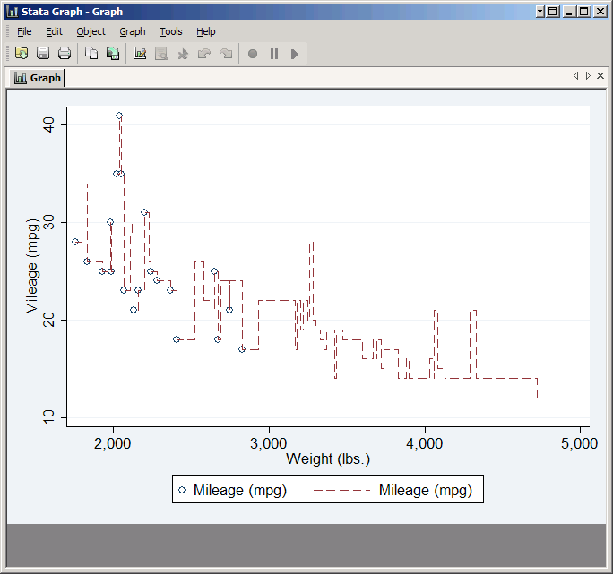
You can control what the line looks like by clicking Line Properties. The most commonly used option here is Pattern. By default Stata distinguishes different line plots by color, but that doesn't help if the graph needs to be printed in black and white. So instead you can set a pattern for each line. (Alternatively you can choose a scheme designed for printing). To see it in action set Pattern to Dash. Also try setting Connecting method to Stairstep.
Plotting Subsamples
Let's go back to just plotting mpg vs. weight, but this time let's make the foreign cars one color and the domestic cars another. You can do this by creating two plots, one for the foreign cars and one for the domestic cars, each having an if condition that limits it to the proper subpopulation. Then Stata will make them different colors automatically.
Begin by resetting everything. Click Accept twice to get back to the main twoway window, then click the R button (![]() ) in the lower left to reset the plots. Next click Create, leave the type as Scatter, set the Y variable to mpg and set the X variable to weight. Then click if/in and in the If: box type !foreign. The exclamation mark is Stata for "not" so this means "not foreign" and is equivalent to foreign==0. Thus this plot will only include the domestic cars.
) in the lower left to reset the plots. Next click Create, leave the type as Scatter, set the Y variable to mpg and set the X variable to weight. Then click if/in and in the If: box type !foreign. The exclamation mark is Stata for "not" so this means "not foreign" and is equivalent to foreign==0. Thus this plot will only include the domestic cars.
Click Accept to get back to the main twoway window, then click Create again and repeat the entire process with one vital difference: this time in the If: box just type foreign. This plot will include only the foreign cars. Click Submit to see the result.

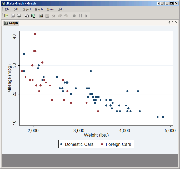
The resulting graph very nicely makes the domestic cars blue and the foreign cars red. However, the legend gives you no indication which is which. To do that you'll need to take control of the legend yourself.
Controlling the Appearance of a Graph
You haven't seen any options for controlling the legend, because thus far we've been focused on the properties of individual plots. The legend is not associated with a particular plot because it potentially contains information from all the plots. Thus to get to it you need to click Accept and get back to the twoway window. This is where you control aspects of the graph as a whole, including the legend.
Legends
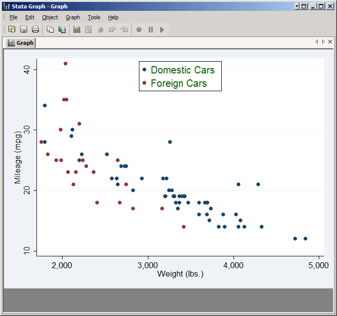
Click on the Legend tab. The Legend behavior just controls whether the legend is shown or not. Since Stata thinks our graph should have one and we agree, we can leave it set to Default. On the other hand, the default keys don't provide any useful information for this graph, so we need to override them. Check Override default keys. Then in the box below you need to type the number of each plot followed by how you want it to be labeled (in quotation marks). For this graph type:
1 "Domestic Cars" 2 "Foreign Cars"
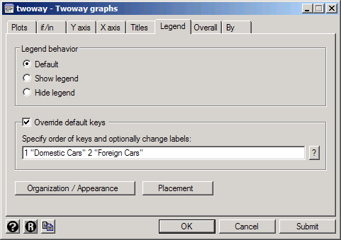
Now click Submit and you'll get a graph with a useful legend. Note that the order in which you list the plots is the order in which they'll appear in the legend: if you typed 2 "Foreign Cars" 1 "Domestic Cars" the legend would put the foreign cars first.
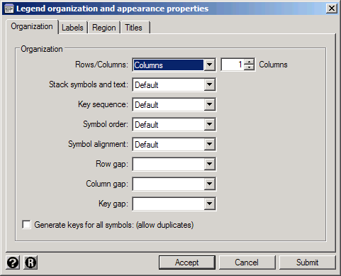
The Organization / Appearance button opens up a dialog box with all sorts of options relating to how the legend looks. Click the Organization tab and set Rows/Columns to Columns (leaving it set to just one column).
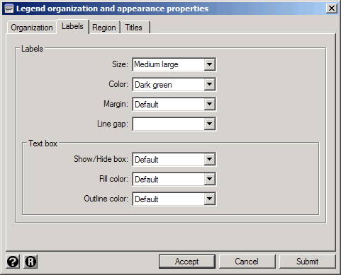
The Labels and Region tabs allow you to control the appearance of the legend text and the entire legend box respectively. The various options like sizes and colors are self-explanatory, but these same options appear in many different contexts so it's worth taking a moment to experiment and see how they work. Choose some different colors and such just to see how they work. Then click Accept to get back to the main twoway window.
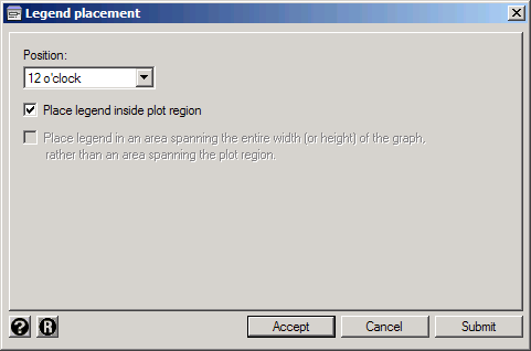
The Placement button allows you to control where the legend is placed in the graph. To understand how locations are specified, imagine putting the face of an analog clock over your graph: 12 o'clock is the top, 6 o'clock the bottom, 3 o'clock the right side, etc. You can also specify that the legend goes inside the plot region rather than in the border area around it--just make sure it doesn't cover up anything important.
Try setting the Position to 12 o'clock and check Place legend inside plot region, then click Submit to see the results.
Titles
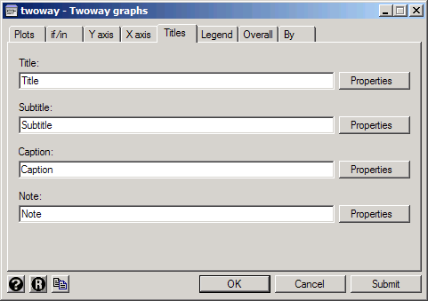
You can add a title to the legend using the Title tab of the in the Legend organization and appearance properties window, but you're much more likely to want to add a title to the graph itself. To do so click Accept to get back to the main twoway window again, and then click on its Titles tab. This gives you four boxes where you can put text: the Title, Subtitle, Caption and Note. The easiest way to see what each one means is to try them out, so type Title, Subtitle, Caption and Note in their respective boxes, and click Submit to see the result.
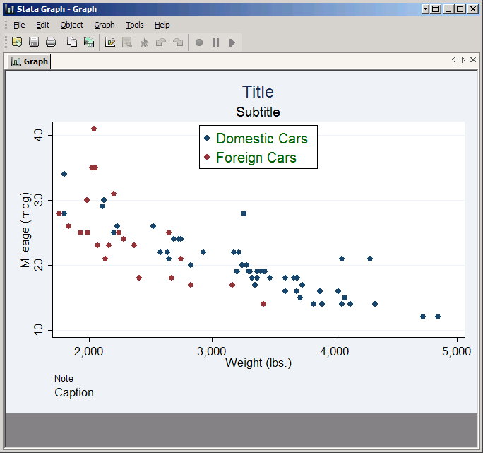
As you see, Title and Subtitle go at the top, while Caption and Note go in the bottom left. Each also has a particular font size associated with it. However, these are simply defaults. Click on the Properties button associated with each one and you can change its position and format. (Legend titles work in the same way, but they appear inside the legend box.)
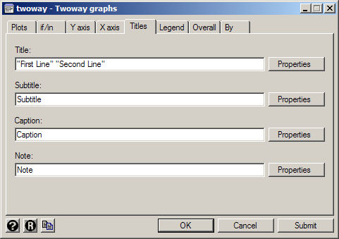
If you want the text to be split across multiple lines, put each line in quotes. To see this in action, replace Title with "First Line" "Second Line" and click Submit.

Axes
Next we'll consider the axes of the graph. Click on the Y axis tab (the X axis tab is identical) and the first thing you'll see is the Title box. If a plot has just one Y variable, the default title for the Y axis is that variable's label if it has one, or else simply its name. If all the plots have multiple Y variables, the default is no title at all. However, you can override the default by typing something here, and control its format by clicking Properties. Type in Miles Per Gallon and click Submit to see the effect.
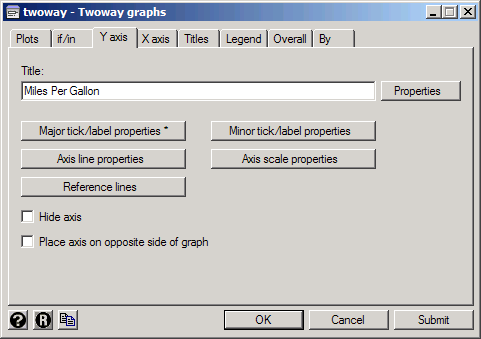
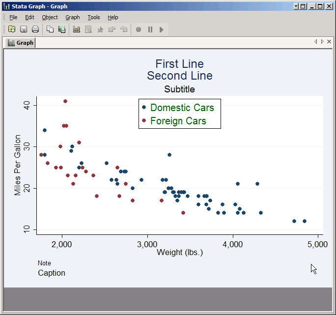
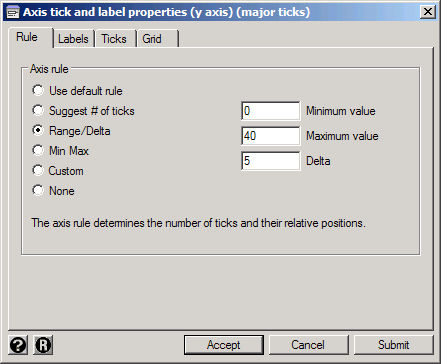
Major ticks are the marks along the axis with numbers by them that we've been seeing all along, but by clicking Major tick/label properties you can control how many there are and where they are placed. This is done by choosing one of several rules. Use the default rule allows Stata to choose, which it usually does pretty well. Suggest # of ticks leaves most of the control to Stata but allows you to set roughly how many ticks there will be. Min Max puts ticks at just the bottom and top of the axis. Range/Delta gives you complete control as long as you want the ticks to follow a regular rule. For example, select Range/Delta, set the Minimum value to 0, the Maximum value to 40, and the Delta to 5, then click Submit to see the results.
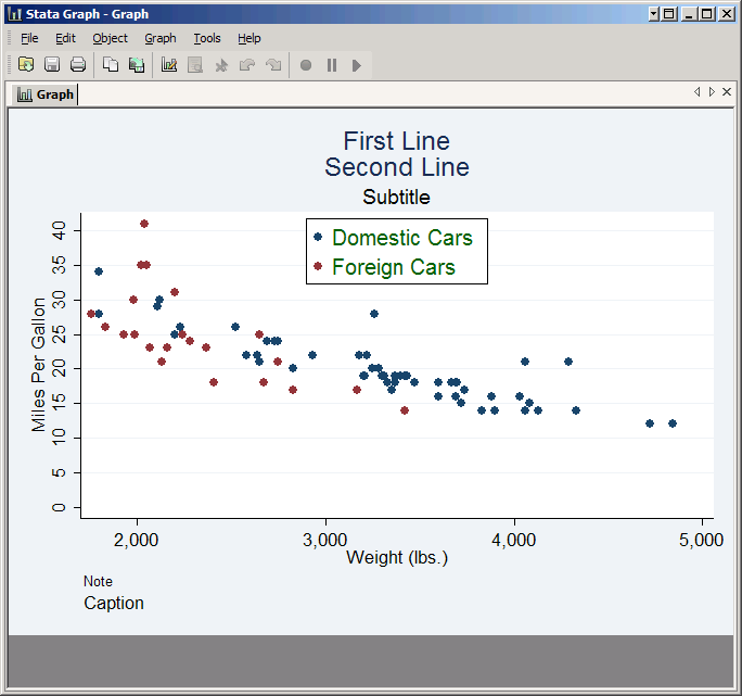
The result is a Y axis that starts at zero and has ticks every five units, but note that the graph continues up to 41 because one car got 41 miles per gallon. You can extend a graph by extending an axis (remember the default version of this graph started at ten) but you cannot truncate it. Stata will always make the graph big enough to plot all the observations in your data. If you really wanted the graph to stop at 40 you'd have to add an if condition like mpg<=40.
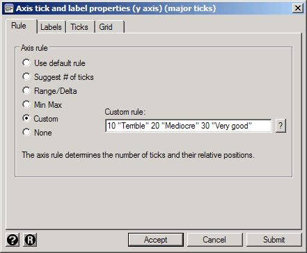
Custom rules allow you to place ticks anywhere you like and have them say whatever you like. The syntax is simply a list of numbers and associated labels. For example, select Custom and in the Custom rule box type 10 "Terrible" 20 "Mediocre" 30 "Very Good".

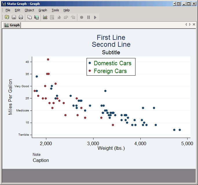
The result is a less informative but more eloquent graph. You could accomplish the same thing by putting value labels on the variable. If you already have value labels assigned just click on the Labels tab and check Use value labels.
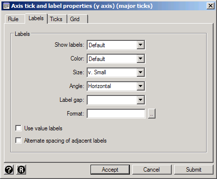
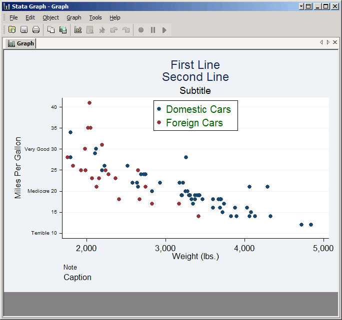
Every tick does not need a text label. For example, you could set the custom rule to 10 "Terrible" 15 20 "Mediocre" 25 30 "Very Good" 35 40 and get ticks every five units with labels at just 10, 20 and 30. However, this will cause the labels to overlap, or at least crowd each other. To fix that, click on the Labels tab and set Angle to Horizontal. Since this will force Stata to expand the margin to the left of the plot in order to make room for the labels, set the Size to v. Small.
However, the text labels don't include the numbers 10, 20 or 30, which looks odd since the other tick marks do have numbers. To make those numbers appear, add them to the end of their respective text labels: 10 "Terrible 10" 15 20 "Mediocre 20" 25 30 "Very Good 30" 35 40. That way they'll line up with the other numbers.
Minor tick/label properties controls smaller ticks that go in between major ticks. They follow the same rules as major ticks, but the rules apply to the spaces between the major ticks rather than the whole axis. Obviously the default size is smaller as well, but they are otherwise similar.
Axis line properties controls the appearance of the axis itself, while Axis scale properties controls its scale. This includes the ability to change it to a logarithmic scale, to reverse the scale, and to extend the scale (but not to truncate it--see the discussion above).
Using By with Graphs
Using by in a graph does not give you a completely separate graph for each subpopulation, but it does give you a separate plots within a single graph.
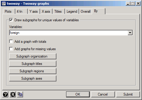
The graph we have been working with has become unwieldy, so start by clicking the reset button (![]() ). Then set up a scatter plot of mpg on weight just like we have made before. Click Accept to go back to the twoway window, then click on the By tab. Check the box for Draw subgraphs for unique values of variables and in the Variables box type or select foreign.
). Then set up a scatter plot of mpg on weight just like we have made before. Click Accept to go back to the twoway window, then click on the By tab. Check the box for Draw subgraphs for unique values of variables and in the Variables box type or select foreign.
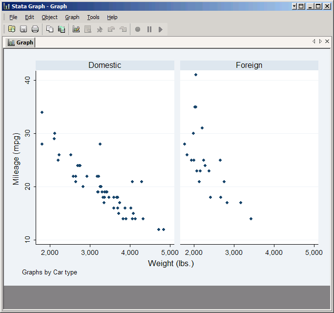
Click Submit and you'll see two scatter plots side-by-side, one for domestic cars and one for foreign cars.
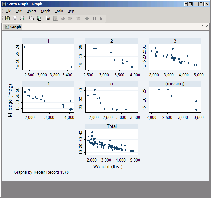
Now replace foreign with rep78. This variable takes on five values, plus it has some missing values. Check the boxes for Add a graph with totals and Add graphs for missing values and click Submit.

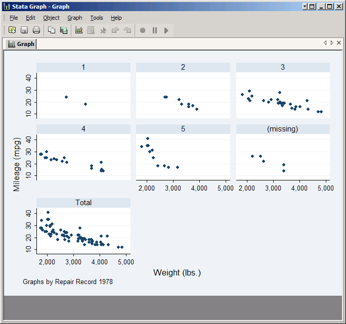
The resulting graph has seven plots: one for each of the five standard values taken by rep78, one for observations which are missing rep78, and one for all observations. However, the default arrangement of these plots is not particularly attractive, so click on Subgraph organization.
One option would be to put all the plots on one row for easy comparison: set Style to Compact, Rows/Columns to Rows and then the number of rows to 1. Click Submit to see the result--obviously if you wanted to use this you'd have to do something about the X axis labels, but you know how to do that.
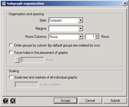
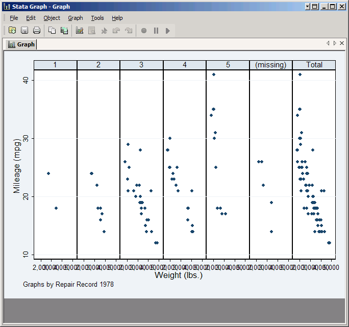
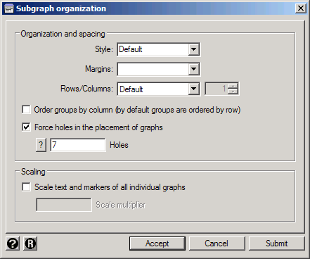
Another possibility would be to go back to the original format, but move the Total graph to the center of the bottom row. First set the Style back to Default and Rows/Columns back to Default, and click Submit to take another look. This arrangement has room for nine plots in three rows with three plots each, and Stata numbers them left to right and then top to bottom. The Total graph is currently in the seventh position. If we tell Stata to leave the seventh position blank, it will automatically move to Total graph to the eighth position, which is in the center of the bottom row. To do so, check Force holes in the placement of graphs and in the Holes box type 7. Note that you could put multiple numbers in this box if you wanted to leave multiple holes. Click Submit to see the result.
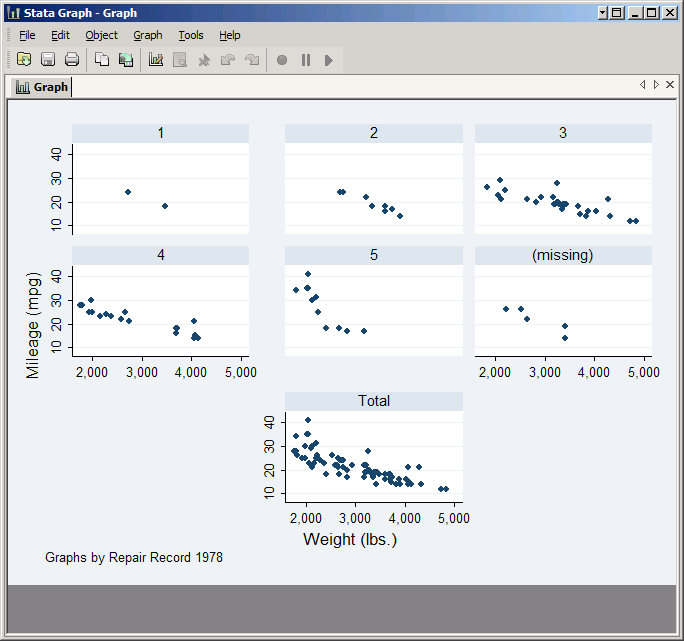
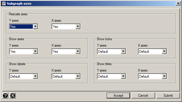
Now click Accept to get back to the twoway window. The Subgraph titles and Subgraph regions are all about controlling appearance and are similar to what you've seen before. Subgraph axes are a little more interesting. One problem with our last graph is that Stata tried to reduce clutter by only putting one set of axes per row and column, but given the layout it looks random. You can fix that by clicking Subgraph axes and then under Show Axes set both Y axes and X axes to Yes. While you're here, also set Rescale axes to Yes for for both axes. This tells Stata to choose the scale for each subgraph based on the points it contains rather than choosing one scale for all of them. This makes each subgraph look nicer, but makes it impossible to compare them (which may be the entire point of the graph).
Overall Options
Finally click on the Overall tab to see some general-purpose options for the whole graph.
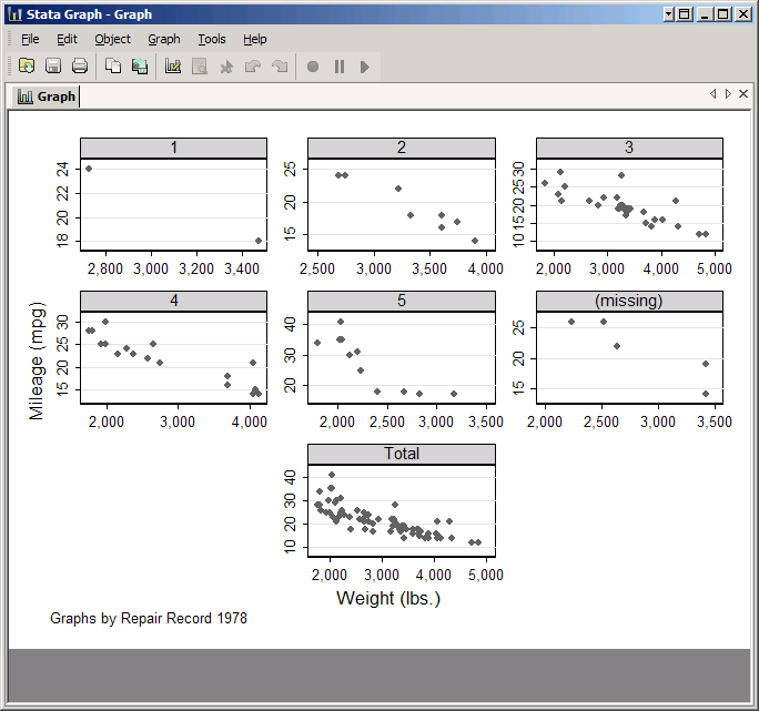
Schemes are stored sets of defaults. For example, the Economist scheme implements the graphics guidelines of the journal The Economist. The two monochrome schemes (s1 monochrome and s2 monochrome) are particularly useful if you need to print your graph in black and white. Feel free to experiment. It's also possible to create your own schemes. Try setting Scheme to s1 monochrome and then click Submit.
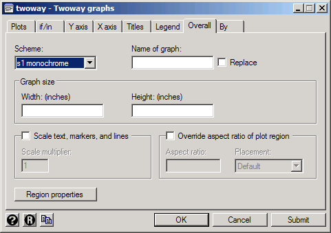
Graph size can be confusing because when you're working with the graph in Stata, Stata will fit the graph in whatever size window you choose. However, when it comes to printing or exporting the graph Stata will make it match the size you set here.
Region properties refers to the Plot region (everything inside a plot) and the Graph region (everything outside a plot). This is where you can make global changes to the appearance of your graph like changing background colors.
Saving a Graph
Once you've created the graph you want, you can save it by clicking File, Save As in the graph's window. However, you should choose what type of file to save it as carefully. The default, Stata Graph format (.gph), has the advantage of allowing you to make further changes to the graph with the graph editor. However, .gph files cannot be placed in other files like Word documents or web pages. If you want to put your graph in a Word document use Enhanced Metafile format (.emf) or for web pages we suggest Portable Network Graphics (.png).
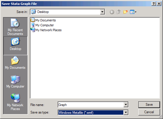
For much more information see Using Stata Graphs in Documents.
Creating Graphs Using Commands
As you worked through the previous sections you've probably noticed that Stata pasted a command into the Results window every time you created a graph. Stata used everything you clicked on to formulate the command, but it's the command that actually created the graph. As you can see, the commands to create graphs are often very complicated. If you write the commands yourself you may be able to make them somewhat simpler, but not much.
So why learn how to create graphs using commands at all? First of all, for simple graphs it can be much faster. For example, you can create your basic scatter plot of mpg on weight simply by typing
scatter mpg weight
Second, even if you've created a graph using the graphical user interface you may want to modify it by recalling the command and making changes. Third, there are a very few things that cannot be done using the graphical user interface.
On the other hand, there's little point in trying to learn the proper syntax for every graph option. Let the graphical user interface help you with details like choosing text sizes and colors. What you need to know is the basic syntax structure, and that's what we'll discuss.
No matter how you created your graph, you should store the command in a do file. This allows you to recreate the graph later, if needed. It also serves as a record of how you created the graph.
Graph Commands
All graph commands really come down to one command: graph. It is followed by either a type of graph (e.g. graph bar) or a family of graphs followed by a type of graph (e.g. graph twoway scatter). Then comes whatever information is needed to create the graph itself. However, the most common graph types and families were also made standalone commands, which is why you can just type scatter mpg weight.
For the ubiquitous twoway family (basically graphs with a Y axis and an X axis) what follows is a varlist. The last variable in the list is taken to be the X variable, and all the others are Y's--similar to how regress handles a varlist but in the opposite way.
Graph commands can use if and in just like regular Stata commands: they go at the end of the command but before any options.
Combining Plots
If you want to include multiple plots in a graph, they must be separated either by putting them in parentheses or by putting two pipe characters between them (||). Thus to create a graph containing two scatter plots of mpg on weight, one for foreign cars and one for domestic cars, you can type either:
scatter mpg weight if foreign || scatter mpg weight if !foreign
or
twoway (scatter mpg weight if foreign) (scatter mpg weight if !foreign)
Note how in the second case you had to start with twoway. That's because a Stata command can't start with a parenthesis, but once you put it in the context of a twoway graph Stata will understand what you mean.
By
Graph commands cannot use the standard by: prefix, but most allow a by option that does the same thing:
scatter mpg weight, by(foreign)
Options
Graph options follow the general option rule of going at the end of the command following a comma, but by that definition a single graph can contain several "commands." For example, the Sort on x variable checkbox for line plots translates into the sort option, but it has to stay with the line plot if the graph has more than one. Thus if you typed:
line mpg weight || scatter mpg weight, sort
the sort option would be applied to the scatter plot, where it would do little good. Instead you should type
line mpg weight, sort || scatter mpg weight
Things like titles are also options:
scatter mpg weight, title(MPG vs Weight)
Note that the text of the title does not have to go in quotes--unless it has a comma in it. You can use quotes to separate lines, just like when you typed it in the Title box.
But what really makes life interesting is when your options have options. Suppose you wanted the title to be merely medium large (medlarge) rather than the default very large (vlarge), and also a dark red (specifically, cranberry). You can make it so with the size and color options, but to make it clear what they are controlling the size and color of they have to go inside the title's parentheses. Yet they still follow a (single) comma. Thus the command becomes:
scatter mpg weight, title(MPG vs Weight, size(medlarge) color(cranberry))
Of course it's at this point that it becomes attractive to let the graphical user interface keep track of the proper placement of such things for you, not to mention letting you know that medlarge and cranberry are among the available options.
For the rest of this article we'll type out the graph commands rather than using the graphical user interface, partially for practice but mostly because we'll be making fairly simple graphs and that's the quickest way to do so.
Other Types of Graphs
Stata can create dozens of different kinds of graphs--for a much larger sampling, see the Visual Overview on Stata's web site. This section will discuss a few more that are fairly commonly used at the SSCC.
Fit Lines
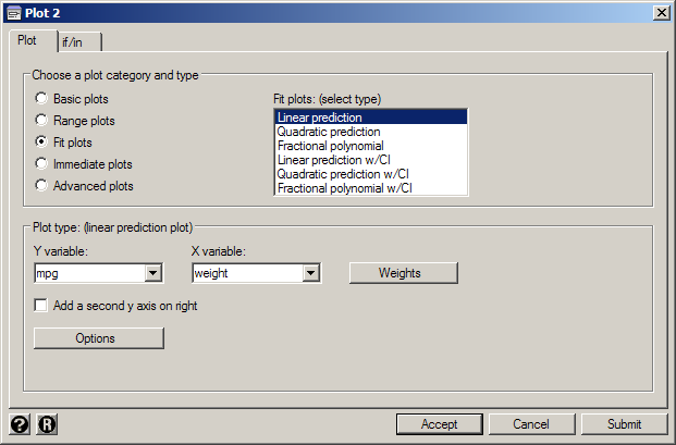
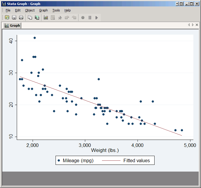
Stata can plot several different kinds of fit lines automatically. The most common are lfit (linear fit), qfit (quadratic fit), lfitci (linear fit with confidence intervals) and qfitci (quadratic fit with confidence intervals. They're not very interesting by themselves--usually they're overlaid on a scatter plot. The syntax is just like any other twoway graph. Type:
scatter mpg weight || lfit mpg weight
(Or if you prefer, set up the scatter plot in the graphical user interface as usual, then add a second plot setting the plot category and type to Fit plots and choosing Linear prediction--but typing it will be a whole lot faster.)
The versions that show confidence intervals need a little care because they can cover things up. Try:
scatter mpg weight || qfitci mpg weight
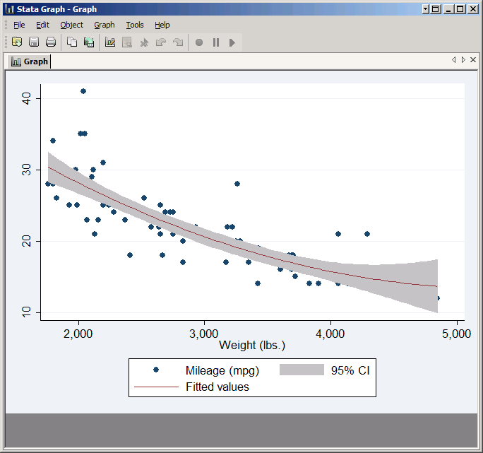
Any points within the confidence interval are covered up by the shaded region. You can fix that by reversing the order of the plots in the command. However, qfitci is not one of the plot types that is recognized by itself, so you need to start with twoway:
twoway qfitci mpg weight || scatter mpg weight
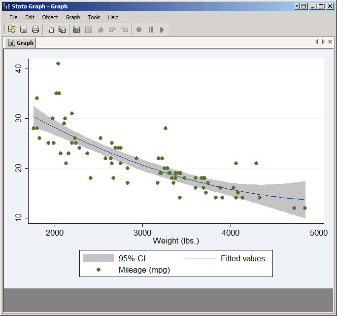
Now all the points are shown. Think of a Stata graph as a painting done with completely opaque paints. If you have multiple plots each plot is a layer of paint, and layers that are added later cover up what was there before. Thus plots that cover areas should be listed first, and anything that needs to go on top should be listed last.
However, all these plots do is regress Y on X (or Y on X and X^2) and plot the predicted values for Y. If you want to run a more complicated regression there's no automatic command to plot the predicted values. On the other hand, you can easily store the predicted values in a new variable and plot it.
Suppose you wanted to plot the predicted probabilities you got from a logit of foreign on mpg (a clear case of reversing cause and effect, but the methodology doesn't care). No graph command will do this for you, but you can do it yourself:
logit foreign mpg
predict phat
line phat mpg,sort
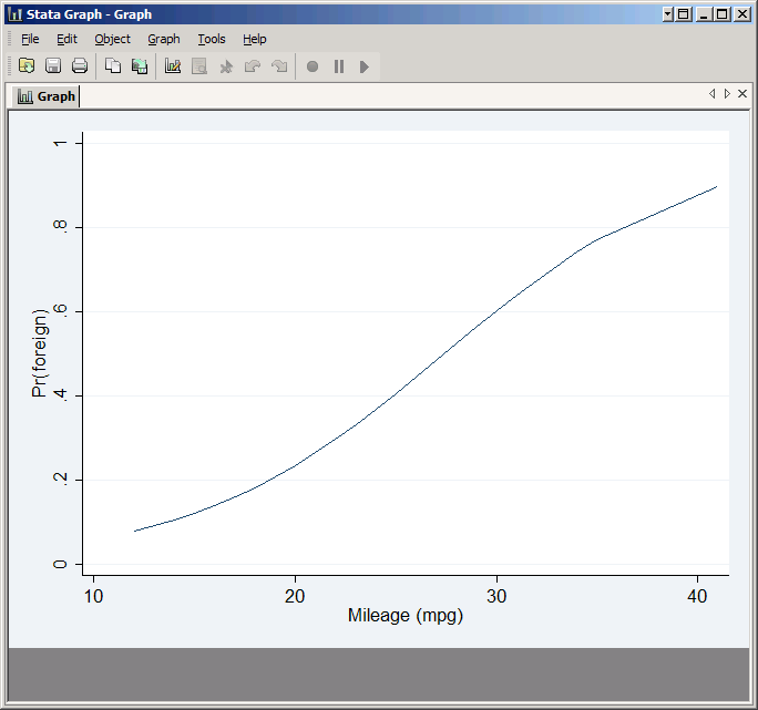
The result looks reasonable, but try it as a scatter plot:
scatter phat mpg
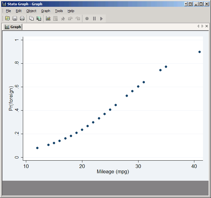
This demonstrates that the only values of mpg represented in the graph are those represented in your data set (and keep in mind many observations have the same value of mpg). That may or may not be a problem, but if you wanted to plot a smooth curve over the full range of mpg you could replace the actual values of mpg with made-up numbers that are evenly distributed from 14 to 41:
gen realMPG=mpg
replace mpg=(41-14)*(_n-1)/(_N-1)+14
predict phat2
scatter phat2 mpg
replace mpg=realMPG
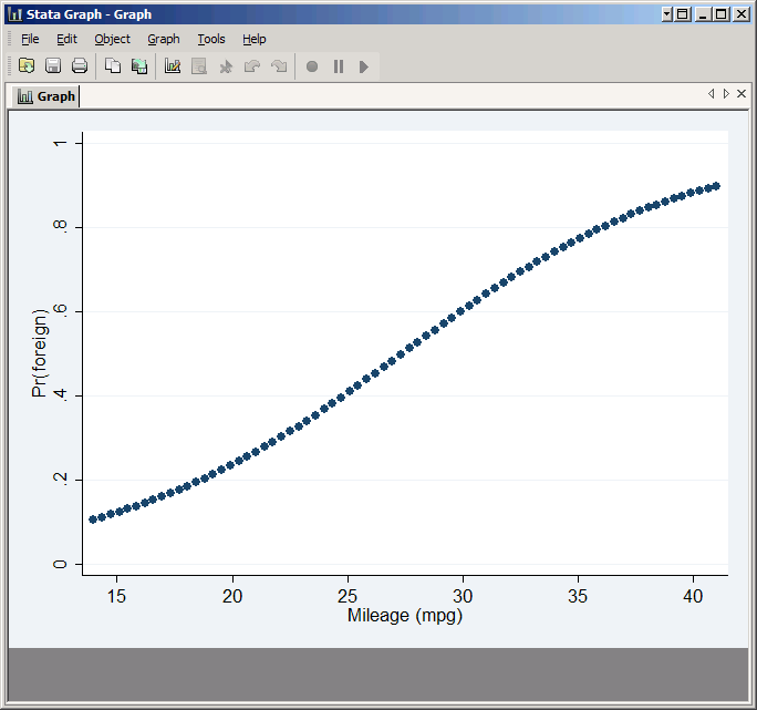
See Making Predictions with Counter-Factual Data in Stata for more explanation of how this method works.
Note that with multivariate regressions if you want to plot the effect of one variable you will probably need to set the others to their means before making predictions. Otherwise the line will jump all over due to the effects of the other variables.
Bar Plots
Stata does two very different kinds of bar plots. twoway bar is just a variation on what we've seen before:
twoway bar mpg weight
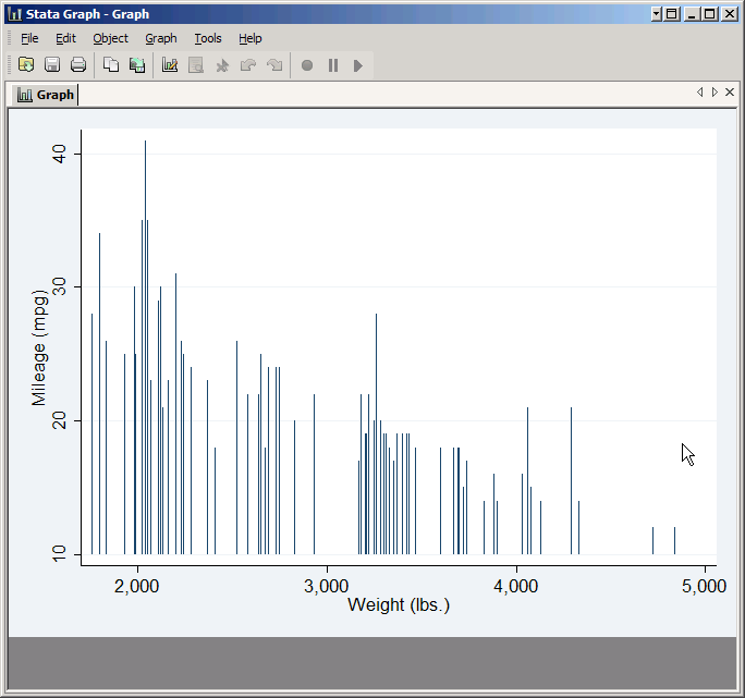
But there's also graph bar which is not part of the twoway family. It plots summary statistics (the default is mean) rather than values, and is normally used to compare between variables or between groups. Variables are simply listed, and the group variable is specified using the over option. For example:
graph bar weight price, over(foreign)
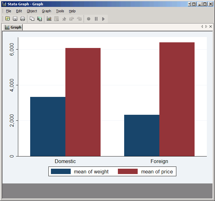
hbar is almost identical--it just turns everything sideways.
graph hbar weight price, over(foreign)
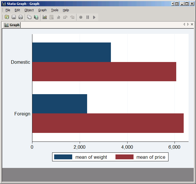
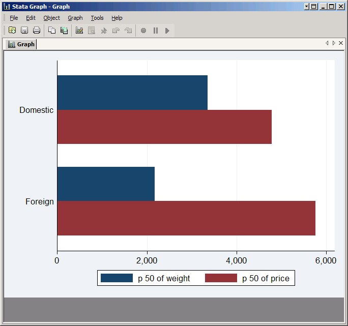
If you want to compare something other than the mean, put that statistic in parentheses before the list of variables:
graph hbar (median) weight price, over(foreign)
Histograms
Histograms are very simple to create:
hist mpg
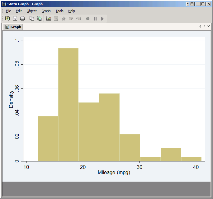
Note that by default Stata does not put frequency on the Y axis, but probability density. This fits with the idea of a histogram being an approximation to the probability density function, but probably isn't how you were taught to make histograms back in grade school. You can have it plot frequencies using the frequency option (percent is another that is frequently used).
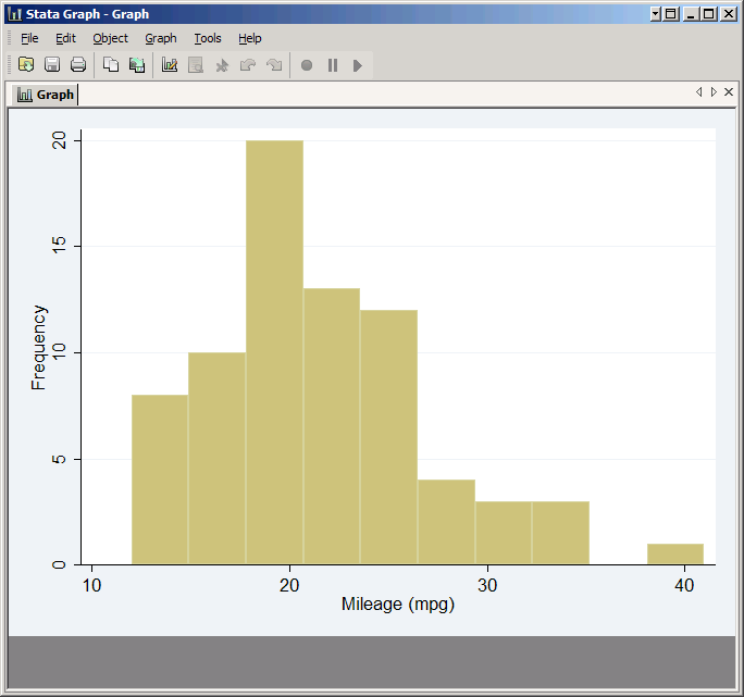
If you don't like Stata's default bins you can take control by either setting the number of bins (bin option) or the width of a bin (width option). You can get the same results either way. The mpg variable goes from 12 to 41, for a total range of 29. Stata chose eight bins, which means each had a width of 29/8=3.625. If you wanted 10 bins, you could type:
hist mpg, bin(10) frequency
But you'll get the exact same graph from
hist mpg, width(2.9) frequency
If you have discrete data, the discrete option tells Stata to choose bins accordingly. For example, if you just type:
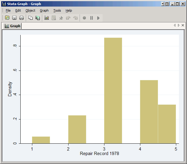
hist rep78
Stata will choose eight bins even though rep78 only has five values. The result is a confusing histogram of fairly simple data.
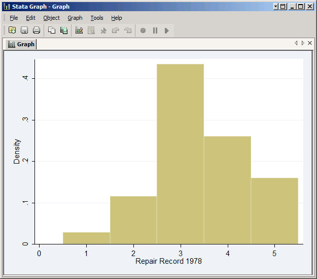
However, if you add the discrete option Stata creates five bins for the five values:
hist rep78, discrete
The result is a much clearer graph.
Kernel Densities
You can overlay a kernel density on your histogram just by adding the kdensity option (there's also a normal option to add a normal density).
hist mpg, width(2.9) frequency kdensity

You can also create an independent kernel density plot with the kdensity command:
kdensity mpg
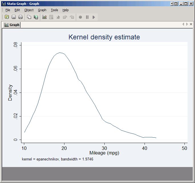
The most commonly used option for kernel densities is bwidth, which sets the bandwidth. Compare:
kdensity mpg, bwidth(5)
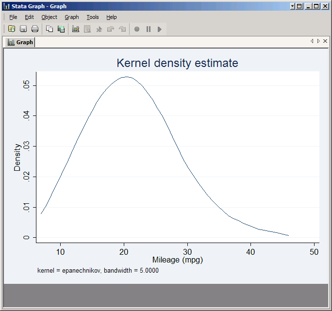
with:
kdensity mpg, bwidth(1)
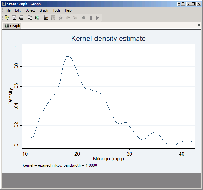
The Graph Editor
Stata includes a graph editor that can be used to modify a graph after it has been created. Its big disadvantage is that it doesn't give you a command you can save in a do file and use to recreate the graph at will. However, it does allow you to make changes very simply and easily.
To see it in action, make a simple scatter plot:
scatter mpg weight
Then click File, Start Graph Editor. You're now ready to make changes to this graph.
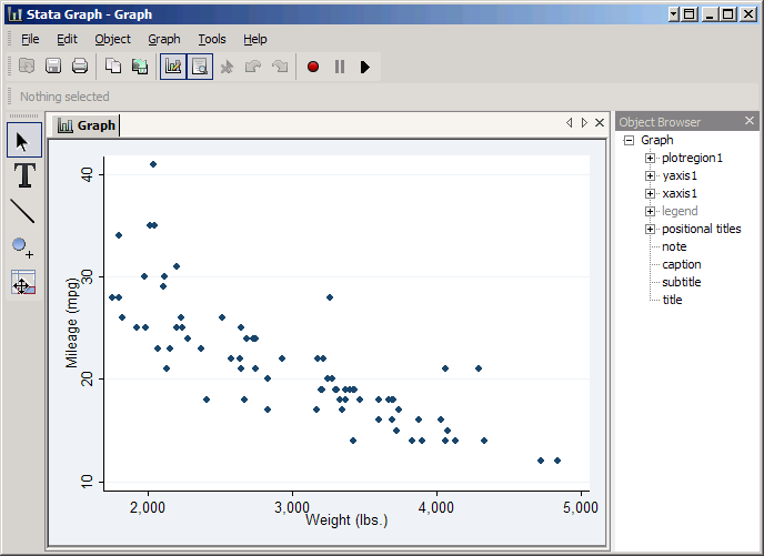
On the left are several buttons that place the graph editor in a particular mode. The top button, the arrow, puts it in pointer mode, which allows you to select an item on the graph to edit. For example, if you click on the plot part of the graph (i.e. inside the axes) you'll be able to edit the plot region. Color and Margin will appear in the tool bar at the top, but if you click More you'll be able to change many more properties.
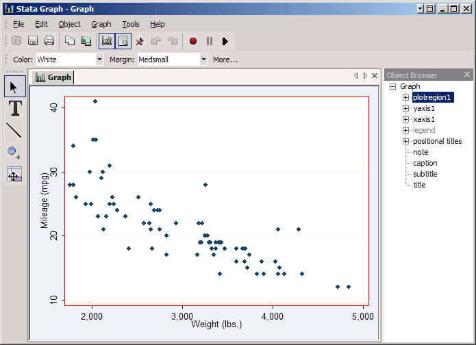
If you then click on a particular point you can change the plot itself. Now the immediate options are Plottype, Color, Size, and Symbol, but you can again click More to see other things.
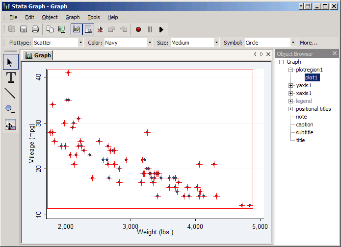
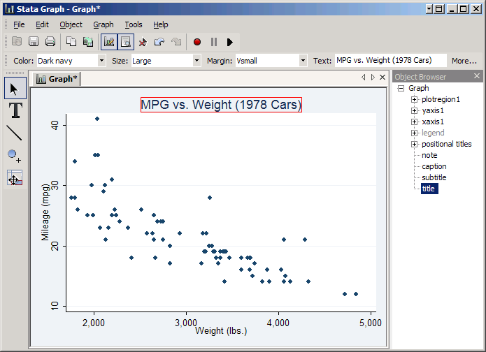
As you do, note the Object Browser on the right. Stata keeps track of the various parts of a graph in a sort of tree structure, and as you click on things it will highlight the object you've selected. You can also select an object directly. For example, click title and you can add a title by typing it in the Text box. Type in MPG vs. Weight (1978 Cars) and press Enter to see the results.
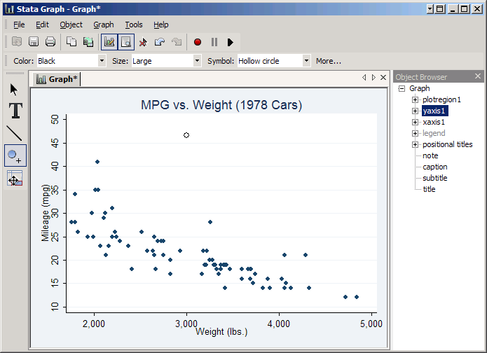
The next three buttons (the large T, the diagonal line, and the circle with a plus sign) allow you to add text, draw lines and place new points anywhere you need them. As an example, let's add the Toyota Prius for comparison (46 mpg and about 3000 pounds for a 2008 four-door). The smart way would be to add it to the dataset before making the graph, but we'll do it using the graph editor as an exercise.
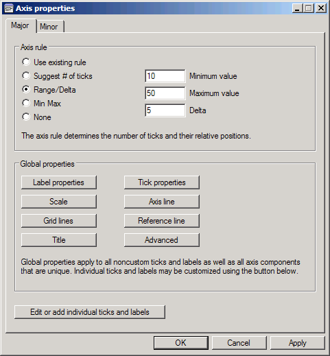
The first problem is that the graph ends at 42 mpg. To fix that select yaxis1 in the Object Browser and click More. Then set the Axis rule to Range/Delta with a Minimum value of 10, a Maximum value of 50 and a Delta of 5. Click OK and the graph will be rescaled--and more ticks will be added so we have a better chance at marking 46 accurately.
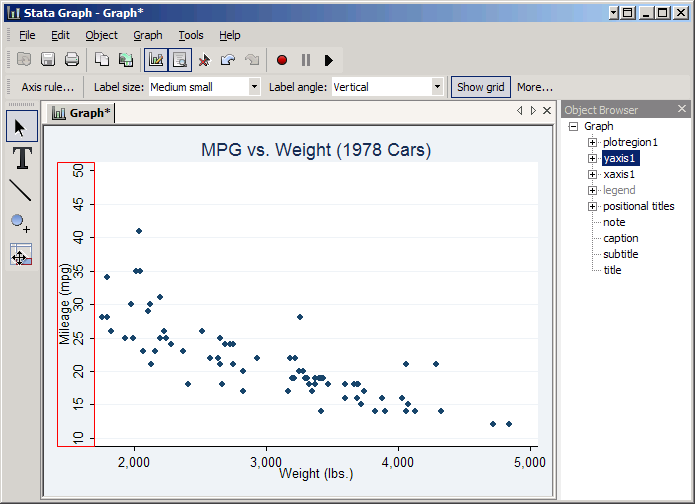
Now click the circle with a plus sign on the left and then click as best you can at the location mpg=46 (just above the line) and weight=3000. This will create a hollow circle at that location by default, but note that you could change its appearance at will. Seeing the point on the graph makes it clearer that the real advantage of a Prius over a 1978 VW Diesel (the 1978 car with 41 MPG) is not the Prius' somewhat higher MPG, but the fact that it gets that MPG despite being a much heavier car.
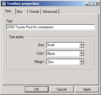
Now click on the T to add text and then click to the right of the new point. This will give you the Textbox properties window. In the Text box type 2008 Toyota Prius for comparison and set the Size to Small. Then click OK.
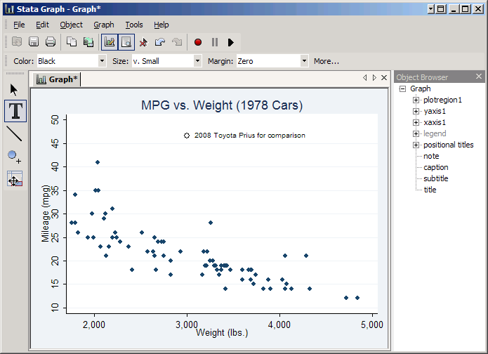
The bottom button on the left is the "grid editor." This allows you to make drastic changes to your graph, like rearranging the parts. Use with discretion, and saving your graph before changing anything is highly recommended.
This is a good time to mention why you might want to save graphs in Stata format: while it's true that you can't put them into documents that way, you can make changes to them in the graph editor. Thus you might want to keep two copies of important graphs, one in Stata graph format in case you need to make changes, and one in something like .emf format that you can insert into your paper.
Last Revised: 6/7/2013