Bar graphs are a very useful tool for presenting summary statistics because the reader can instantly grasp the relationships between the various values. This is especially useful for non-technical audiences. In this article we'll discuss two simple bar graphs:
You can build on what you learn here to create much more complex graphs.
Setting Up
If you plan to carry out the examples in this article, make sure you've downloaded the GSS sample to your U:\SFS folder as described in Managing Stata Files. Then create a do file called bargraph.do in that folder that loads the GSS sample as described in Doing Your Work Using Do Files. If you plan on applying what you learn directly to your homework, create a similar do file but have it load the data set used for your assignment.
Mean of a Quantitative Variable Across a Categorical Variable
In the Descriptive Statistics section, one of the examples was:
tab class, sum(edu)
Which gives the following output:
 SUBJECTIVE |
      CLASS |  Summary of HIGHEST YEAR OF SCHOOL
IDENTIFICAT |              COMPLETED
        ION |        Mean   Std. Dev.       Freq.
------------+------------------------------------
  LOWER CLA |        11.5   3.5630959          24
  WORKING C |   12.570248   3.1247038         121
  MIDDLE CL |    14.71134   3.0171688          97
  UPPER CLA |        15.2   3.4253954          10
------------+------------------------------------
      Total |   13.396825   3.3473052         252
A few seconds spent examining this table will show that mean education increases with subjective class identification.
To make a bar graph of the same information, use the command graph bar followed by the quantitative variable whose means you want to see (in this case, edu). The variable that defines the categories (in this case, class) goes in an option called over:
graph bar edu, over(class)
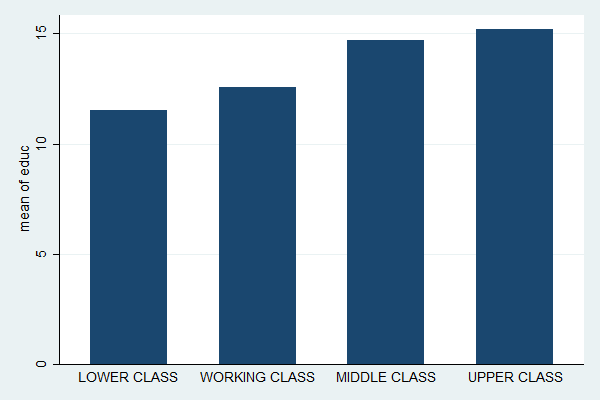
Now the relationship is immediately obvious.
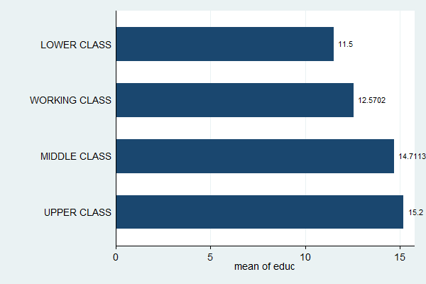
Many people prefer horizontal bar graphs because they better match the eye's natural left-to-right, top-to-bottom reading pattern (western eyes, anyway). They're especially good if the category names are long. You can convert this graph to a horizontal bar graph by changing the command from graph bar to graph hbar:
graph hbar edu, over(class)

While this graph makes it easy to see the relationship between the two variables, it's hard to read off the values of the means. You can fix that, at the price of adding some clutter to your graph, by putting a label on each bar that gives the height of the bar. This is done by adding the blabel (bar label) option with bar (bar height) in the parentheses:
graph hbar edu, over(class) blabel(bar)
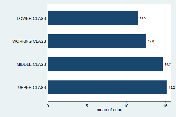
Some of the labels have more significant digits than are useful. You can tell Stata how to format the labels by putting a format option inside the blabel option with the format you want. The format %9.1f means "format the number such that it fits in no more than nine total spaces (more than enough) with one digit after the decimal point, following the general rules for floating point numbers" but you don't really need to memorize all that.
graph hbar edu, over(class) blabel(bar, format(%9.1f))
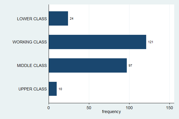
Frequencies of a Categorical Variable
Creating a bar graph to show the frequencies of a categorical variable is done in exactly the same way; just replace the first variable with (count).
graph bar (count), over(class)
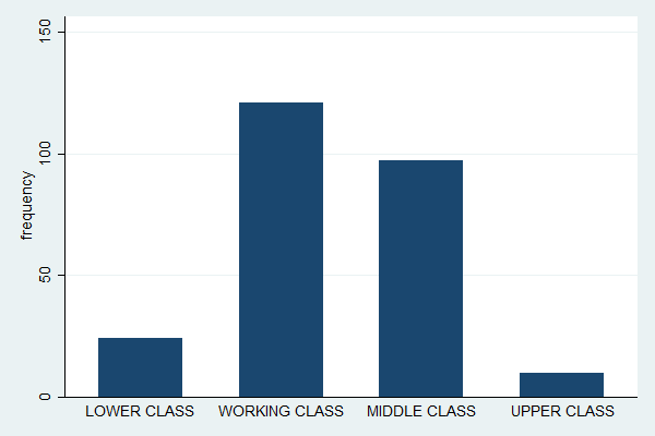
Note how this is essentially a histogram, just with space between the bars and better labels (compare with histogram class, discrete frequency).
All the tools you learned in the previous section can apply here as well (but no need to worry about decimal places with frequencies).
graph hbar (count), over(class) blabel(bar)
There is much more that can be done with bar graphs, such as changing labels and titles, and working with more than one categorical variable. If you're interested, click Graphics, Bar chart in Stata, and start experimenting.
Complete Do File
The following is a complete do file for this section:
capture log close
log using bargraph.log, replace
clear all
set more off
use gss_sample
tab class, sum(edu)
graph bar edu, over(class)
graph hbar edu, over(class)
graph hbar edu, over(class) blabel(bar)
graph hbar edu, over(class) blabel(bar, format(%9.1f))
graph bar (count), over(class)
graph hbar (count), over(class) blabel(bar)
log close
Last Revised: 1/3/2017