R for researchers: Regression inference
April 2015
This article is part of the R for Researchers series. For a list of topics covered by this series, see the Introduction article. If you're new to R we highly recommend reading the articles in order.
Overview
This article will introduce you to functions which are used to construct confidence intervals of coefficients, test hypothesis about models, and predict expected values for an observation. These functions are demonstrated using the salary model and the glm models from the prior articles. This article also provides examples of plots of the fitted to observed values for these models. While these plots are not a formal test of a model, they provide a means to visual report the predicted values for a range of observations.
Preliminaries
You will get the most from this article if you follow along with the examples in RStudio. Working the exercise will further enhance your skills with the material. The following steps will prepare your RStudio session to run this article's examples.
- Start RStudio and open your RFR project.
- Confirm that RFR (the name of your project) is displayed in the upper left corner of the RStudio window.
- Open your SalAnalysis script.
- Run all the commands in SalAnalysis script.
- Open your glm script.
- Run all the commands in glm script.
Test if coefficient are zero
The test of a coefficient equalling zero was covered with variable selection in the Regression (ordinary least squares) and Regression (generalized linear models) articles.
Confidence intervals for coefficients
To determine what range of values a coefficient might take, we will use the confint() function.
Syntax and use of the confint() function
confint(modObj, level = CI)
Returns a matrix with a row for each coefficient in the model. There is a column for the lower bounds and another for the upper bounds.
It is important to remember these confidence intervals assume each coefficient is free to vary on it own.
level is an optional parameter. The default is a 95% confidence interval. The level parameter can be set to produce different CIs.
OLS
For an OLS model the confint() function is the equivalent of using the coefficient's standard error to construct the confidence interval.
Enter the following commands in your script and run them.
confint(salMod)The results of the above commands are shown below.
                    2.5 %       97.5 %
(Intercept)   66.66636520 75.037073873
dscplB         9.78500203 14.630103047
sexMale       -1.03333488  5.303487814
rankAssocProf  9.07294592 17.700736538
rankProf      41.27076937 54.401196956
yrSin         -0.41049056  0.733196818
yrSinSqr      -0.01591441  0.005627824
When model terms are correlated, a confidence region for the variables would need to be used instead. This can be constructed from the matrix returned by the vcov() extractor function.
The yrSin and yrSinSqr are correlated in the salary model. The confidence interval can be reported as a binormal distribution. The model vcov matrix can be used to determine the variance-covariance matrix of yrSin (sixth model coefficient) and yrSinSqr (seventh model term.)
Enter the following command in your script and run it.
salModVcov <- vcov(salMod)
salModVcov[c(6,7),c(6,7)]
The results of the above commands are shown below
                yrSin      yrSinSqr
yrSin     0.084597743 -1.493224e-03
yrSinSqr -0.001493224  3.001412e-05
The confidence region can also be graphed for a visual display of the region. The ellipse package has an ellipse function which will plot the confidence region.
Syntax of the ellipse() function.
ellipse(modObj, which = coef, level = CI)
Returns a matrix of points outlining the region.
coef is the pair of coefficients the region is to be constructed for.
CI is the same as for confint() above.
Enter the following command in your script and run it.
library(ellipse)
ggplot(data.frame( ellipse(salMod, which = c(6,7) ) ),
       aes(x=yrSin,y=yrSinSqr)
      ) +
  geom_polygon(fill="dodgerblue1") +
  theme_bw()
The following plot is produced.
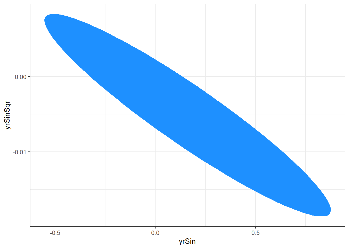
The plotted region is the set of values that we are 95% confident that the yrSin and yrSinSqr coefficients can take together.
GLM
The confint() function provides a profiled confidence interval for glm models. This profiled confidence interval is preferred to a confidence interval generated from the coefficient's standard error, since the coefficients standard error is sensitive to even small deviations from the model's assumptions. The MASS package must be loaded to use profiling confint() function. We load the MASS package in our scripts.
The profiled confidence intervals for the binary data model are generated with the following code.
Enter the following commands in your script and run them.
confint(g2)The results of the above commands are shown below.
Waiting for profiling to be done...2.5 % 97.5 % (Intercept) -8.008386075 -2.984769977 schtyppublic -2.033250948 -0.148755827 read 0.019163396 0.117861493 write 0.001822963 0.097984722 science -0.097654325 -0.003834431 socst 0.013353477 0.098657446
The profiled confidence intervals for the quasipoisson and negative binomial models are generated with the following code.
Enter the following commands in your script and run them.
confint(p1)
confint(nb1)
The results of the above commands are shown below.
Waiting for profiling to be done...2.5 % 97.5 % (Intercept) 0.3906468422 1.1024099836 year 0.0172142079 0.0505602607 yearSqr -0.0005847852 -0.0002434672Waiting for profiling to be done...2.5 % 97.5 % (Intercept) 0.344183806 1.1401150631 year 0.015479898 0.0528388203 yearSqr -0.000606184 -0.0002268549
The confidence intervals for the coefficients of these two models are similar. The confidence intervals for the coefficients are not always similar between over-dispersed Poisson and negative binomial models.
Other tests of coefficients
The linearHypothesis() function is used for test of coefficients. The function allows the test to be specified in two forms. The first is as a written equation giving the hypothesis in symbolic form. The coefficient names from the model object are used in this equation. The second is as a matrix with each row of the matrix being a contrast of interest.
Syntax and use of the linearHypothesis() function
linearHypothesis(modelObj, testEquations)
linearHypothesis(modelObj, hypothesis.matrix, rhs)Returns a data.frame with the anova results of the test of the contrasts. This is a Wald based test similar to the test for zero coefficients in the summary output.
model object is an object returned from a regression function.
Each element of the testEquations vector symbolically specifies a linear combinations of the coefficients.
The rows of hypothesis.matrix specify the linear combinations of the coefficients.
The linear combinations are tested being equal to the values given in the rhs(right hand side) parameter. The default value of rhs is zero.
OLS
Lets look at a few examples from our SalMod model. Our model object tests if professor and associate professor are same. We can use linearHypothesis() to test if professor and associate professor are the same. This example shows the test being done using both methods to specify the test contrast.
Enter the following commands in your script and run them.
linearHypothesis(salMod,c("rankAssocProf-rankProf=0") )
linearHypothesis(salMod,c(0,0,0,1,-1,0,0),0 )
The results of the above commands are shown below.
Linear hypothesis test

Hypothesis:
rankAssocProf - rankProf = 0

Model 1: restricted model
Model 2: salary ~ dscpl + sex + rank + yrSin + yrSinSqr

  Res.Df   RSS Df Sum of Sq      F    Pr(>F)
1    391 81030
2    390 54658  1     26372 188.17 < 2.2e-16 ***
---
Signif. codes:  0 '***' 0.001 '**' 0.01 '*' 0.05 '.' 0.1 ' ' 1
Linear hypothesis test Hypothesis: rankAssocProf - rankProf = 0 Model 1: restricted model Model 2: salary ~ dscpl + sex + rank + yrSin + yrSinSqr Res.Df RSS Df Sum of Sq F Pr(>F) 1 391 81030 2 390 54658 1 26372 188.17 < 2.2e-16 *** --- Signif. codes: 0 '***' 0.001 '**' 0.01 '*' 0.05 '.' 0.1 ' ' 1
From the displays above we can see that both tests are the same. The p-value for the test is nearly zero.
The next example tests if a professor from discipline A with 10 years experience is equal to an associate professor in discipline B with 5. Further we will also test if the same professor from discipline A above is equal to an associate professor in discipline A with 20 years experience.
The equations we want to test are:
(prof + 10*yrSin + 100*yrSinSqr) -
                 (dscplB + rankAssocProf + 5*yrSin + 25*yrSinSqr) = 0
(prof + 10*yrSin + 100*yrSinSqr) -
                 (rankAssocProf + 20*yrSin + 400*yrSinSqr) = 0
We simplifying these equations so that there is only one reference to each coefficient.
prof + 5*yrSin + 75*yrSinSqr - dscplB - rankAssocProf = 0
prof - 10*yrSin - 300*yrSinSqr - rankAssocProf = 0
Enter the following command in your script and run it.
linearHypothesis(salMod,
    c("rankProf+5*yrSin+25*yrSinSqr-dscplB-rankAssocProf=0",
      "rankProf-10*yrSin-300*yrSinSqr-rankAssocProf=0") )
The results of the above command are shown below.
Linear hypothesis test

Hypothesis:
- dscplB - rankAssocProf  + rankProf  + 5 yrSin  + 25 yrSinSqr = 0
- rankAssocProf  + rankProf - 10 yrSin - 300 yrSinSqr = 0

Model 1: restricted model
Model 2: salary ~ dscpl + sex + rank + yrSin + yrSinSqr

  Res.Df   RSS Df Sum of Sq      F    Pr(>F)
1    392 70022
2    390 54658  2     15364 54.814 < 2.2e-16 ***
---
Signif. codes:  0 '***' 0.001 '**' 0.01 '*' 0.05 '.' 0.1 ' ' 1
The very small p-value here indicates that at least one of the equalities is not true.
GLM
The linearHypothesis() function has the same drawbacks as the Wald test of coefficient in summary() for glm models. When possible, it is better to refit the model with the variables recoded such that the test can be done as a test of nested models. The linearHypothesis() function is useful as a quick check of GLM models to see if the nested model test is worth the effort. Here we will check to see if write and science are different in the g2 model.
Enter the following commands in your script and run them.
linearHypothesis(g2,c("write-science=0") )The results of the above commands are shown below.
Linear hypothesis test

Hypothesis:
write - science = 0

Model 1: restricted model
Model 2: I(prog == "academic") ~ schtyp + read + write + science + socst

  Res.Df Df  Chisq Pr(>Chisq)
1    195
2    194  1 6.2518    0.01241 *
---
Signif. codes:  0 '***' 0.001 '**' 0.01 '*' 0.05 '.' 0.1 ' ' 1
The small p-value here is evidence that the two coefficients are different. A nested model would be used to determine an accurate p-value to report.
Predictions
The predict() function is used to determine the predicted values for a particular set of values of the independent variables. The predict() function can also return the confidence interval or prediction interval with the predictions.
Syntax and use of the predict() function
predict(modelObj,newObs,interval=type,level=level)
The modelObj is an an object returned from regression.
The newObs parameter is optional. If it is not provided, the predictions will be for the observed values in the model. The form of newObs is a data.frame with the same columns as used in modelObj.
The parameter type can be "none", "confidence", or "prediction". The default is none, no interval, and alternatively it can be a confidence interval or a prediction interval.
The level parameter is the confidence or prediction level.
We will predict the mean salary for the professors we included in the last hypothesis test above.
OLS
Enter the following commands in your script and run them.
newObs <- data.frame(dscpl=c("A","B","A"),
                     sex=c("Male","Female","Female"),
                     rank=c("Prof","AssocProf","AssocProf"),
                     yrSin=c(10,5,20),
                     yrSinSqr=c(10^2,5^2,20^2)
                     )
predict(salMod, newObs, interval="confidence")
The results of the above commands are shown below.
        fit       lwr       upr
1 121.92198 116.55697 127.28699
2  97.12430  92.21091 102.03769
3  85.40831  81.18070  89.63591
The confidence intervals for the three sets of professors, in the output above, suggest their mean salaries are not the same, since their CI do not overlap.
GLM
The predict function for GLM model objects has an additional parameter. The type parameter specifies the scale to use for the predictions.
Syntax of the predict() function type parameter.
predict(modObj, type=scale, se.fit="logical")
The type parameter can be provided either "link" or "response" for the scale.
We will predict the probability (the response scale) of a student at a public school with scores of read=50,write=52, science=53, and socst=52 being in an academic program.
Enter the following commands in your script and run them.
medstd <- data.frame(schtyp="public",read=50,write=52,
                     science=53,socst=52)
predict(g2,medstd,type="response")
The results of the above commands are shown below.
        1
0.4216985
The inverse logit function is sometimes useful when working with logit models.
Syntax and use of the ilogit() function
ilogit(realVal)
Returns a vector with an inverse logit value for each element in the realVal vector.
We can use the ilogit function to transform values on the link scale to the response scale here. As an example we will predict the same student as above on the link scale and use ilogit to transform to the response scale.
Enter the following commands in your script and run them.
ilogit( predict(g2,medstd,type="link") )The results of the above commands are shown below.
        1
0.4216985
We get the same value as before.
Plots of predicted values
Plots of the predicted values of a model versus one of the continuous variables of the model are useful to visualize what the models predicts. These plots sometimes include the observations from the model fit as points. This is sometime useful if observations do not distract from the plot of of the predictions.
These plots are typically constructed after the optimal model has been selected. As such they are done after variable selection and the diagnostics for the models been considered.
OLS
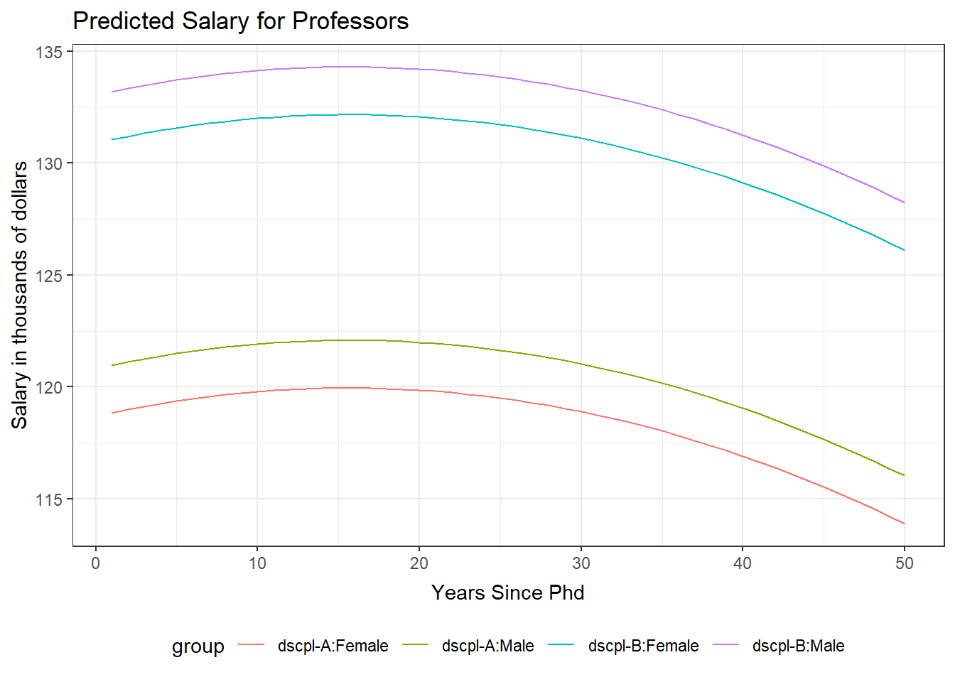
The salary model has several factor variables and the quadratic form of yrSin. We will plot the predicted values of salary versus yrSin for each pairing of discipline and gender. This plot includes a curve for each of the gender and discipline groups. The observation from the model were not added to this plot. This choice was made because of the large number of observations and the plot has four curves on it. Adding the observed values distracted from the relationships being displayed by the four curves.
Enter the following commands in your script and run them.
yrPred <- data.frame(dscpl=c( rep("A",100),rep("B",100) ),
                    sex=c(rep("Male",50),rep("Female",50),
                          rep("Male",50),rep("Female",50)),
                    rank=rep("Prof",200),
                    yrSin=c(1:50, 1:50, 1:50, 1:50),
                    yrSinSqr=c((1:50)^2, (1:50)^2, (1:50)^2, (1:50)^2)
                    )
yrPred$predicted <- predict(salMod, yrPred)
yrPred$group <- paste("dscpl-",yrPred$dscpl,":",yrPred$sex,sep="")

ggplot(yrPred, aes(x=yrSin,y=predicted, color=group)) +
  geom_line() +
  theme_bw() +
  ggtitle("Predicted Salary for Professors") +
  theme( plot.title=element_text(vjust=1.0) ) +
  xlab("Years Since Phd") +
  theme( axis.title.x = element_text(vjust=-.5) ) +
  ylab("Salary in thousands of dollars") +
  theme( axis.title.y = element_text(vjust=1.0) ) +
  theme(legend.position = "bottom")
There are no console results from these commands. The following plot is produced.
GLM
The quadratic form of years was used in our model for the number of inventions. We will plot the predicted number of inventions for the years of the study. We will use the negative binomial model. The blue line is the predicted mean. The model observations are included in this plot.
Enter the following command in your script and run it.
ggplot(data=nb1Diag, aes(x=year)) +
  geom_point(aes(y=count) ) +
  geom_smooth(method="loess", aes(y=fit)) +
  theme_bw() +
  ggtitle("Predicted Mean Inventions") +
  theme( plot.title=element_text(vjust=1.0) ) +
  xlab("Number of years since 1860") +
  theme( axis.title.x = element_text(vjust=-.5) ) +
  ylab("Number of inventions") +
  theme( axis.title.y = element_text(vjust=1.0) )
There are no console results from this command. The following plot is produced.
`geom_smooth()` using formula 'y ~ x'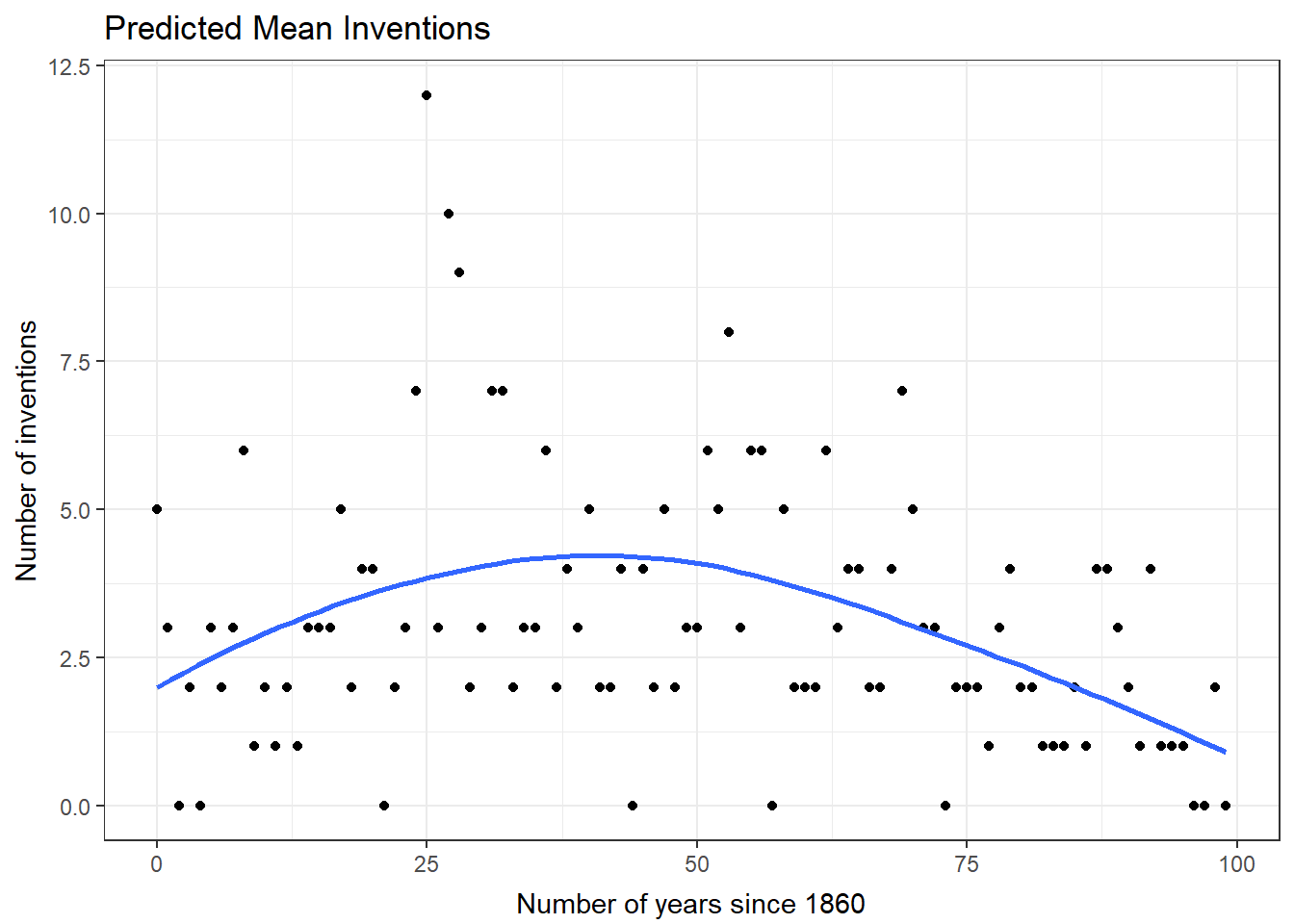
Plot of fit
Another common plot is the observed versus fitted values. These plots are not formally inference. They are similar in that they provide a valuation of how close to the predictions one can expect to be.
OLS
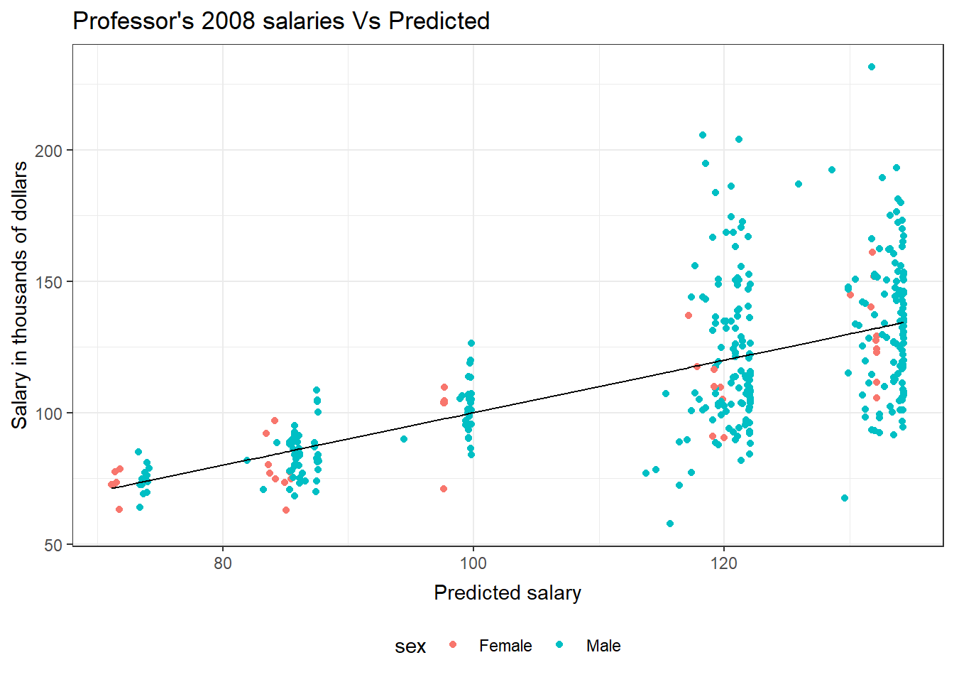
This plot of the predicted professor salaries versus the observed salaries uses a black line for the predicted salary and colors for the observed genders.
Enter the following command in your script and run it.
ggplot(salModDiag, aes(x=fit)) +
  geom_point(aes(y=salary, col=sex)) +
  geom_line(aes(y=fit)) +
  theme_bw() +
  ggtitle("Professor's 2008 salaries Vs Predicted") +
  theme( plot.title=element_text(vjust=1.0) ) +
  xlab("Predicted salary") +
  theme( axis.title.x = element_text(vjust=-.5) ) +
  ylab("Salary in thousands of dollars") +
  theme( axis.title.y = element_text(vjust=1.0) ) +
  theme(legend.position = "bottom")
There are no console results from this command. The following plot is produced.
GLM
This plot of the observed academic program status for the binary response model uses the link scale for the predicted value. This produces a logit curve for the prediction. The observed values of academic or not are jittered in this plot to allow for a better sense of the fit. The correctly predicted status of the observation has been identified with color in the plot.
Enter the following command in your script and run it.
g2Fit <- predict(g2, type="response")
g2Actual <- as.numeric(hsb$prog == "academic")
g2Correct <- ( g2Fit > .5) & g2Actual |
             ( g2Fit <= .5) & !g2Actual
g2Diag <- data.frame(hsb,
                     academic=g2Actual,
                     link=predict(g2, type="link"),
                     fit=g2Fit,
                     pearson=residuals(g2,type="pearson"),
                     Correct=g2Correct
                     )
ggplot(data=g2Diag, aes(x=link)) +
  geom_point(position = position_jitter(height = 0.05),
             aes(y=academic, color=Correct) ) +
  geom_smooth(method="loess", aes(y=fit), color="black") +
  theme_bw() +
  ggtitle("Predicted probability for academic students") +
  theme( plot.title=element_text(vjust=1.0) ) +
  xlab("Predicted link value") +
  theme( axis.title.x = element_text(vjust=-.5) ) +
  ylab("Probability") +
  theme( axis.title.y = element_text(vjust=1.0) ) +
  theme(legend.position = "bottom")
There are no console results from this command. The following plot is produced.
`geom_smooth()` using formula 'y ~ x'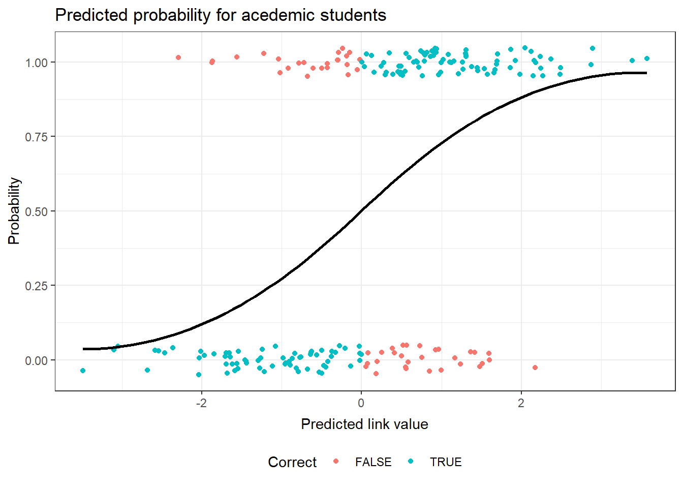
This plot of the observed number of inventions verse the predicted number uses the predictions from the negative binomial model. A blue line is used for the predicted mean, since the observations are in black.
Enter the following command in your script and run it.
ggplot(data=nb1Diag, aes(x=fit)) +
  geom_point(aes(y=count) ) +
  geom_smooth(method="loess", aes(y=fit)) +
  theme_bw() +
  ggtitle("Number of Inventions Vs. Predicted") +
  theme( plot.title=element_text(vjust=1.0) ) +
  xlab("Predicted number of inventions") +
  theme( axis.title.x = element_text(vjust=-.5) ) +
  ylab("Number of inventions") +
  theme( axis.title.y = element_text(vjust=1.0) )
There are no console results from this command. The following plot is produced.
`geom_smooth()` using formula 'y ~ x'
Exercise
These exercises use the alfalfa dataset and the work you started on the alfAnalysis script. Open the script and run all the commands in the script to prepare your session for these problems.
Note, we will use the shade and irrig variables as continuous variables for these exercises. They could also be considered as factor variables. Since both represent increasing levels we first try to use them as scale.
Find the confidence interval for the model coefficients.
Test if inoculant A equals inoculant D.
Predict the confidence interval for the mean yield for a plot which has irrigation level 3, shade level 5, and inoculation C.
Plot the observed verse fitted values for your model
Commit your changes to AlfAnalysis.
Previous: Regression (generalized linear models)
Last Revised: 3/19/2014