 Supporting Statistical Analysis for Research
3.4 Relationship between more than two variables
These exercises use the Mroz.csv data set
that was imported in the prior sections of this chapter.
Create a scatter plot for
ageagainstlwg. Use color to display women college attendance status.ggplot(mroz, aes(x = age, y = lwg, color = wc)) + geom_point() + theme_bw()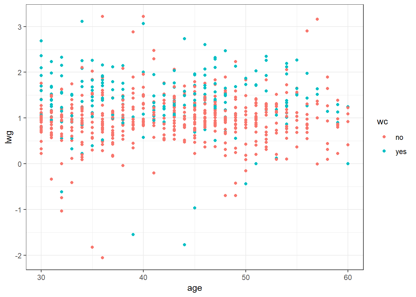
Facet the prior plot on
hc.ggplot(mroz, aes(x = age, y = lwg, color = wc)) + geom_point() + facet_wrap(~hc) + theme_bw()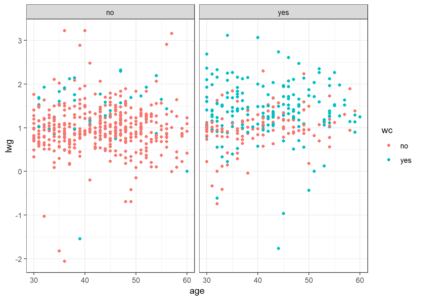
Add a loess smoothing line
hc.ggplot(mroz, aes(x = age, y = lwg, color = wc)) + geom_point() + geom_smooth(color = "blue") + facet_wrap(~hc) + theme_bw()`geom_smooth()` using method = 'loess' and formula 'y ~ x'
If the prior plot produces a message or warning, change the code to avoid the warning.
ggplot(mroz, aes(x = age, y = lwg, color = wc)) +
  geom_point() +
  geom_smooth(method = "loess", formula = "y ~ x", color = "blue") +
  facet_wrap(~hc) +
  theme_bw()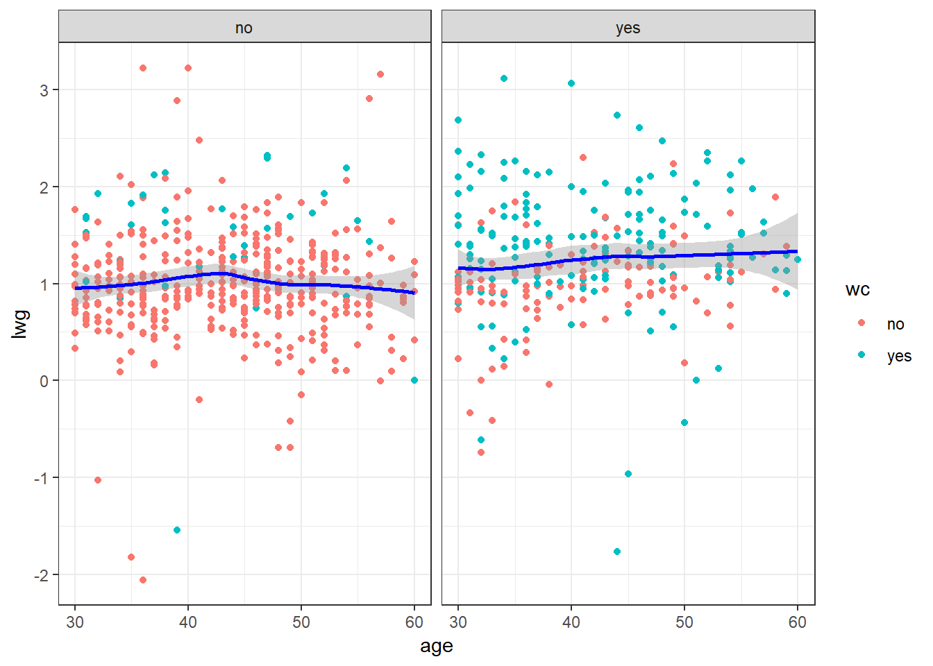
Add a title and provide better axis labels.
ggplot(mroz, aes(x = age, y = lwg, color = wc)) +
  geom_point() +
  geom_smooth(method = "loess", formula = "y ~ x", color = "blue") +
  facet_wrap(~hc) +
  theme_bw() +
  ggtitle("Womens Wages and Ages") +
  theme(plot.title = element_text(hjust = 0.5)) +
  xlab("Log Womens Wages") +
  ylab("Age")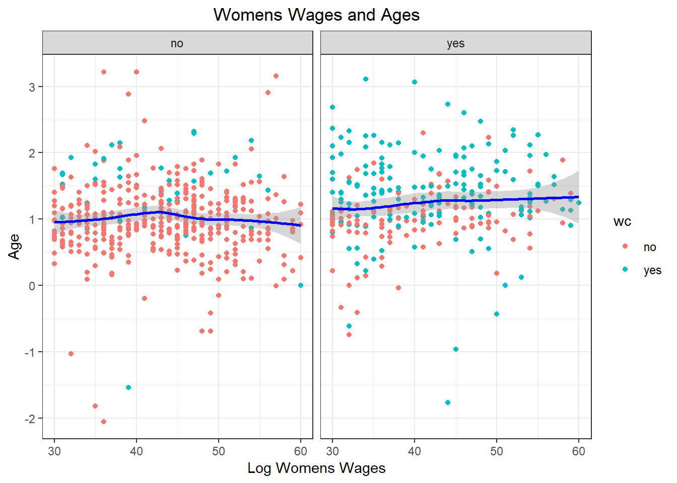
Create a plot that explores the relationship between at least three variables. Use at least one different value than was used in the prior exercise.