6 Customizing Plot Appearance
Load the libraries and data needed for this chapter. See Download the Data for links to the data.
library(ggplot2)

acs_small <- readRDS("acs_small.rds")
In the plots until this point, little attention was paid to making plots that look good, only making plots that we can understand.
ggplot has powerful functionality for customizing every bit of a plot, and with a bit of work, you can produce plots ready for presentations and publications.
6.1 Adding and Changing Labels
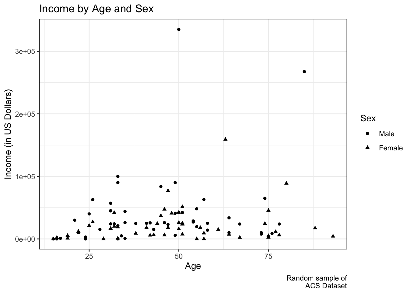
Labels can be added to a plot with labs() by assigning a character string to the aesthetic (x, y, shape, etc.). Setting labels is important for at least two reasons. First, we usually want to make our variable names look nice for presentations by capitlizing the first letters and clarifying meanings, like changing “income” to “Income (in US Dollars)”. Second, and more importantly, we want our plots to be interpretable. Unless a reader is already familiar with dummy coding in general and your dataset in particular, seeing “as.factor(female)” as a legend title and 0 and 1 as level labels will be confusing. To help others (including future-us) understand our plot more readily, we can call the variable “Sex” and its levels “Male” and “Female”.
ggplot(acs_small, aes(x = age, y = income,
                       shape = as.factor(female))) +
  geom_point() +
  labs(title = "Income by Age, Sex, and Education",
       caption = "Random sample of\nACS Dataset",
       x = "Age",
       y = "Income (in US Dollars)",
       shape = "Sex") +
  facet_wrap(~ edu) +
  scale_shape_discrete(labels = c("Male", "Female"))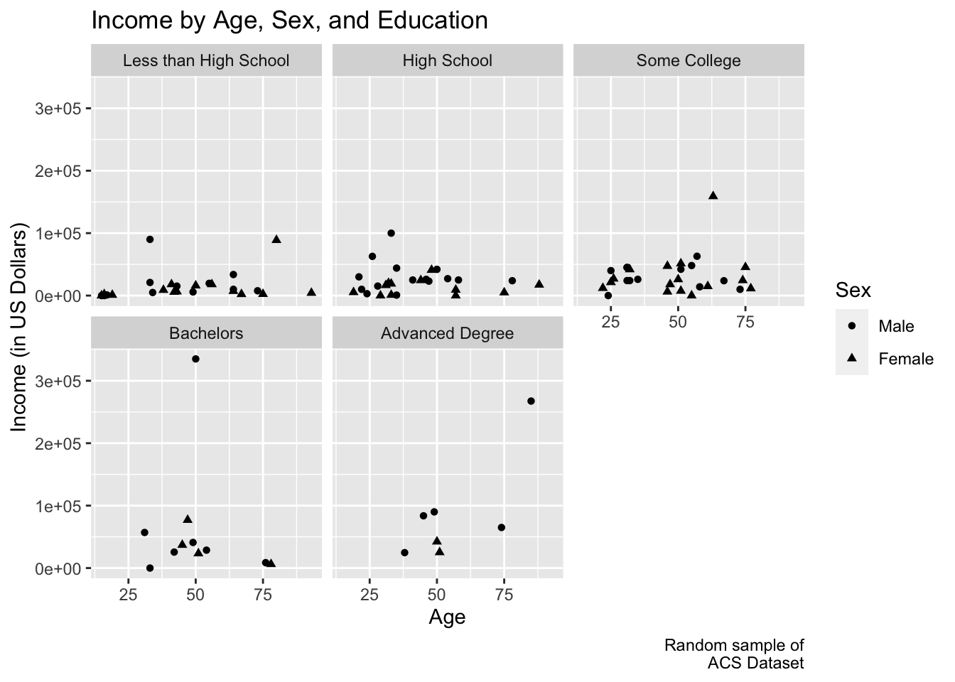
6.2 Changing Text and Axes
Text size, font, angle, and position are all customizable. We can tell theme() what we would like to change. (To see a list of things that can be changed, see help(theme).)
To remove something, we can set it equal to element_blank(). Below, the y-axis ticks and the facet labels were removed.
Axis breaks can be modified with one of the scale_x_*() or scale_y_*() arguments.
ggplot(acs_small, aes(x = age, y = income,
                       shape = as.factor(female))) +
  geom_point() +
  labs(title = "Income by Age, Sex, and Education",
       caption = "Random sample of\nACS Dataset",
       x = "Age",
       y = "Income (in US Dollars)",
       shape = "Sex") +
  facet_wrap(~ edu) +
  scale_shape_discrete(labels = c("Male", "Female")) +
  theme(axis.title.x = element_text(size = 10, face = "italic"),
        axis.title.y = element_text(size = 25, face = "bold"),
        axis.text.y = element_text(angle = 20),
        axis.ticks.length.x = unit(1, "cm"),
        axis.ticks.x = element_line(arrow = arrow()),
        axis.ticks.y = element_blank(),
        legend.position = "bottom",
        plot.title = element_text(angle = 15, vjust = -.2),
        strip.text = element_blank()) +
  scale_x_continuous(breaks = seq(0, 100, 20))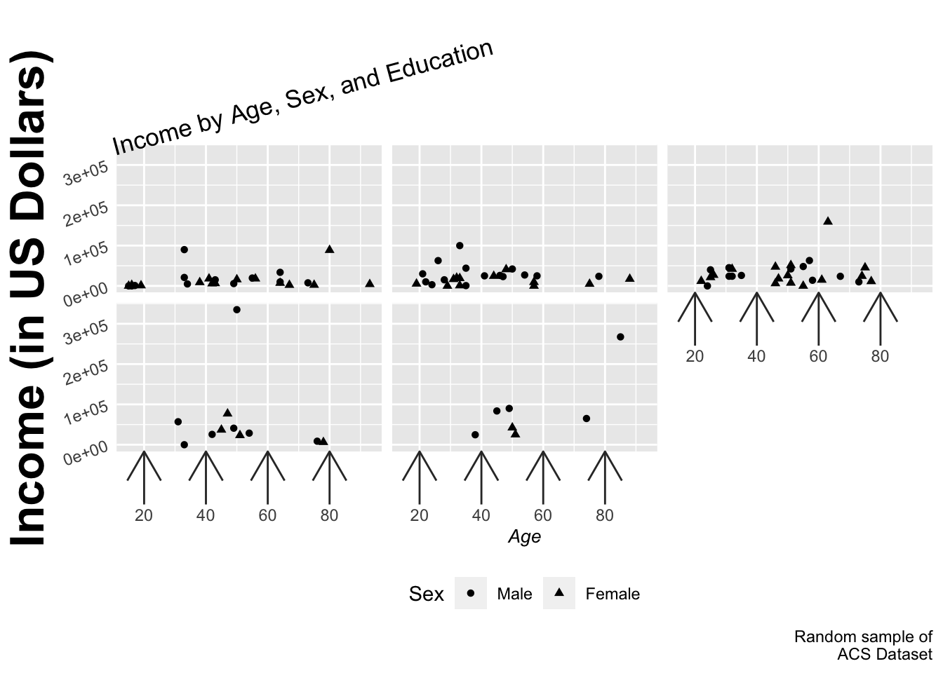
While this is certainly not a good plot, it hopefully gives you an idea of the customization capabilities of ggplot.
6.3 Changing Themes
Several preset themes are available in ggplot, including theme_gray() (default) and theme_bw() (shown below). (For a full list, see help(theme_gray).) Many more themes are available in the ggthemes package, but you are free to customize everything (see help(theme)).
ggplot(acs_small, aes(x = age, y = income,
                       shape = as.factor(female))) +
  geom_point() +
  labs(title = "Income by Age and Sex",
       caption = "Random sample of\nACS Dataset",
       x = "Age",
       y = "Income (in US Dollars)",
       shape = "Sex") +
  scale_shape_discrete(labels = c("Male", "Female")) +
  theme_bw()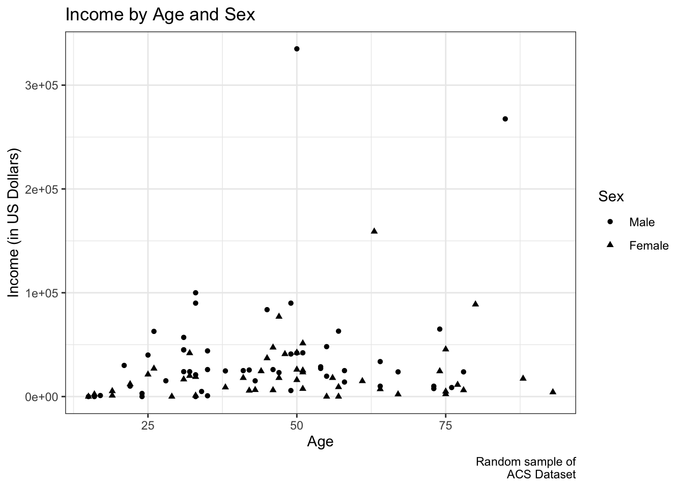
Or we can try to reproduce the above plot manually:
ggplot(acs_small, aes(x = age, y = income,
                       shape = as.factor(female))) +
  geom_point() +
  labs(title = "Income by Age and Sex",
       caption = "Random sample of\nACS Dataset",
       x = "Age",
       y = "Income (in US Dollars)",
       shape = "Sex") +
  scale_shape_discrete(labels = c("Male", "Female")) +
  theme(panel.border = element_rect(color = "black", fill = NA),
        panel.grid = element_line(color = "#EEEEEE"),
        panel.background = element_rect(fill = NA),
        legend.key = element_rect(fill = NA))
After a while, you may create your own theme that you like very much. If you do so, you can start every script with assigning your preferences as a theme object. When making a plot, simply call that object, as done below with myTheme.
myTheme <- theme(panel.border = element_rect(color = "black", fill = NA),
                 panel.grid = element_line(color = "#EEEEEE"),
                 panel.background = element_rect(fill = NA),
                 legend.key = element_rect(fill = NA))

ggplot(acs_small, aes(x = age, y = income,
                       shape = as.factor(female))) +
  geom_point() +
  labs(title = "Income by Age and Sex",
       caption = "Random sample of\nACS Dataset",
       x = "Age",
       y = "Income (in US Dollars)",
       shape = "Sex") +
  scale_shape_discrete(labels = c("Male", "Female")) +
  myTheme