4 Two Variables
Load the libraries and data needed for this chapter. See Download the Data for links to the data.
library(ggplot2)
library(dplyr)
library(scales)

acs <- readRDS("acs.rds")
4.1 One Discrete, One Continuous
4.1.1 Barplots
Barplots can also be used when plotting two variables. To do so, use geom_col(), which is the same as geom_bar() but with a different statistic. (It plots stat = "identity", meaning the actual values, instead of stat = "count". This means that geom_col() and geom_bar(stat = "identity") are equivalent.)
The pipe below calculates the mean income by education level.
acs |>
  filter(!is.na(edu)) |>
  group_by(edu) |>
  summarize(income = mean(income, na.rm = T)) |>
  ggplot(aes(x = edu, y = income)) +
  geom_col() +
  coord_flip()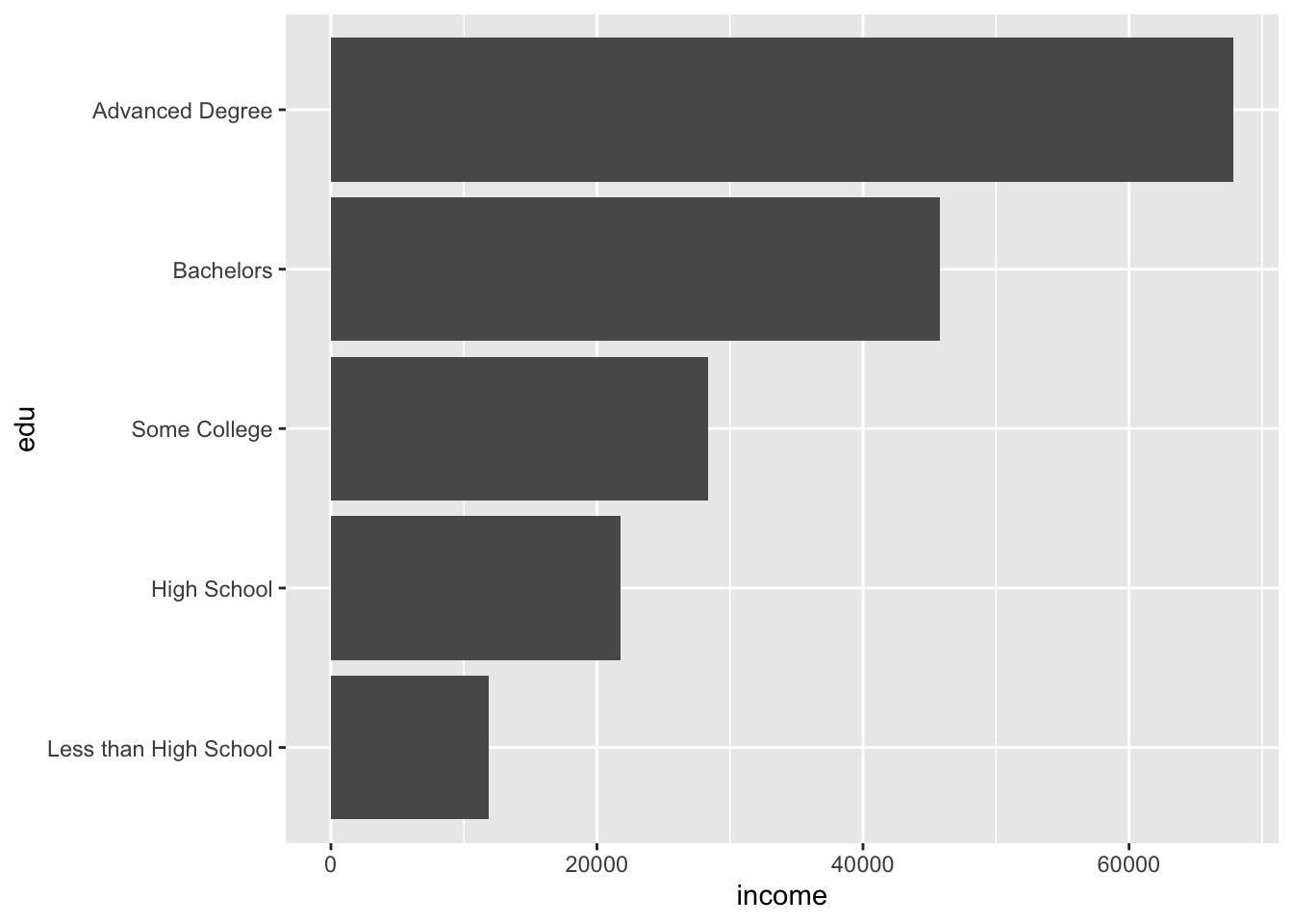
We may want to add text with the exact (but rounded) value represented by each bar.
acs |>
  filter(!is.na(edu)) |>
  group_by(edu) |>
  summarize(income = mean(income, na.rm = T)) |>
  ggplot(aes(x = edu, y = income)) +
  geom_col() +
  coord_flip() +
  geom_text(aes(label = round(income)))
The text has been unhelpfully centered at the end of each bar, making it difficult to read.
Adding text and labels in ggplot involves a lot of trial and error. Text positions can be adjusted with horizontally with the hjust argument, and vertically with vjust.
acs |>
  filter(!is.na(edu)) |>
  group_by(edu) |>
  summarize(income = mean(income, na.rm = T)) |>
  ggplot(aes(x = edu, y = income)) +
  geom_col() +
  coord_flip() +
  geom_text(aes(label = round(income)),
            hjust = -.2)
The text for the first bar is not fully visible. To fix this, adjust the axis limits.
Remember, the coordinates were flipped, so the horizontal axis is actually the y-axis and is mapped to the y aesthetic of income (aes(..., y = income)).
The current “y” limit appears to be around 70,000. Perhaps increasing it to 75,000 will be enough to see the text. We can adjust limits by supplying ylim() with a two-number vector of the minimum and maximum.
acs |>
  filter(!is.na(edu)) |>
  group_by(edu) |>
  summarize(income = mean(income, na.rm = T)) |>
  ggplot(aes(x = edu, y = income)) +
  geom_col() +
  coord_flip() +
  geom_text(aes(label = round(income)),
            hjust = -.2) +
  ylim(c(0, 75000))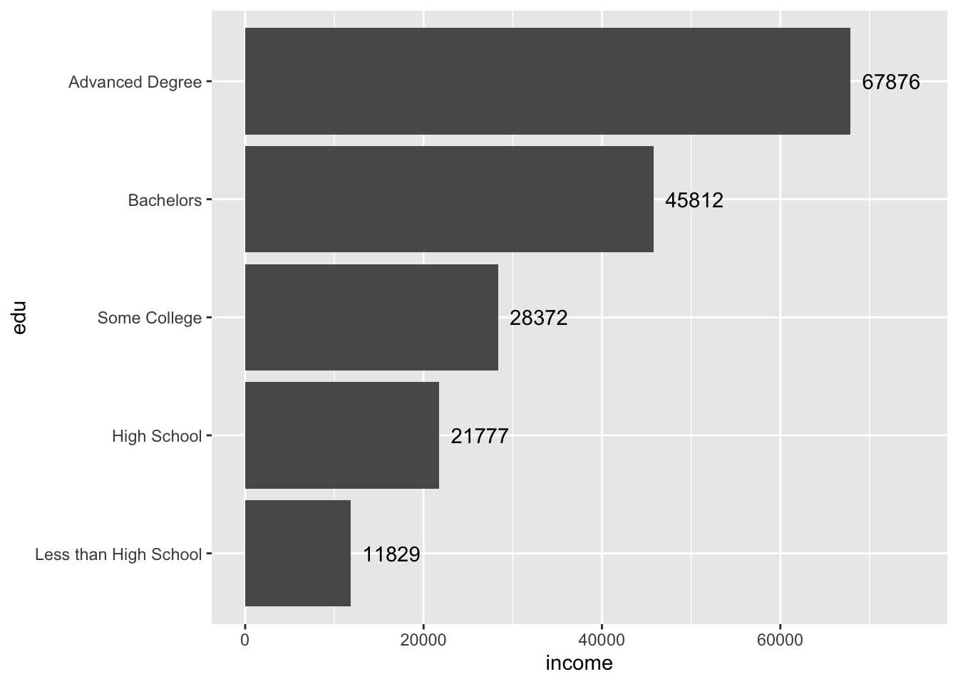
Perfect.
4.1.2 Boxplots
Boxplots are another option for visualizing a continuous variable along a discrete variable. Again, coord_flip() can be used to rotate the plot 90 degrees.
acs |>
  filter(!is.na(edu), !is.na(income)) |>
  ggplot(aes(x = edu, y = income)) +
  geom_boxplot() +
  coord_flip()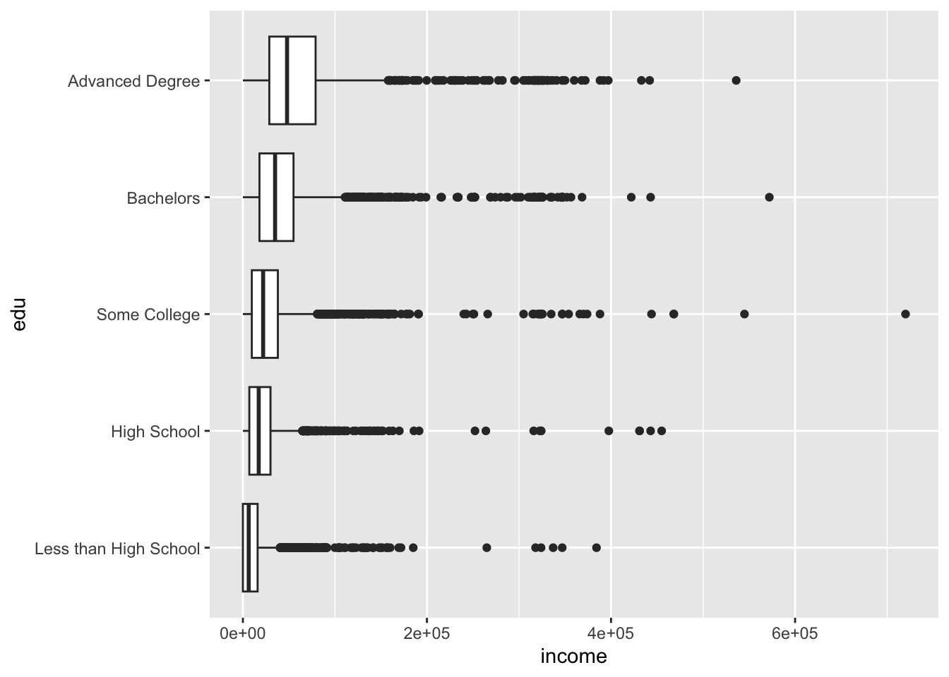
The plot above defaulted to scientific notation for the y-axis labels. (Remember the axes were flipped, so the horizontal axis is actually the y-axis!). To fix the y-axis labels, set the labels argument of scale_y_continuous() to comma, an option available from the scales package.
acs |>
  filter(!is.na(edu), !is.na(income)) |>
  ggplot(aes(x = edu, y = income)) +
  geom_boxplot() +
  coord_flip() +
  scale_y_continuous(labels = comma)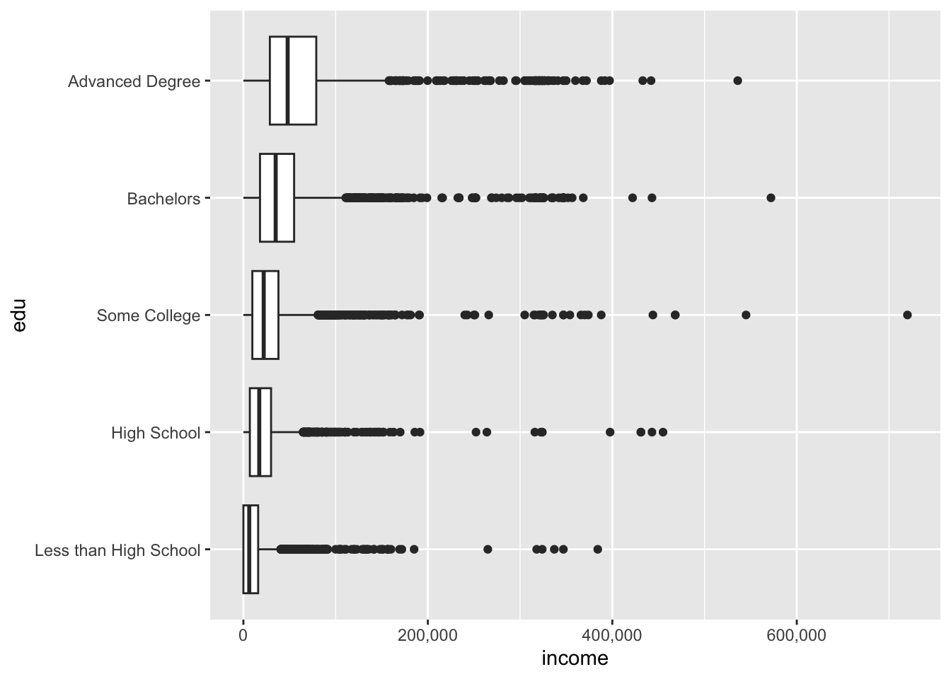
We might also like to use a combination of geoms to visualize our data. One nice combination is the violin plot and the boxplot.
ggplot(acs, aes(x = race, y = age)) +
  geom_violin() +
  geom_boxplot() +
  coord_flip()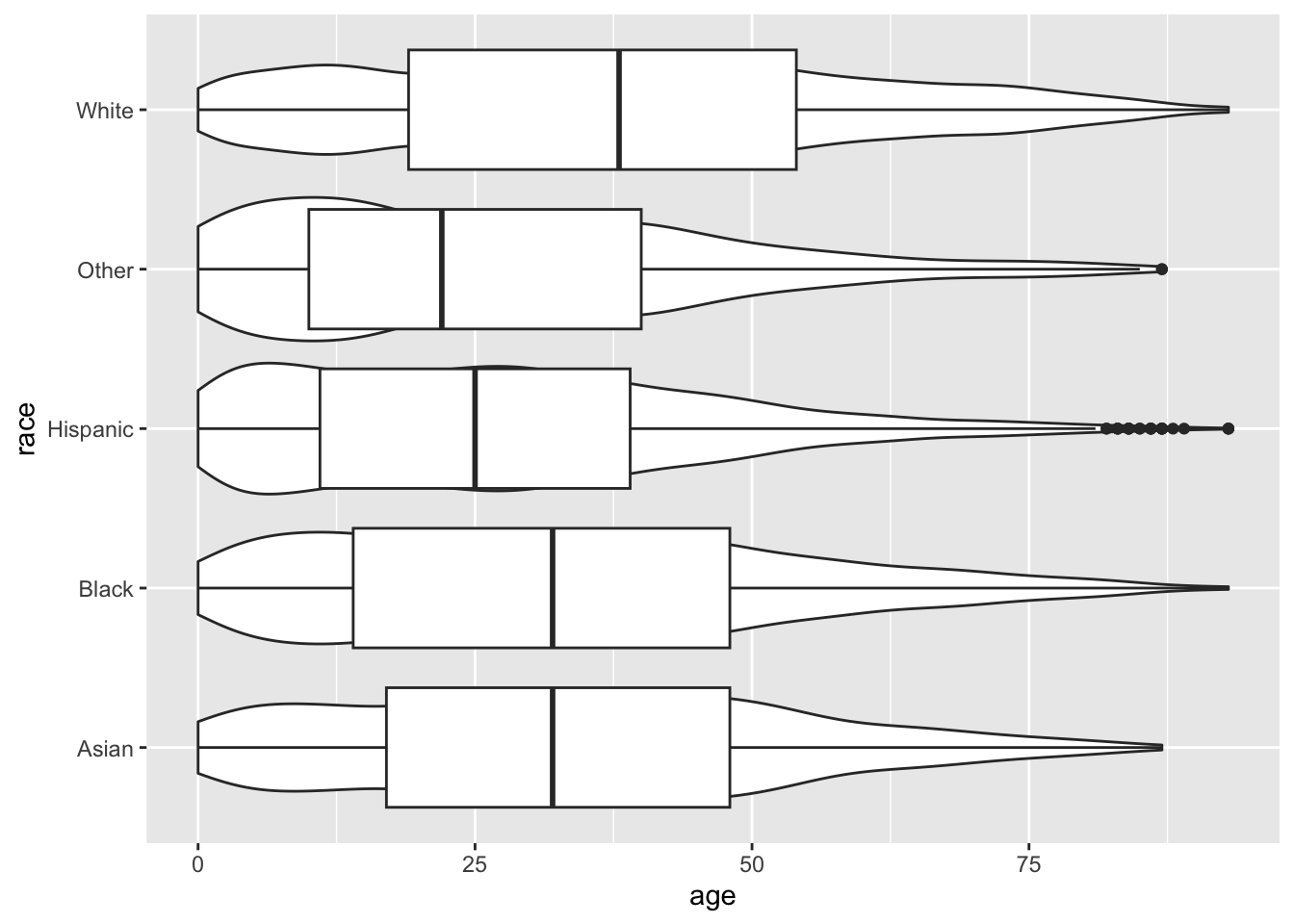
The boxplot has covered up the violin plot, so we can reduce the width of the boxplot with the width argument.
ggplot(acs, aes(x = race, y = age)) +
  geom_violin() +
  geom_boxplot(width = .25) +
  coord_flip()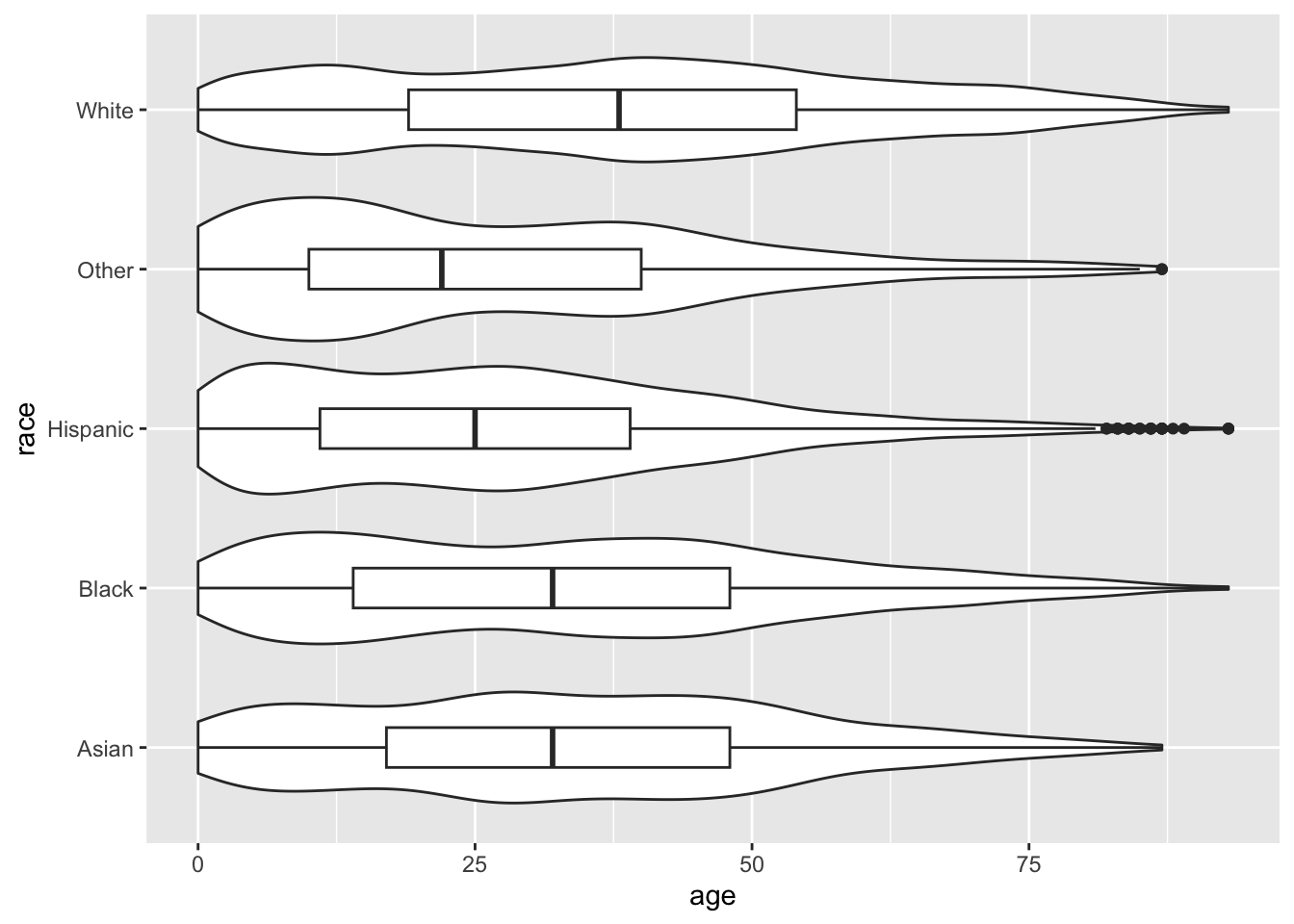
Remember, order matters. Geoms are added one on top of another, so if we plot the boxplot first and the violin plot second…
ggplot(acs, aes(x = race, y = age)) +
  geom_boxplot(width = .25) +
  geom_violin() +
  coord_flip()
4.2 Two Continuous
4.2.1 Scatterplots
The relationship of two continuous variables can be visualized with a scatterplot, accomplished with geom_point().
ggplot(acs, aes(x = age, y = income)) +
  geom_point()
## Warning: Removed 6173 rows containing missing values or values outside the scale range (`geom_point()`).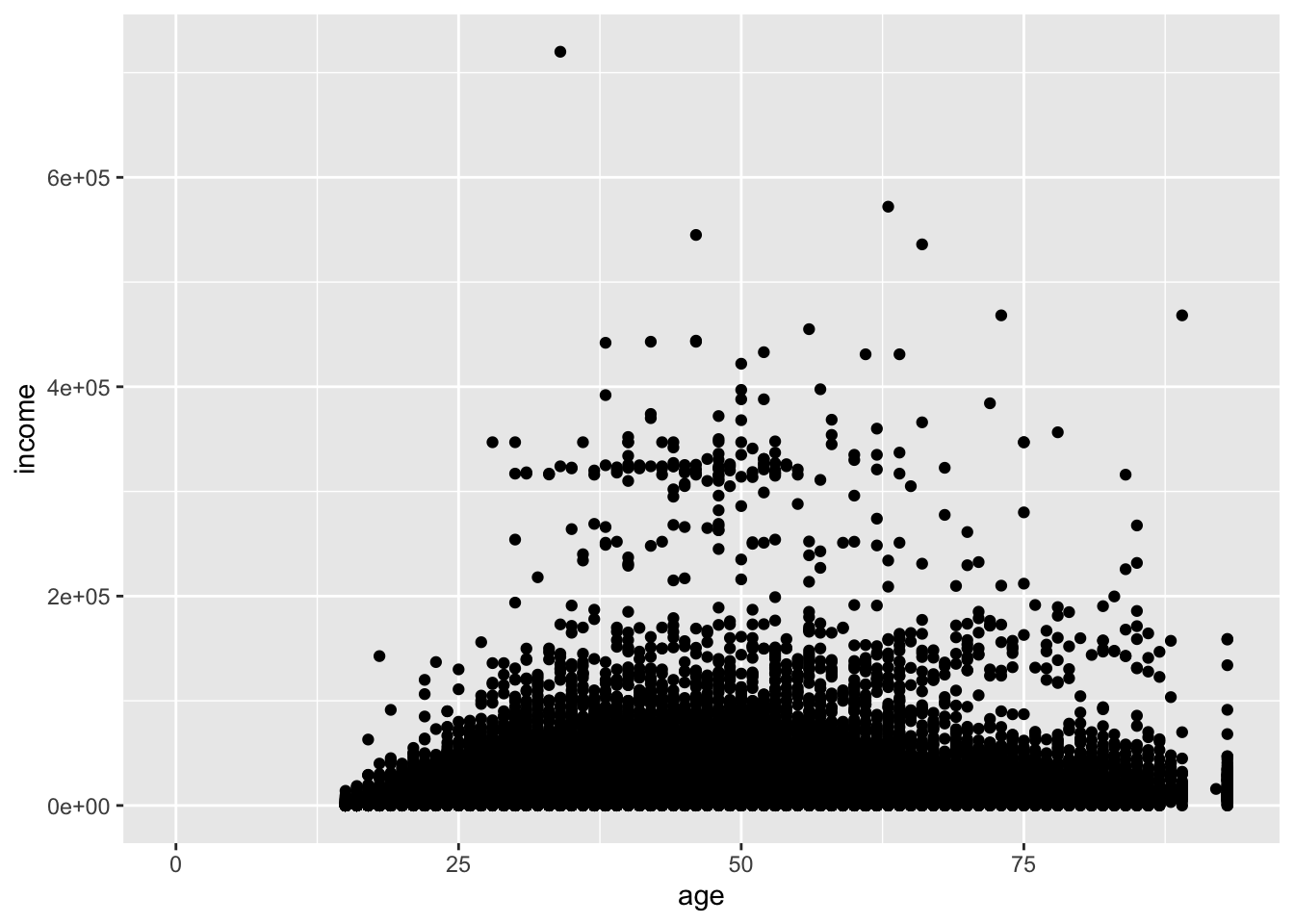
When you have many points, and here we have over 20,000, scatterplots can become difficult to read. The bottom eighth of the plot is a mass of points, and we cannot be sure how dense that area is.
One option to rectify the plot is to reduce the size of the points. size is measured in millimeters.
ggplot(acs, aes(x = age, y = income)) +
  geom_point(size = .5)
## Warning: Removed 6173 rows containing missing values or values outside the scale range (`geom_point()`).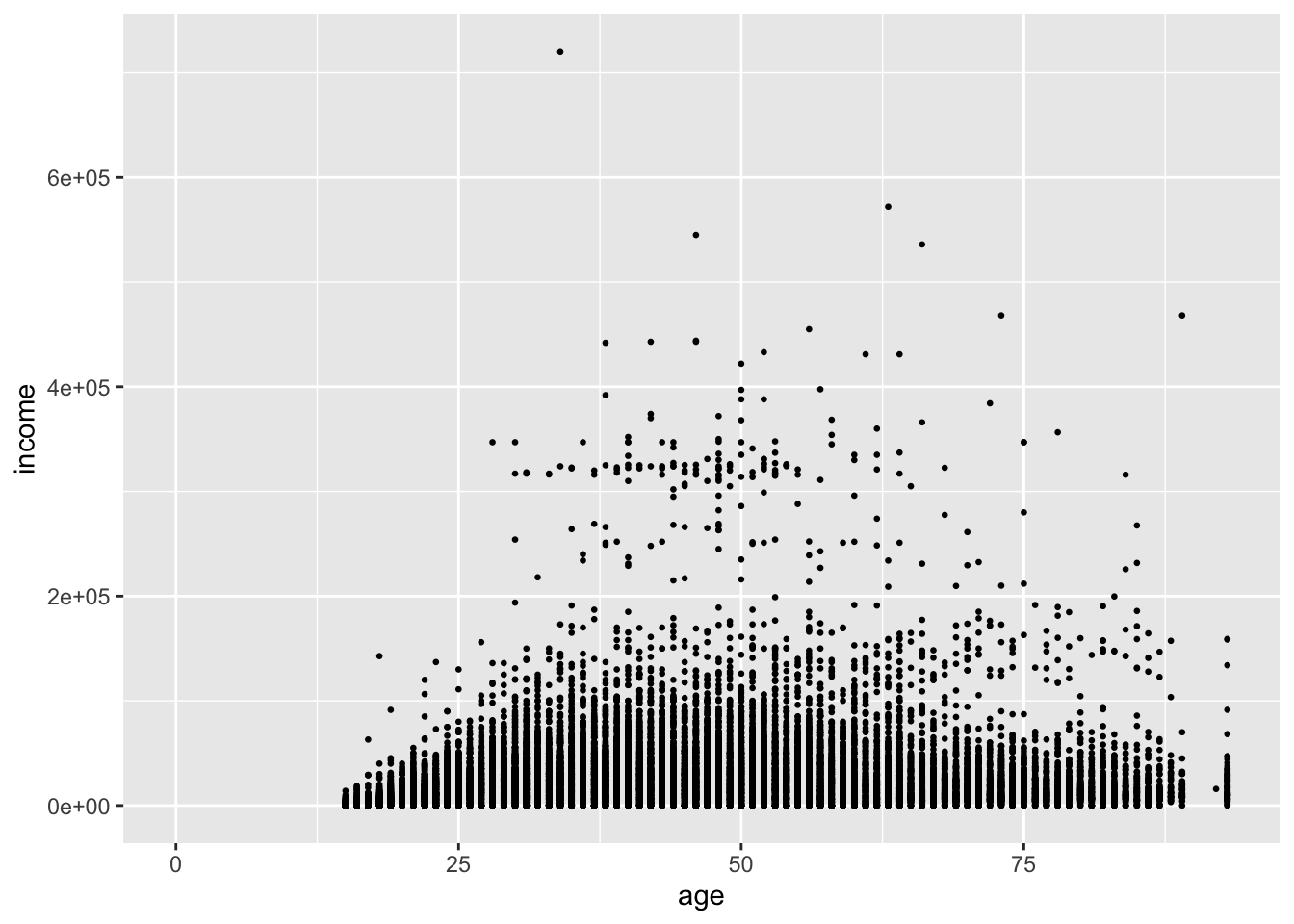
This helps us see that age is coded as an integer, but it does little to help us see the density of points.
Instead, we can use the alpha argument. This value ranges from 0 to 1, where 0 is transparent and 1 is opaque (the default). We have a lot of points, so we can set the value fairly low.
ggplot(acs, aes(x = age, y = income)) +
  geom_point(alpha = .1)
## Warning: Removed 6173 rows containing missing values or values outside the scale range (`geom_point()`).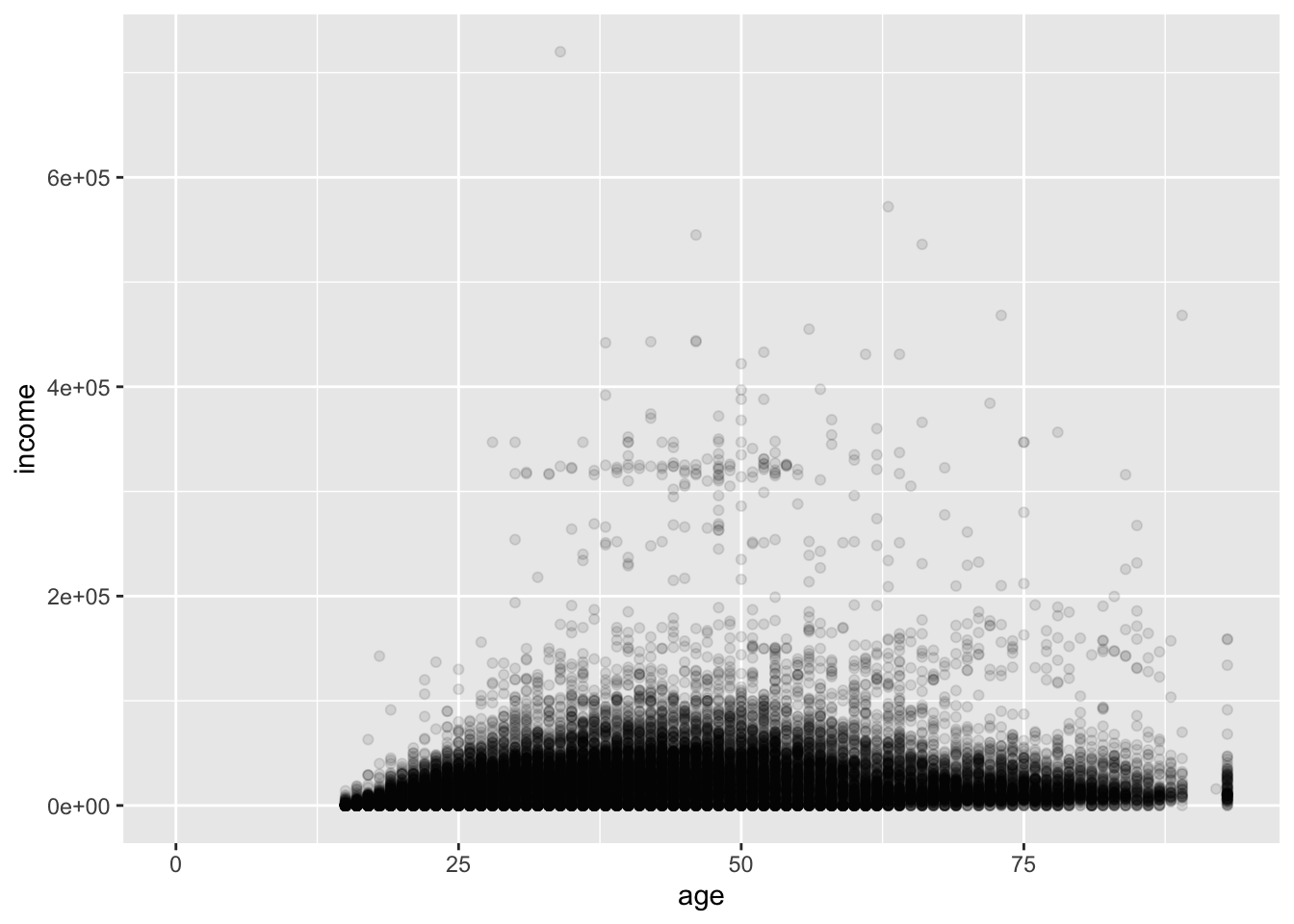
Now, the darkness of a point cluster represents its density. Comparing this to the first plot, we see that the upper part of the big mass of points actually represents fewer people than the lower part.
We can also add a linear fit of y ~ x by using geom_smooth() and setting its method to "lm".
ggplot(acs, aes(x = age, y = income)) +
  geom_point(alpha = .1) +
  geom_smooth(method = "lm")
## `geom_smooth()` using formula = 'y ~ x'## Warning: Removed 6173 rows containing non-finite outside the scale range (`stat_smooth()`).## Warning: Removed 6173 rows containing missing values or values outside the scale range (`geom_point()`).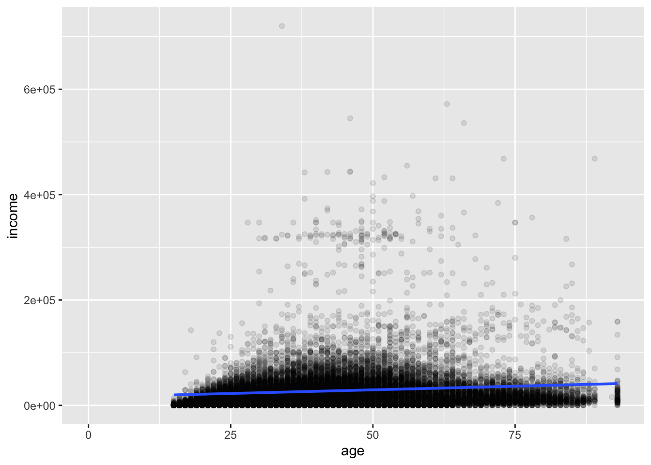
Deleting the method argument will produce a plot with a smoothed conditional mean. A standard error ribbon is included by default (se = T), but the standard error is much too small to see clearly in this plot.
ggplot(acs, aes(x = age, y = income)) +
  geom_point(alpha = .1) +
  geom_smooth()
## `geom_smooth()` using method = 'gam' and formula = 'y ~ s(x, bs = "cs")'## Warning: Removed 6173 rows containing non-finite outside the scale range (`stat_smooth()`).## Warning: Removed 6173 rows containing missing values or values outside the scale range (`geom_point()`).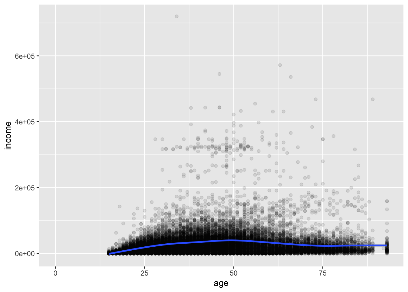
4.3 Two Discrete
4.3.1 Scatterplots
The bivariate distribution of two discrete variables can be examined with a table:
table(acs$edu, acs$race, useNA = "ifany")##
## Asian Black Hispanic Other White
## Less than High School 340 1459 2171 417 5924
## High School 112 645 536 143 4327
## Some College 170 584 455 145 4374
## Bachelors 165 228 113 68 2346
## Advanced Degree 107 94 51 17 1296
## <NA> 42 135 221 63 662prop.table(table(acs$edu, acs$race, useNA = "ifany"))##
## Asian Black Hispanic Other White
## Less than High School 0.0124042320 0.0532287486 0.0792046698 0.0152134258 0.2161255016
## High School 0.0040861000 0.0235315578 0.0195549070 0.0052170741 0.1578620941
## Some College 0.0062021160 0.0213060927 0.0165997811 0.0052900401 0.1595767968
## Bachelors 0.0060197008 0.0083181321 0.0041225830 0.0024808464 0.0855892010
## Advanced Degree 0.0039036848 0.0034294053 0.0018606348 0.0006202116 0.0472820139
## <NA> 0.0015322875 0.0049252098 0.0080627508 0.0022984312 0.0241517694One option for plotting this relationship is a scatterplot, which at first seems like a terrible idea:
ggplot(acs, aes(x = race, y = edu)) +
  geom_point()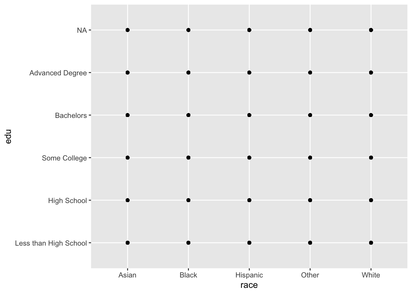
All we learn from that plot is that all combinations of race and edu were observed in the data.
We can add a small amount of noise (jitter) to the x and y variables by changing geom_point() to geom_jitter().
ggplot(acs, aes(x = race, y = edu)) +
  geom_jitter()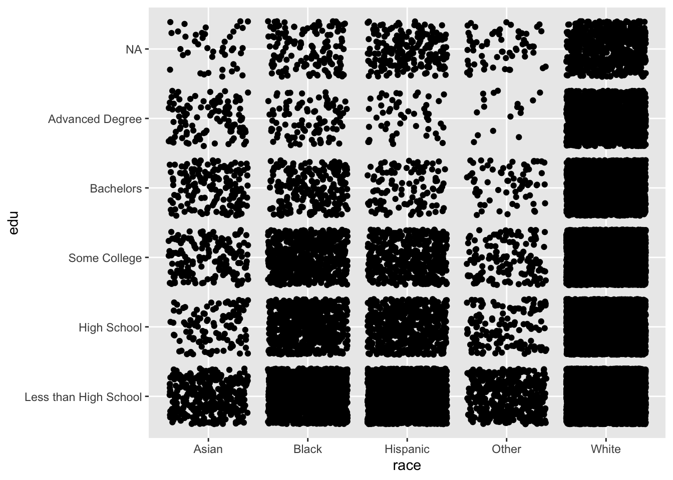
We can begin to see differences between the variables, but the “White” column is so densely populated that we cannot tell the difference in counts between the levels of education.
A little trial-and-error with the size and alpha arguments of geom_jitter() produces the following:
ggplot(acs, aes(x = race, y = edu)) +
  geom_jitter(size = .25, alpha = .1)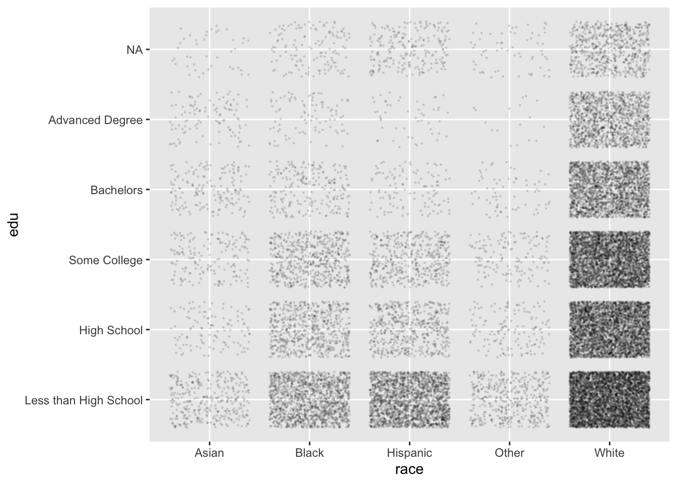
Now, this plot is created from the same data as the contingency tables above, but we are much better at finding patterns in point density than we are in comparing numbers in a table. For example, we see:
- “White” is the most populous level of
race, and “Asian” and “Other” have much fewer individuals - For all levels of
race, the general pattern is that lower levels ofeduare more common, and higher levels less common
With just two lines of code and some experimenting, we can produce plots that help us in the beginning stages of data exploration.
4.3.2 Barplots
Another choice to visualize two discrete variables is the barplot.
Instead of making edu the y variable, we can assign it to the fill aesthetic, which geom_bar() uses to color the bars.
Setting the position argument of geom_bar() to "dodge" places the bars side by side.
ggplot(acs, aes(x = race, fill = edu)) +
  geom_bar(position = "dodge")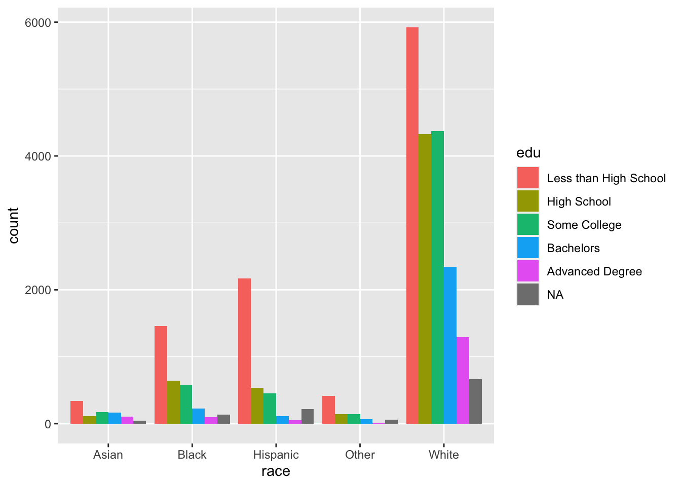
Recall that edu is a factor vector (ordered categorical variable), while race is a character vector (unordered categorical variable). As such, the levels of edu follow the order we supplied, while race defaults to alphabetical If we wanted to change this, we could simply make race a factor and specify its levels with fct_relevel() as we did earlier.
Instead of placing the bars next to each other, we can stack them by setting position to "stack".
ggplot(acs, aes(x = race, fill = edu)) +
  geom_bar(position = "stack")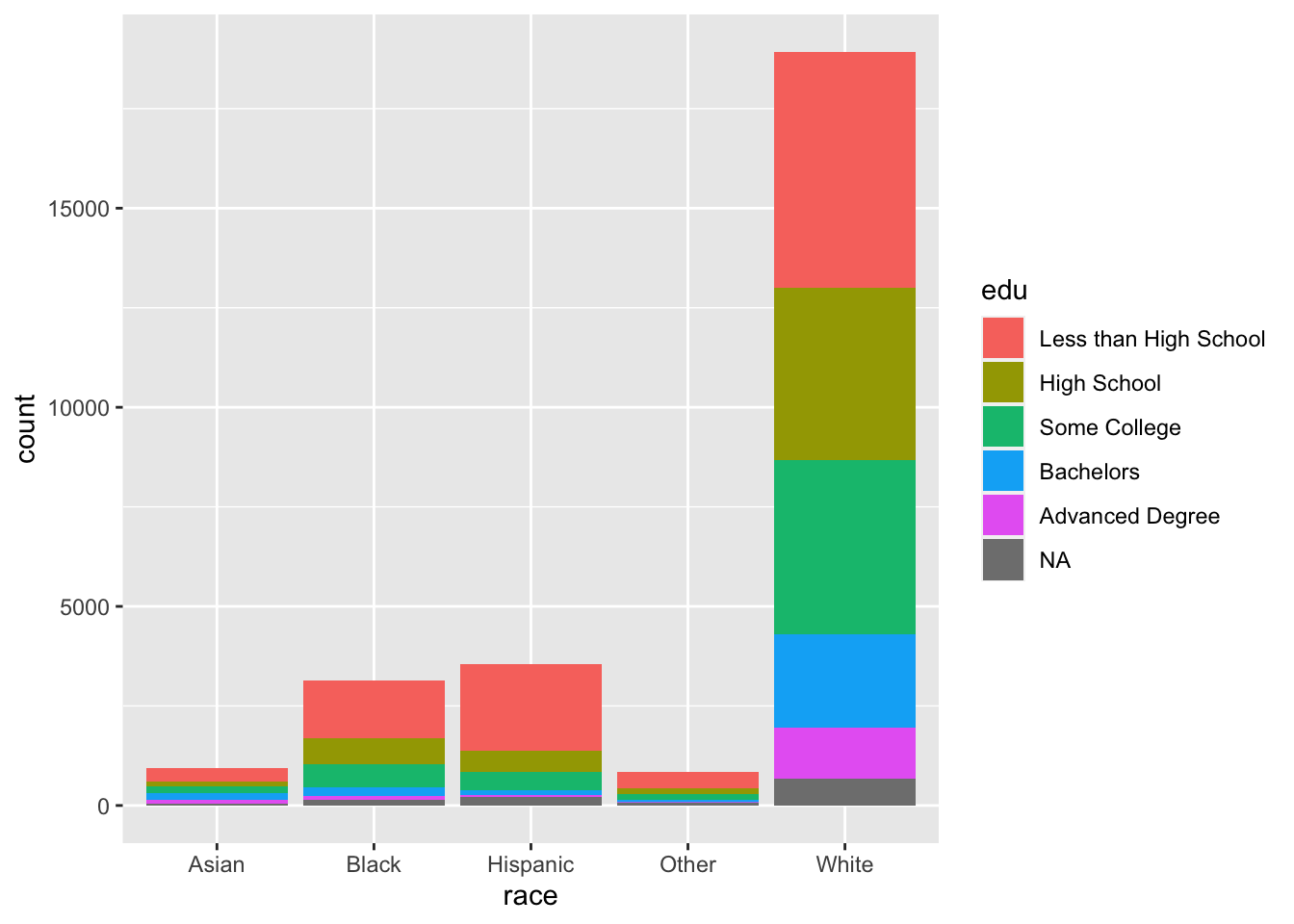
The default statistic of the y-axis when using geom_bar() is count. The representation of the levels of edu are difficult to interpret for Asian and Other. To correct this, we can change the y-axis to be the proportion of counts within each race. To do so, set position to "fill". Although the y-axis is still labeled “count”, but we can tell by its scale that it is a proportion. position = "fill" is a standardized version of position = "stack", where count bars are stacked and then standardized to have the same height. In this way, the height of each edu bar within each level of race represents the proportion of cases for each race with each level of edu.
(To change the y-axis label, see the section Adding and Changing Labels.)
ggplot(acs, aes(x = race, fill = edu)) +
  geom_bar(position = "fill")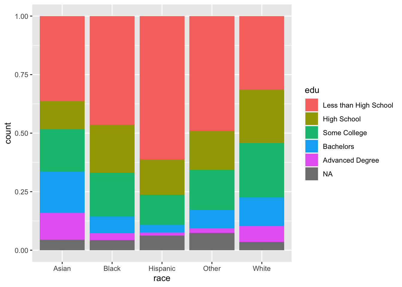
Our problem here is that we are relying on colors to communicate information. Colors are automatically chosen to be evenly spaced around the color space to be distinguishable, but it can be difficult to distinguish them as the number of categories increase. Also, colors can cause difficulties for people with colorblindness, and colors often do not have the same level of contrast when they are printed in grayscale (and some colors are indistinguishable when printed in grayscale).
All that to say, use colors as you wish for personal data visualization, but whenever you produce plots for colleagues or for publication, it is best to avoid colors.
With a little bit of data wrangling (see Data Wrangling with R), we can calculate the percent of each race who have each level of edu rather than having ggplot calculate this with the fill aesthetic. ggplot has some capabilities for calculating summary statistics for us (e.g., counts, proportions), but it is very limited in this regard. It is better to calculate what we want to plot outside of ggplot, pass these calculated values to ggplot(), and then plot them as-is. Our eventual goal is to create a plot that separates each of the edu bars and aligns them to facilitate visual comparison. We first need to run a few calculations to end up with a dataframe with one observation for each combination of race and edu.
The pipe below does the following:
group_by()specifies our grouping variables:raceandedu.summarize()then creates a dataset with one observation for each unique combination ofraceandedu, and a variablenwhich contains the number of observations (n()) per combination.- Using
summarize()also peels back one layer of our grouping variables, starting from the end, so now data are only grouped byrace mutate()creates a new variableperc. It is defined asn, the number of observations in eachrace-educombination, divided bysum(n), the total number of observations for each level ofrace, our current and only grouping variable. Multiplying this by 100 changes it from a proportion to a percentage.
acs |>
  group_by(race, edu) |>
  summarize(n = n()) |>
  mutate(perc = 100*n/sum(n))
## `summarise()` has grouped output by 'race'. You can override using the `.groups` argument.## # A tibble: 30 × 4
## # Groups: race [5]
## race edu n perc
## <chr> <fct> <int> <dbl>
## 1 Asian Less than High School 340 36.3
## 2 Asian High School 112 12.0
## 3 Asian Some College 170 18.2
## 4 Asian Bachelors 165 17.6
## 5 Asian Advanced Degree 107 11.4
## 6 Asian <NA> 42 4.49
## 7 Black Less than High School 1459 46.4
## 8 Black High School 645 20.5
## 9 Black Some College 584 18.6
## 10 Black Bachelors 228 7.25
## # ℹ 20 more rowsAfter this wrangling, we pipe the resulting dataframe into ggplot(). We can specify race as our x variable and perc (the percentage of each race with each level of edu) as our y variable.
Then, as with earlier, we need to specify that we do not want a count of observations for our x variable by setting stat = "identity". Then, stack the barplots.
acs |>
  group_by(race, edu) |>
  summarize(n = n()) |>
  mutate(perc = 100*n/sum(n)) |>
  ggplot(aes(x = race, y = perc)) +
  geom_bar(stat = "identity")
## `summarise()` has grouped output by 'race'. You can override using the `.groups` argument.
Note that, at this point, this plot contains mostly the same information as the colorful plot we produced above when we specified fill = edu and position = "fill", with a few exceptions. The scale of the y-axis is 0-100 instead of 0-1, the edu bars are not colored and are separated with thin gray lines, and the levels of edu are in the opposite order. (If we look at “Asian”, the largest bar is at the bottom rather than at the top.)
However, one vital piece of information is not included in this plot, which was communicated by color in a previous plot. Which bars correspond to which levels of edu?
We can communicate this information is by separating the levels of edu and adding labels by using facet_grid(). Faceting allows us to split our one plot into several panels. (See the section With Facets.) Specifying the formula ~ edu means that the plots will be split along the education variable.
Then, flipping the coordinates will arrange our barplots horizontally.
acs |>
  group_by(race, edu) |>
  summarize(n = n()) |>
  mutate(perc = 100*n/sum(n)) |>
  ggplot(aes(x = race, y = perc)) +
  geom_bar(stat = "identity") +
  facet_grid(~ edu) +
  coord_flip()
## `summarise()` has grouped output by 'race'. You can override using the `.groups` argument.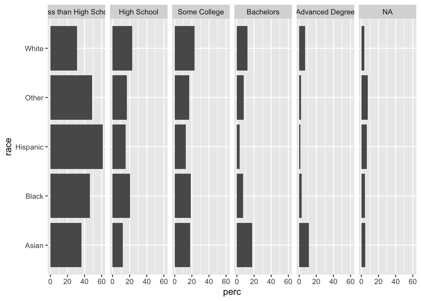
One advantage of this plot over the colorful stacked barplot is that we can easily compare the proportions within each level of edu. Vertically scan the “Some College” facet, and you can see which levels of race have greater or lesser proportions in this category (“White” has the most, “Hispanic” the least, and the other three are somewhat tied). However, if we try to compare the green “Some College” bars in our stacked barplot, it is much more difficult to compare. Separating the bars into facets facilitates this type of between-race, within-edu comparison.
We can also add text with the percentage shown by each bar. As with before, we need to adjust the y limits to make room for our labels, and then we need to use hjust to move the text to a better place.
Note how we can use round() within our ggplot call to round perc to the nearest tenth.
acs |>
  group_by(race, edu) |>
  summarize(n = n()) |>
  mutate(perc = 100*n/sum(n)) |>
  ggplot(aes(x = race, y = perc)) +
  geom_col() +
  facet_grid(~ edu) +
  coord_flip() +
  ylim(c(0, 90)) +
  geom_text(aes(label = round(perc, 1)), hjust = -.1)
## `summarise()` has grouped output by 'race'. You can override using the `.groups` argument.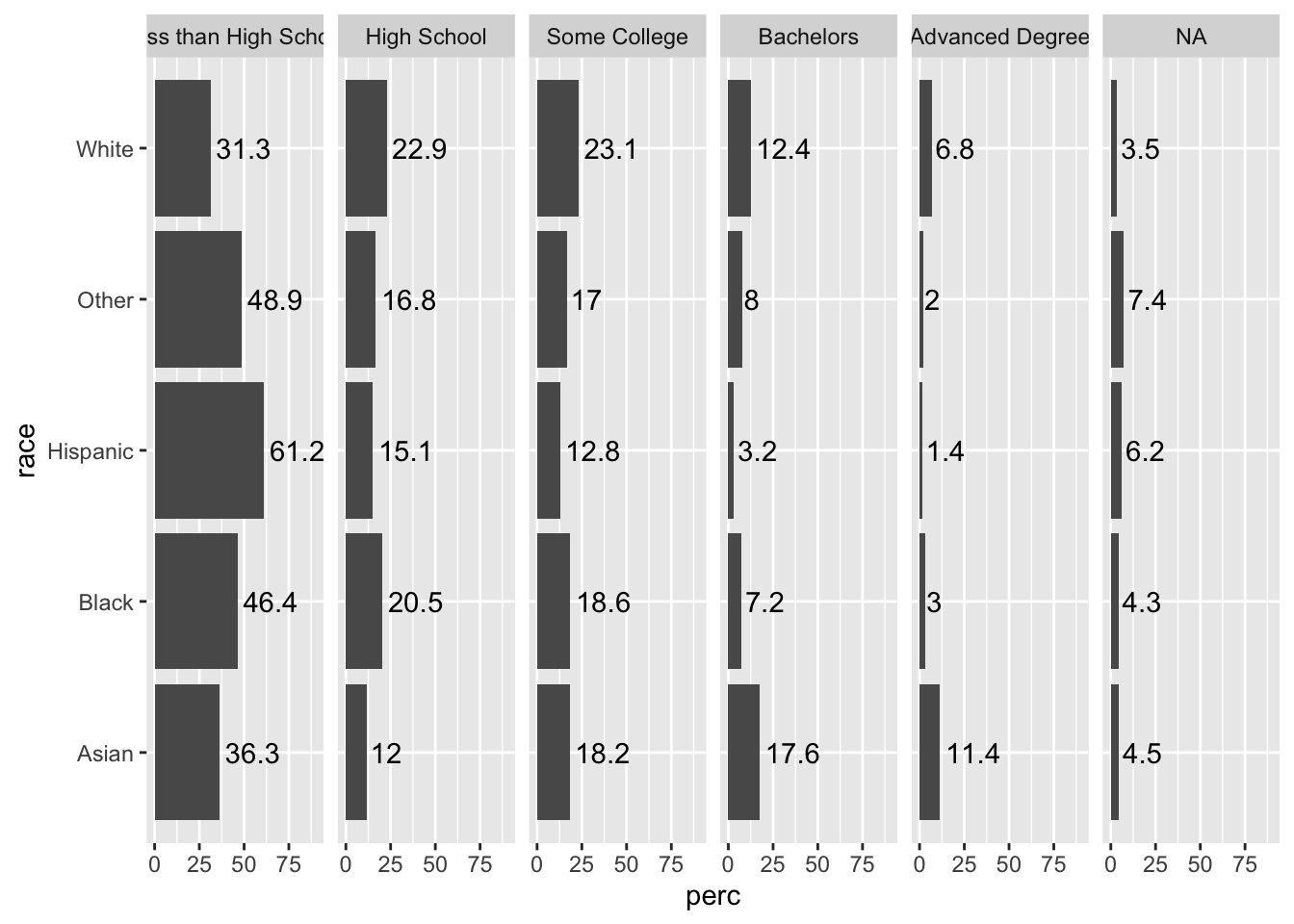
In this case, since our bars are separated and the column names give information about the edu variable, we can add color for strictly aesthetic purposes.
Specify this with fill = edu.
acs |>
  filter(!is.na(edu)) |>
  group_by(race, edu) |>
  summarize(n = n()) |>
  mutate(perc = 100*n/sum(n)) |>
  ggplot(aes(x = race, y = perc, fill = edu)) +
  geom_col() +
  facet_grid(~ edu) +
  coord_flip() +
  ylim(c(0, 90)) +
  geom_text(aes(label = round(perc, 1)), hjust = -.1)
## `summarise()` has grouped output by 'race'. You can override using the `.groups` argument.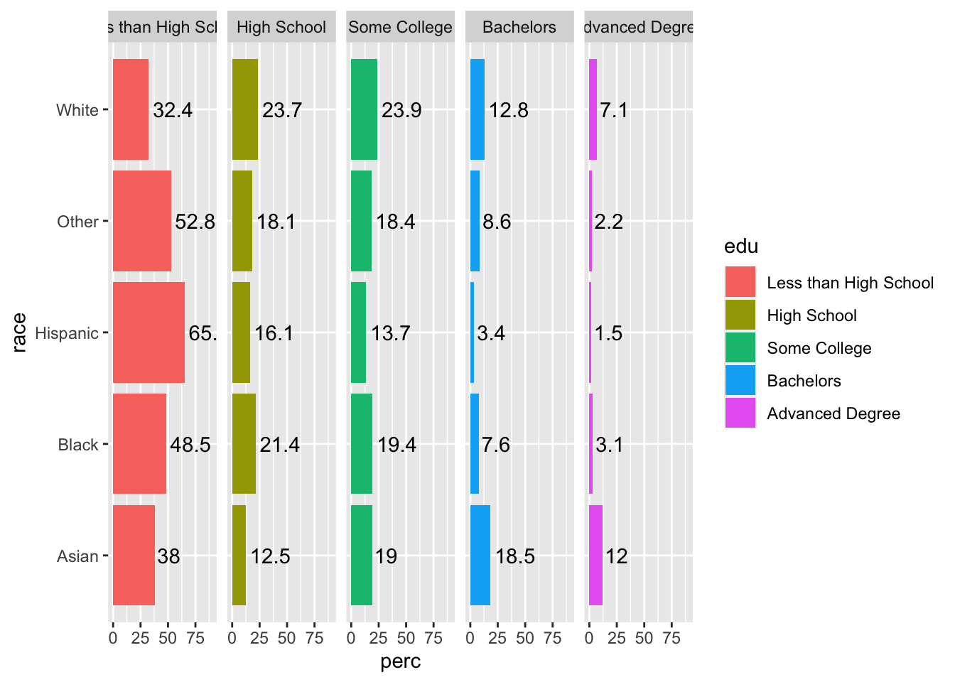
Since color does not give any unique information, add show.legend = F to geom_bar() to suppress the legend, since it does not add any information.
acs |>
  filter(!is.na(edu)) |>
  group_by(race, edu) |>
  summarize(n = n()) |>
  mutate(perc = 100*n/sum(n)) |>
  ggplot(aes(x = race, y = perc, fill = edu)) +
  geom_col(show.legend = F) +
  facet_grid(~ edu) +
  coord_flip() +
  ylim(c(0, 90)) +
  geom_text(aes(label = round(perc, 1)), hjust = -.1)
## `summarise()` has grouped output by 'race'. You can override using the `.groups` argument.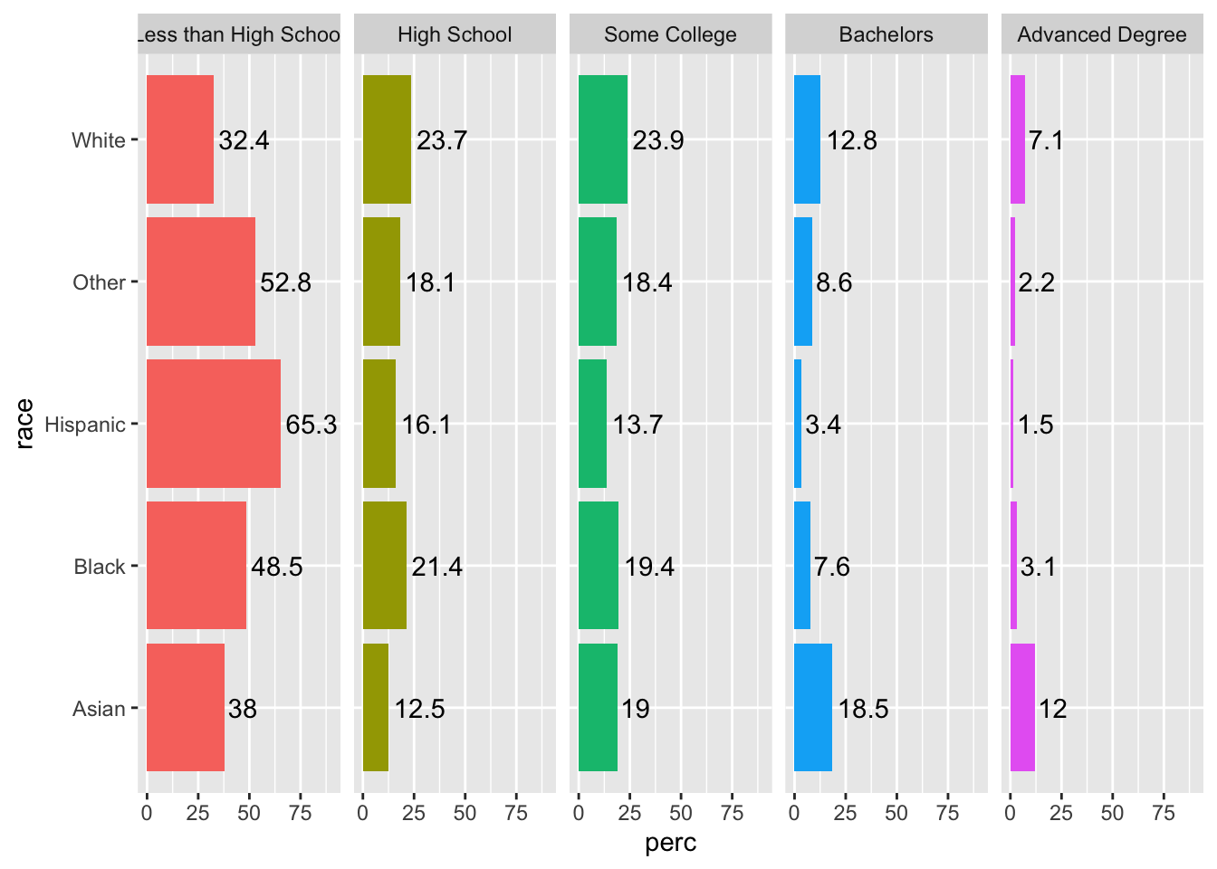
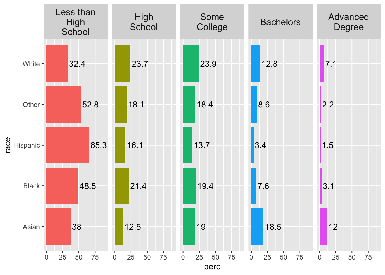
One issue in the plot is that our facet names are a little long, and “Less than High School” is being cut off. We could experiment with text size, or we can use the labeller argument in our facet_grid() function and specify the maximum number of characters before the line wraps.
While we are at it, we can also increase the text size of the facet text for emphasis with the strip.text argument in theme().
acs |>
  filter(!is.na(edu)) |>
  group_by(race, edu) |>
  summarize(n = n()) |>
  mutate(perc = 100*n/sum(n)) |>
  ggplot(aes(x = race, y = perc, fill = edu)) +
  geom_col(show.legend = F) +
  facet_grid(~ edu, labeller = label_wrap_gen(width=10)) +
  coord_flip() +
  ylim(c(0, 90)) +
  geom_text(aes(label = round(perc, 1)), hjust = -.1) +
  theme(strip.text = element_text(size = 12))
## `summarise()` has grouped output by 'race'. You can override using the `.groups` argument.