5 Three Variables
Load the libraries and data needed for this chapter. See Download the Data for links to the data.
library(ggplot2)
library(dplyr)

acs <- readRDS("acs.rds")
acs_small <- readRDS("acs_small.rds")
More than two variables can be visualized without resorting to 3D plots by mapping the third variable to some other aesthetic, or by creating a separate plot (“facet”) for each of its values.
5.1 With Aesthetics
Colors can be useful, especially for continuous variables. In this plot, older individuals are plotted with a lighter shade of blue.
ggplot(acs_small, aes(x = edu, y = income, color = age)) +
  geom_jitter(width = .2)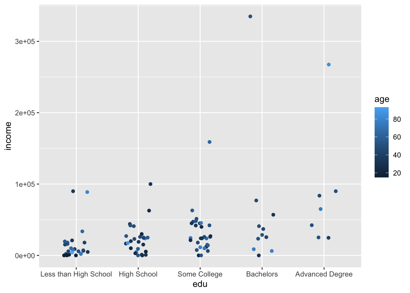
ggplot(acs_small, aes(x = age, y = income, color = female)) +
  geom_point()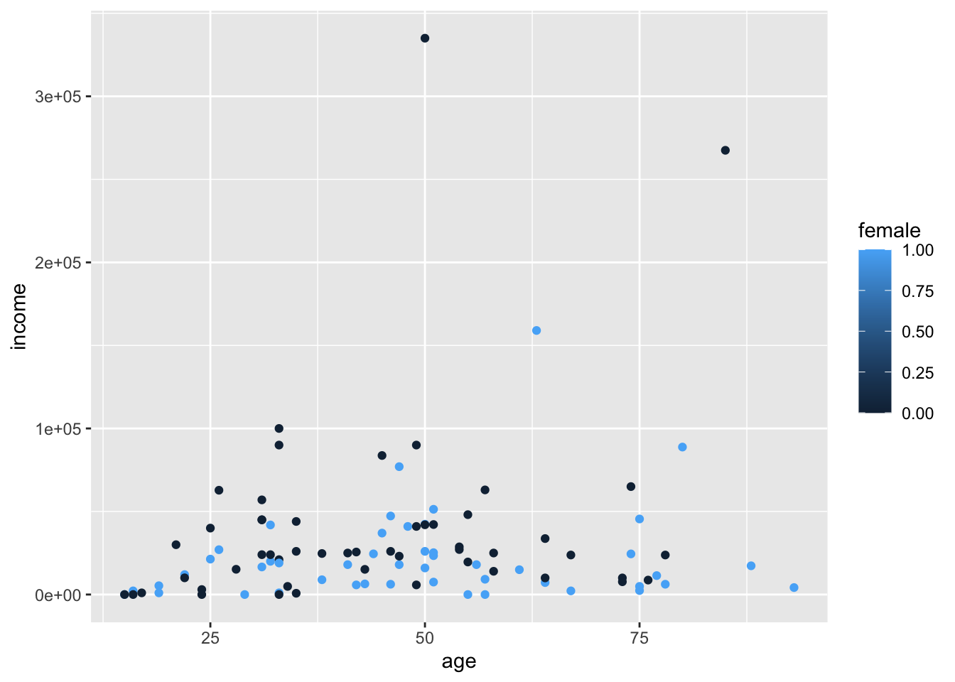
Note that since female is numeric, ggplot created a legend with a continuous color scale.
To correct this, we can either change our dataframe to make female a character or factor vector, or we can temporarily specify it as such when we create our plot.
ggplot(acs_small, aes(x = age, y = income, color = as.factor(female))) +
  geom_point()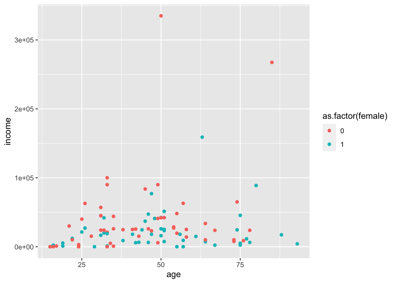
Colors can also be manually specified with names, hex codes, and other methods. See this online color picker application.
ggplot(acs_small, aes(x = age, y = income, color = as.factor(female))) +
  geom_point() +
  scale_color_manual(values = c("#270181", "coral"))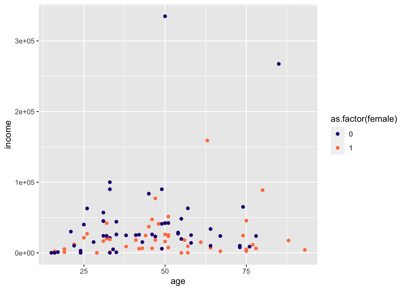
We can also use a variable to modify the shape aesthetic handled by geom_point().
ggplot(acs_small, aes(x = age, y = income, shape = as.factor(female))) +
  geom_point()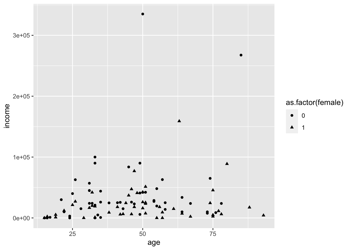
However, shapes and colors quickly become a mess as we increase the number of categories.
ggplot(acs_small, aes(x = age, y = income, color = edu)) +
  geom_point()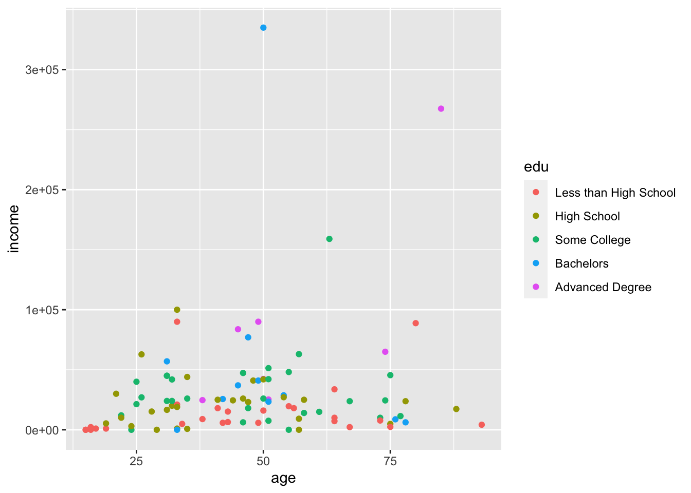
ggplot(acs_small, aes(x = age, y = income, shape = edu)) +
  geom_point()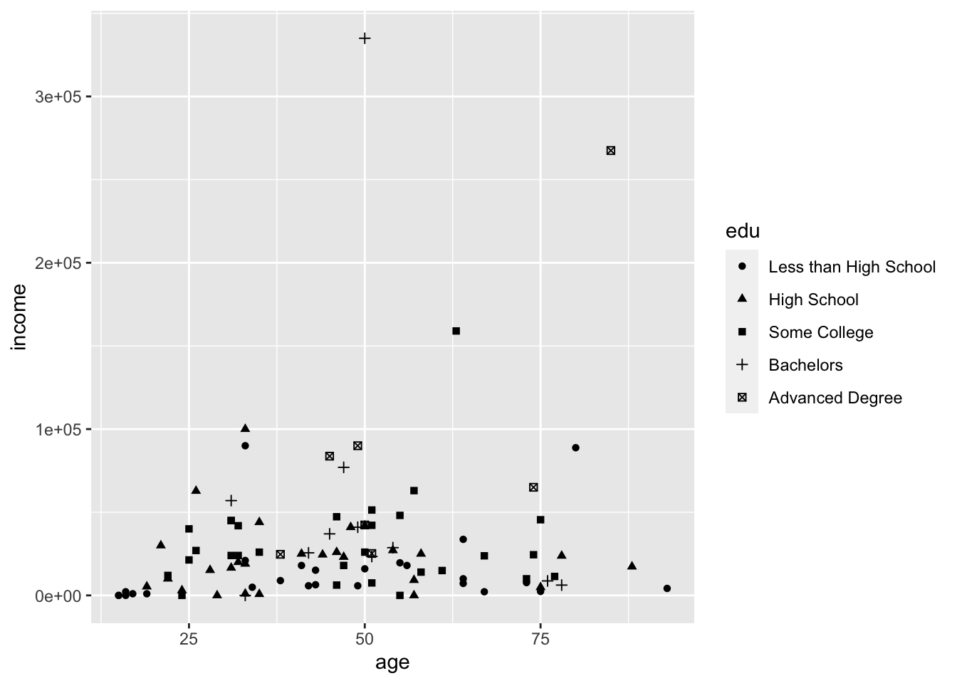
5.2 With Facets
Facets are a better way to visualize categorical variables with many categories. Facets split our plot into several smaller plots along a categorical variable.
We can supply facet_wrap() with the formula ~ edu. It is assumed that the left side of our formula is the rest of our selected data, so the formula can be read “age and income by education.” And that is what we see:
ggplot(acs_small, aes(x = age, y = income)) +
  geom_point() +
  facet_wrap(~ edu)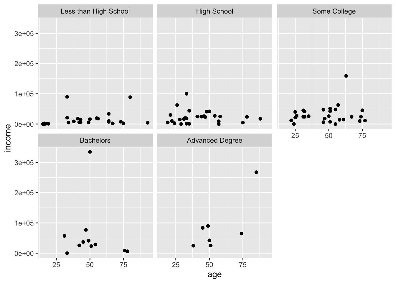
The numbers of columns and rows can be modified with the nrow or ncol argument:
ggplot(acs_small, aes(x = age, y = income)) +
  geom_point() +
  facet_wrap(~ edu, nrow = 1)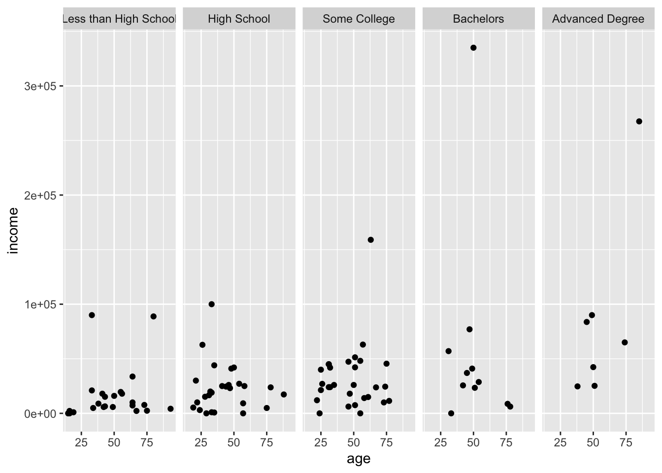
More variables can be supplied by lengthening the formula: ~ edu + race + female, but where two intersecting variables are used, facet_grid() is useful.
Give facet_grid() a formula, where the left side will become the rows, and the right side the columns.
ggplot(acs_small, aes(x = age, y = income)) +
  geom_point() +
  facet_grid(female ~ edu)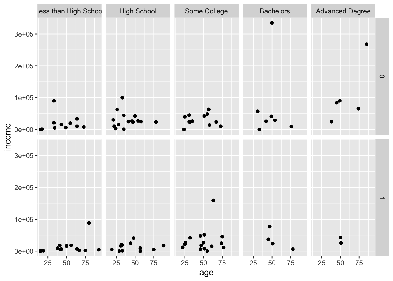
Although female is a numeric variable, it was turned into a factor for the faceting. This would also work if you use the formula age ~ edu, but this is not advised.
The facet rows are labeled with the values of female, 0 and 1, which is not very informative. To change this, make female a character variable, either temporarily in a pipe (as below) or permanently by re-assigning the result back to the dataframe.
acs_small |>
  mutate(female = ifelse(female %in% 0, "Male", "Female")) |>
  ggplot(aes(x = age, y = income)) +
  geom_point() +
  facet_grid(female ~ edu)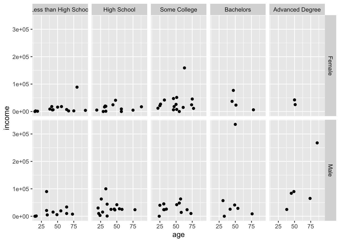
Notice how the order of the facets changed, since 0 comes before 1 numerically, but “Female” comes before “Male” alphabetically.
More variables can be added as additional facets and aesthetics, making it possible to show more than three variables in a single plot. The plot below shows six variables, although not very well.
acs_small |>
  mutate(female = ifelse(female %in% 0, "Male", "Female")) |>
  ggplot(aes(x = age, y = income, color = person)) +
  geom_point() +
  facet_grid(female + race ~ edu)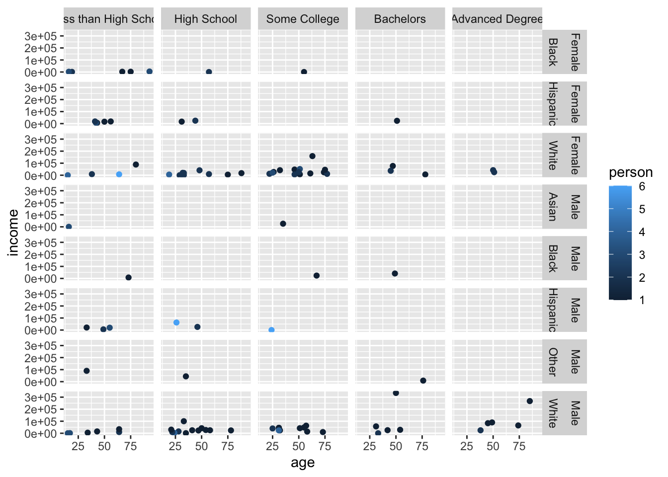
It is also possible to allow each facet to have its own axis scales with scales = "free". This makes it easier to see the distribution within each facet, but it also makes it much harder to compare between facets.
acs_small |>
  mutate(female = ifelse(female %in% 0, "Male", "Female")) |>
  ggplot(aes(x = age, y = income)) +
  geom_point() +
  facet_grid(female ~ edu, scales = "free")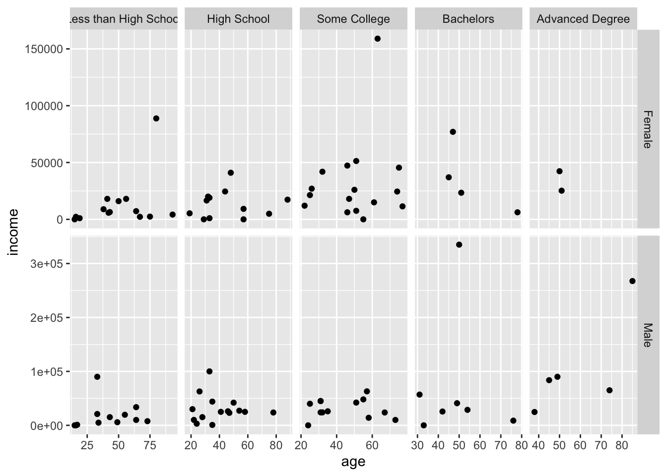
Notice how the Advanced Degree panel on the far right now only ranges 35-65 while the other panels range at least 20-80.