 Supporting Statistical Analysis for Research
3.2 Relationships between two continuous variables
3.2.1 Data concepts - Continuous variables
A continuous variable can take on infinitely many values. The "can take" part of the definition is important since our data sets have a finite number of observations.
Integer valued variables are considered continuous if they are measures on a continuous scale. For example a variable may have the height of subjects in inches. The measure of height is infinite on the inches scale so the variable would be treated as continuous.
3.2.2 Exploring - Scatter plots
One useful way to explore the relationship between two continuous variables is with a scatter plot. A scatter plot displays the observed values of a pair of variables as points on a coordinate grid. The values of one of the variables are aligned to the values of the horizontal axis and the other variable values to the vertical axis. A relationship between these two variables is seen as a pattern in the plotted points.
3.2.3 Programing - ggplot layers
This book uses ggplot to create graphs for both R and Python. While there are other plotting packages available in both languages, ggplot is particularly useful to quickly create graphs that explore relationships within data.
ggplot implements a layered grammar of graphics.
This is an extension of
The Grammar of Graphics
by Wilkinson, Anand, and Grossman (2005).
Both of these approaches provide a structured method for specifying the
transformation of data to graphical images (plots.)
Each of the layers in ggplot can be thought of as the contents of a single plot. The layers are stacked one on top of the another to create the completed graph. For example, one layer could be a scatter plot of data points and another could be a regression line. When stacked, these two layer display the points and the regression line through them. This layering allows for a nice stepwise approach to creating plots.
A layer is constructed from the following components
data
This is either a data frame or an object that can be coerced to a data frame.
geometric objects to be graphed
Examples are points, lines, bars, etc.
aesthetics which map variable values to geometric characteristics
Variables can be mapped to an axis (to determine position on plot), color, shape for points, line type for lines, etc.
statistical transformation
Examples are summary statistics generated for box plots and frequencies of occurrences for bar charts. When points or lines are drawn, there is no statistical transformation.
position adjustments
This allows the position of a geometric object to be adjusted. Examples include stacking the bars of a bar chart, or jittering the position of points in a scatter plot.
A layer is specified using a geometry function,
such as geom_point(), geom_line(), geom_boxplox(),
or geom_bar().
These geometry functions define the geometric object to be plotted.
The other components of a layer
(data, aesthetics mapping, statistical mapping, and position)
are specified as parameters to the geometry.
Each of the geometries has default settings for many of the
these parameters.
These defaults make it easy to quickly create plots.
The ggplot() function creates a new plot object.
Layers are added to a plot using the + operator.
For example, the following syntax template is used to
create a scatter plot.
`ggplot() + geom_points()`.The parameters that identify the data frame to use and the aesthetics mapping would need to be included.
Data and aesthetics can be specified as parameters to
either the ggplot() function or the geom_*() functions.
When parameters are specified in the ggplot() function,
the parameters are used for all geom_*() functions
added to the plot.
These parameters are said to have a global scope.
It is good coding practice to specify data and most aesthetics
globally in ggplot().
Any data or aesthetic that is unique to a layer is then
specified as a parameter to the geom_*() function for
the layer.
This is called local scope.
Locally scoped parameters override globally scoped parameters
in ggplot.
This allows global parameters to be replaced by local parameters when
needed by a layer.
A ggplot object can be displayed upon its creation.
It can also be saved (assigned a name) for later use.
A saved plot can be displayed by printing the object
(implicitly or explicitly).
The saved ggplot object can also be modified.
For example, a layer can be added by using the + operator.
3.2.4 Examples - R
These examples use the auto.csv data set.
We begin by using the same code as in the prior chapters to load the tidyverse and import the csv file.
library(tidyverse)auto_path <- file.path("..", "datasets", "auto.csv") auto <- read_csv(auto_path, col_types = cols())Warning: Missing column names filled in: 'X1' [1]glimpse(auto)Observations: 392 Variables: 10 $ X1 <dbl> 1, 2, 3, 4, 5, 6, 7, 8, 9, 10, 11, 12, 13, 14, 15... $ mpg <dbl> 18, 15, 18, 16, 17, 15, 14, 14, 14, 15, 15, 14, 1... $ cylinders <dbl> 8, 8, 8, 8, 8, 8, 8, 8, 8, 8, 8, 8, 8, 8, 4, 6, 6... $ displacement <dbl> 307, 350, 318, 304, 302, 429, 454, 440, 455, 390,... $ horsepower <dbl> 130, 165, 150, 150, 140, 198, 220, 215, 225, 190,... $ weight <dbl> 3504, 3693, 3436, 3433, 3449, 4341, 4354, 4312, 4... $ acceleration <dbl> 12.0, 11.5, 11.0, 12.0, 10.5, 10.0, 9.0, 8.5, 10.... $ year <dbl> 70, 70, 70, 70, 70, 70, 70, 70, 70, 70, 70, 70, 7... $ origin <dbl> 1, 1, 1, 1, 1, 1, 1, 1, 1, 1, 1, 1, 1, 1, 3, 1, 1... $ name <chr> "chevrolet chevelle malibu", "buick skylark 320",...
3.2.4.1 Exploring - Scatter plots
We will explore the relationship between the
weightandmpgvariables. (There are a number of other relationships we could explore as well.) They are both continuous variables. This example creates a scatter plot with theweighton the horizontal axis andmpgon the vertical axis.The data frame and aesthetics are specified globally in the
ggplot()function. Note that the variable names do not need to be quoted here. R knows to interpret these as names of variables in the data frame.ggplot(data=auto, mapping = aes(x = weight, y = mpg)) + geom_point() + theme_bw()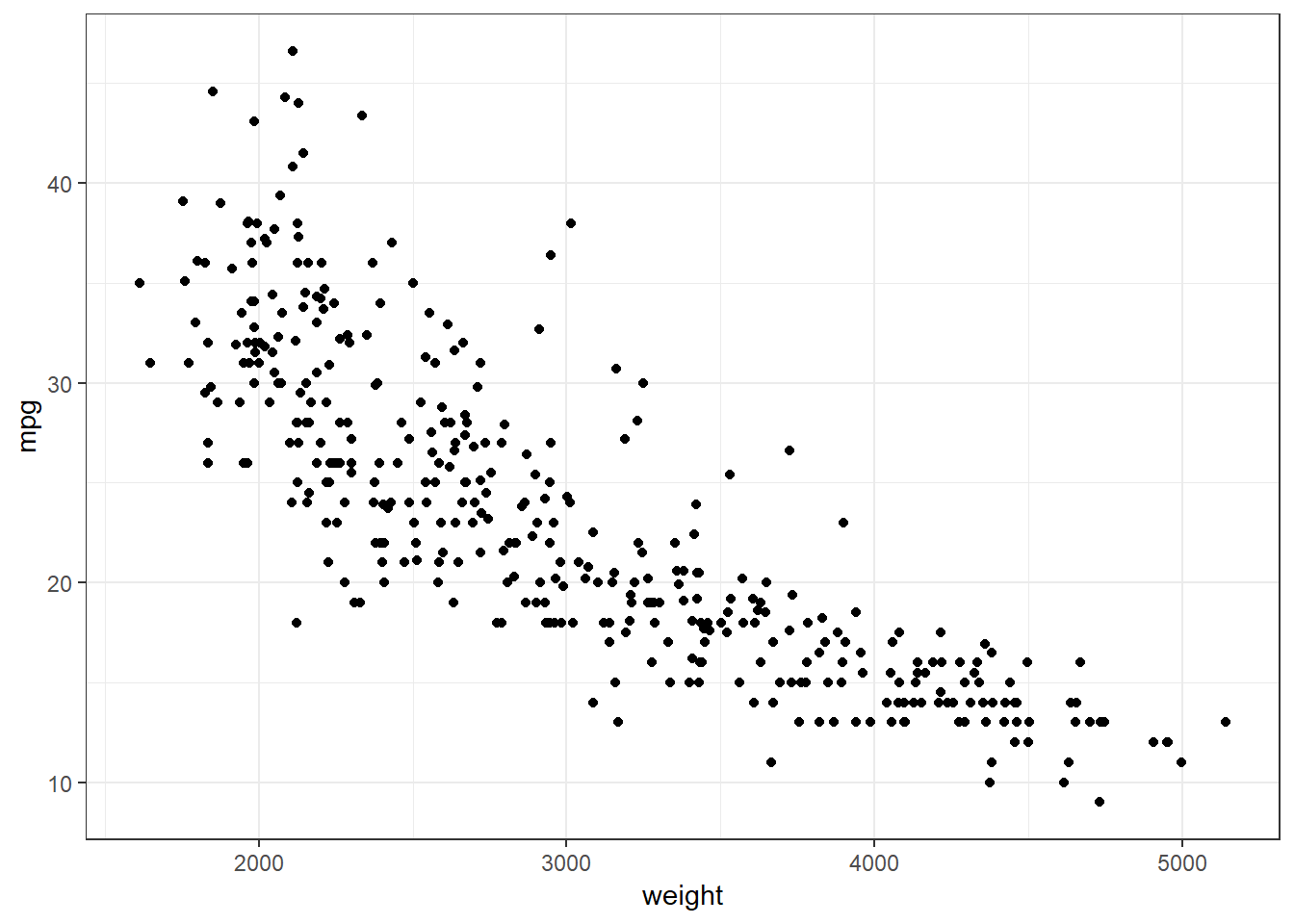
In the above graph, one can see observations that are aligned horizontally. This occurs most noticeably in the graph where
weightis between 3500 pounds and 5000 pounds. This is a result of thempgvariable being recorded as an integer. The true gas mileage for these automobiles was likely rounded to these values.The above example used named parameters to the
ggplot()function. Thedataandmappingare well understood using their position and the code is more readable without these parameter names. These parameter names will be dropped in future examples.This example adds a loess (locally estimated scatterplot smoothing) line to the same scatter plot as was created the prior example. A loess line can be an aid in determining the pattern in a graph.
ggplot(auto, aes(x = weight, y = mpg)) +
  geom_point() +
  geom_smooth(color = "blue") +
  theme_bw()
`geom_smooth()` using method = 'loess' and formula 'y ~ x'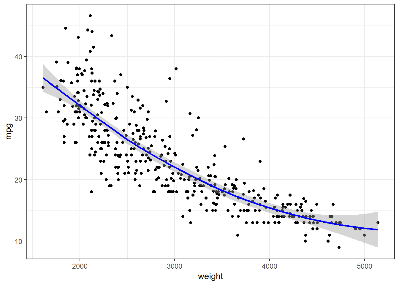
The loess line in the above graph suggests there may be a slight non-linear relationship between the
weightandmpgvariables.
3.2.5 Examples - Python
ggplot() was written in R and is part of the ggplot2 R package.
There are several ports of the ggplot2 package to Python.
We will be using the version in the plotnine package.
This is a nice implementation and works very similarly to the R ggplot2.
These examples use the auto.csv data set. It is a record of air accidents.
We begin by loading the pandas and os package and then importing the csv file.
from pathlib import Path
import pandas as pd
import plotnine as p9The above code imports the plotnine package. This include the ggplot functions and methods. Python name space management requires the use of the p9 name when using the functions and methods of ggplot from the
plotninepackage. This is the same as with functions from pandas.auto_path = Path('..') / 'datasets' / 'Auto.csv' auto = pd.read_csv(auto_path) print(auto.dtypes)Unnamed: 0 int64 mpg float64 cylinders int64 displacement float64 horsepower int64 weight int64 acceleration float64 year int64 origin int64 name object dtype: object
3.2.5.1 Exploring - Scatter plots
We will explore the relationship between the
weightandmpgvariables. (There are a number of other relationships we could explore as well.) They are both continuous variables. This example creates a scatter plot with theweighton the horizontal axis andmpgon the vertical axis.The data frame and aesthetics are specified globally in the
ggplot()function. Note that the variable names need to be quoted when used as parameters in the ggplot functions.print( p9.ggplot(data=auto, mapping=p9.aes(x='weight', y='mpg')) + p9.geom_point() + p9.theme_bw())<ggplot: (-9223371893263534350)>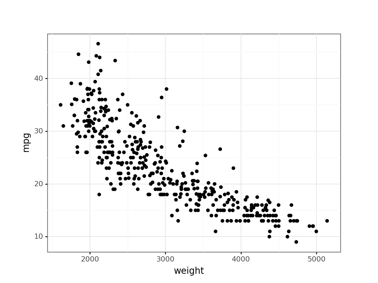
In the above graph, one can see observations that are aligned horizontally. This occurs most noticeably in the graph where
weightis between 3500 pounds and 5000 pounds. This is a result of thempgvariable being recorded as an integer. The true gas mileage for these automobiles was likely rounded to these values.The above example used named parameters to the
ggplot()function. Thedataandmappingare well understood using their position and the code is more readable without these parameter names. These parameter names will be dropped in future examples.This example adds a loess (locally estimated scatterplot smoothing) line to the same scatter plot as was created the prior example. A loess line can be an aid in determining the pattern in a graph.
print(
    p9.ggplot(auto, p9.aes(x='weight', y='mpg')) +
    p9.geom_point() +
    p9.geom_smooth(color = "blue") +
    p9.theme_bw())
<ggplot: (143602231030)> C:\PROGRA~3\ANACON~1\lib\site-packages\plotnine\stats\smoothers.py:146: UserWarning: Confidence intervals are not yet implementedfor lowess smoothings. warnings.warn("Confidence intervals are not yet implemented"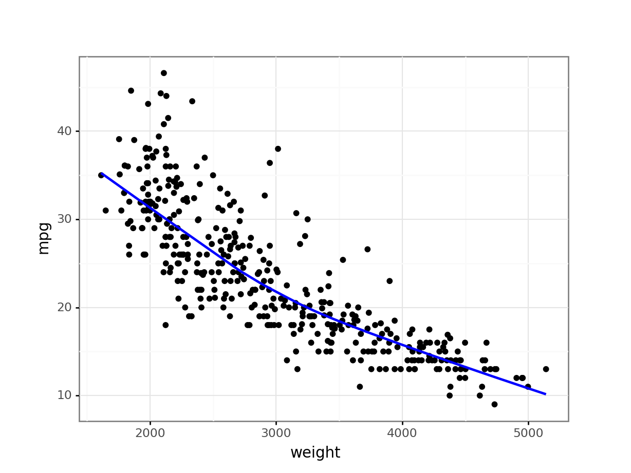
The loess line in the above graph suggests there may be a slight non-linear relationship between the
weightandmpgvariables.
3.2.6 Exercises
Import the
Mroz.csvdata set.Plot
incagainstlwg.Plot
ageagainstlwg. Add a loess line to the plot.